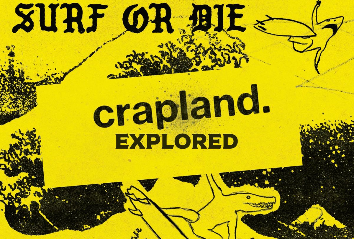
Exploring Crapland Squared
Voice. It's the secret weapon of rpg writing.

Crapland Squared is written by Sean Richer, visually designed by DN "Crap Wizard" Wilkie, and edited by Jared Sinclair and Jarrett Crader. The publisher is Orbital Intelligence.
You're entering a Design Delve, A semi-regular Explorers Design book critique. You can find previous delves when you subscribe for free or become a member.
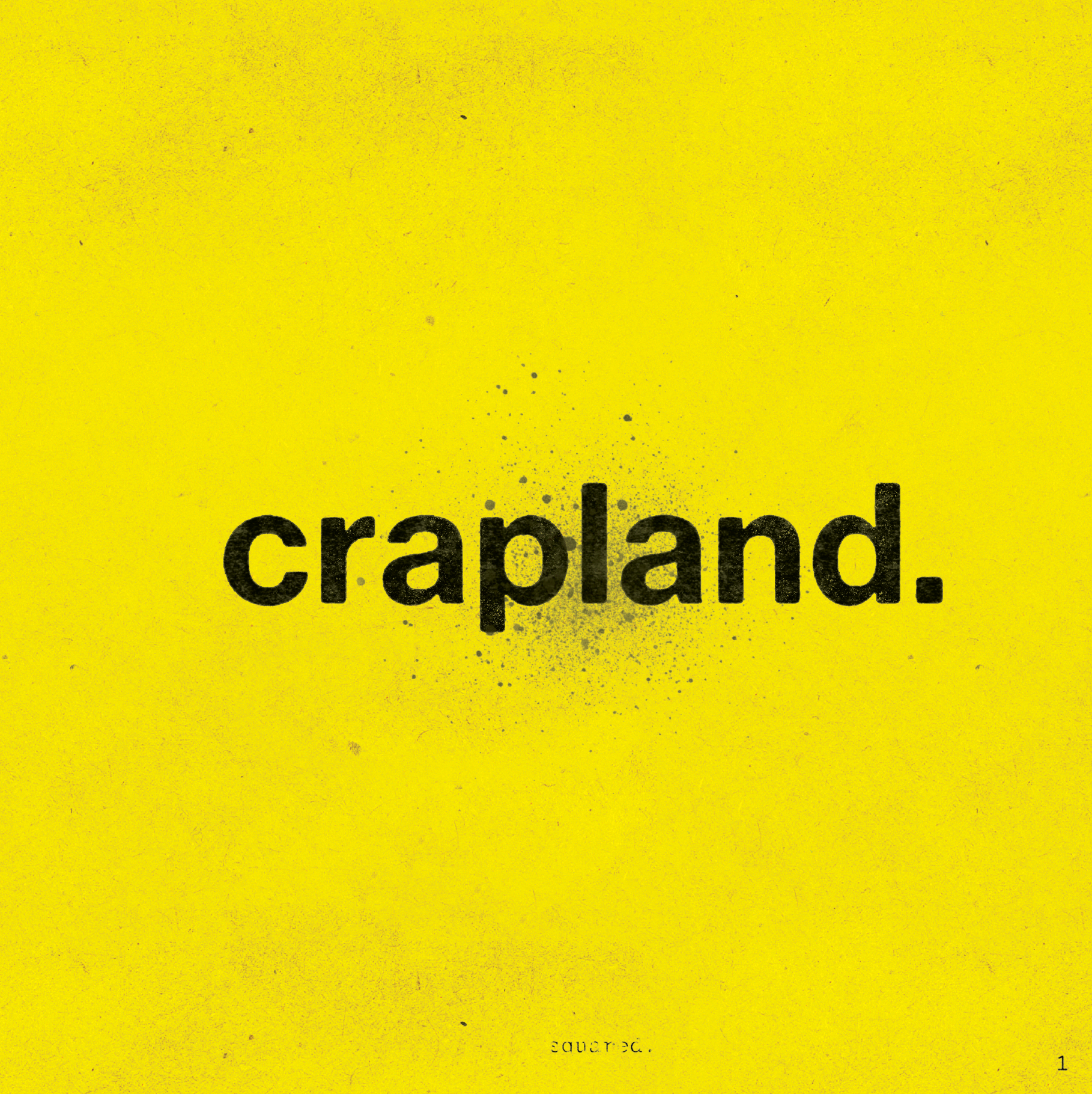
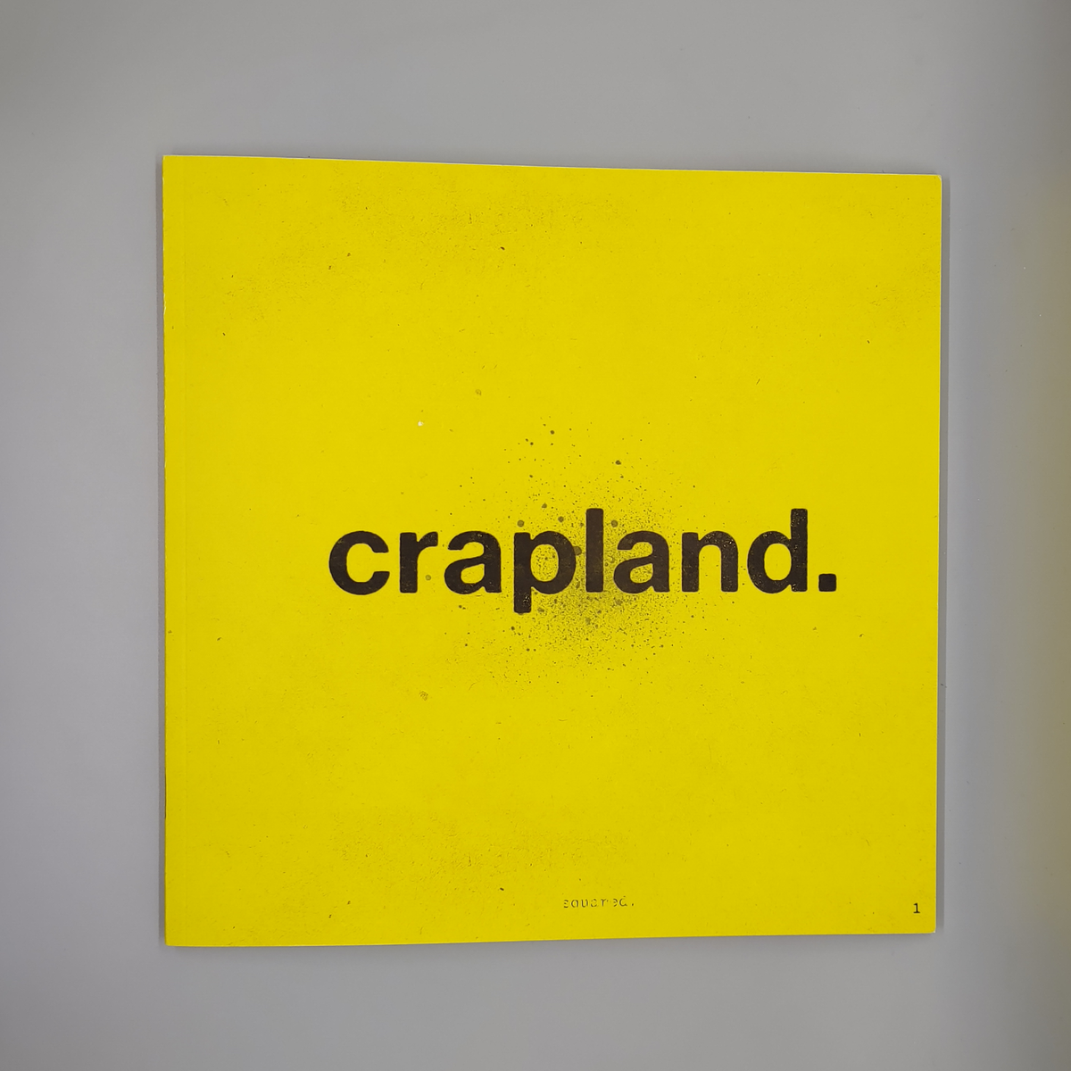
The front and back cover of Crapland Squared.
What a load of crap. (But good.)
If a shirtless skateboarder were cursed to live out their vape-sucking life as a Troika setting, they would be Crapland Squared. It's 62 pages of trash that could win over a Juggalo.
I read Crapland as part of The Awards a couple of years ago. Since then, I've been thinking about voice. That nasty bit of humanity that sneaks into puckish little games like this. I've met a Crapland in person. His name was Pelt, he looked like a Mad Max warboy, and he loved talking about shit, balls, and drinking from plastic jugs of liquor. He was a primal force.
Pelt's personality defined him and made him special. Great games have personalities, too. We see personality in what they do and how they do it. For roleplaying games, that how is often expressed in writing.
What's the deal with the "crappy" voice?
The great thing about voice (or "style") is that it does more than flavor the messaging; it adds to it. In other words, a unique voice can be "functional" and "flavorful." It sets expectations, establishes the pace, and builds the world.
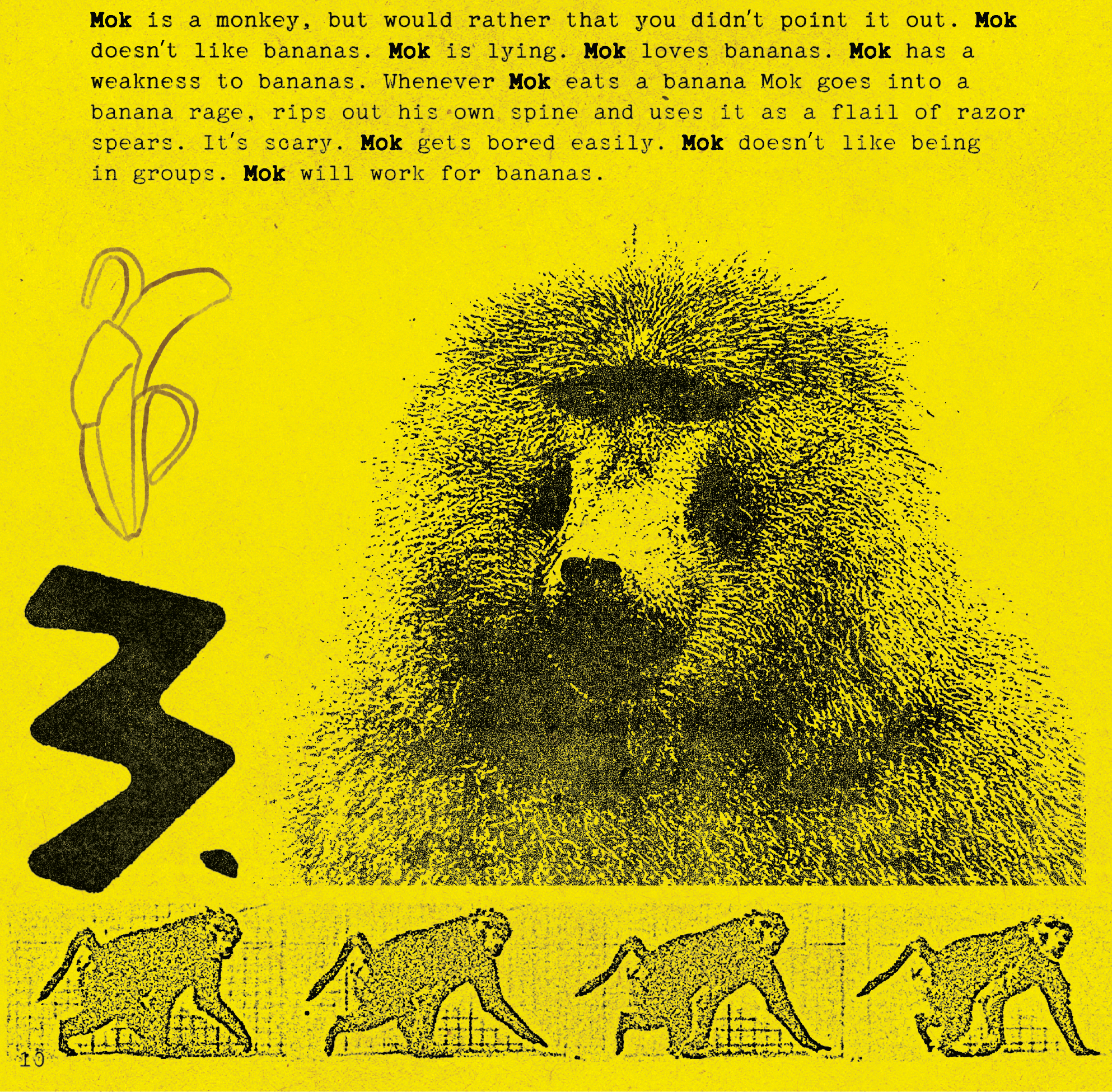
Read this Troika background from Crapland:
Mok is a monkey, but would rather that you didnt point it out. Mok doesn't like bananas. Mok is lying. Mok loves bananas. Mok has a weakness to bananas. Whenever Mok eats a banana Mok goes into a banana rage, rips out his own spine and uses it as a flail of razor spears. It's scary. Mok gets bored easily. Mok doesn't like being in groups. Mok will work for bananas.
I love this little excerpt. The simple sentences and repetition are delightfully dumb. But there's more to this under the hood. Voice is textual and technical—what and how it's said. Crapland's voice stands out because it achieves both. Notice the rhythm of the short and long sentences. The way the short, choppy sentences create a build-up before landing on a long, complex sentence.
It's easy to mistake the lack of punctuation, sentence fragments, and non-sequiturs as bugs getting past editing—but the whole zine tells a bigger picture. It's intentional. The typos and "mistakes" are part of the picture. (Similar to how all the weathering and gunk on the images form the whole image. "Fake mistakes" in visuals, like weathering, can also be made in the writing through intentionality.)
Game design is explicit and implicit. It can be persuasive and suggestive. If you displayed the cover of a Warhammer 40k book to a group of newbies, turned them around, and used Traveller rules, you would be playing something other than "raw" Traveller. Covers telegraph play. Writing telegraphs play.
The excerpt conveys personality and gameable details. It gives you a basic character, their beliefs, personality, weaknesses, insecurities, abilities, strengths, and even a motive. Bonus points for being funny.
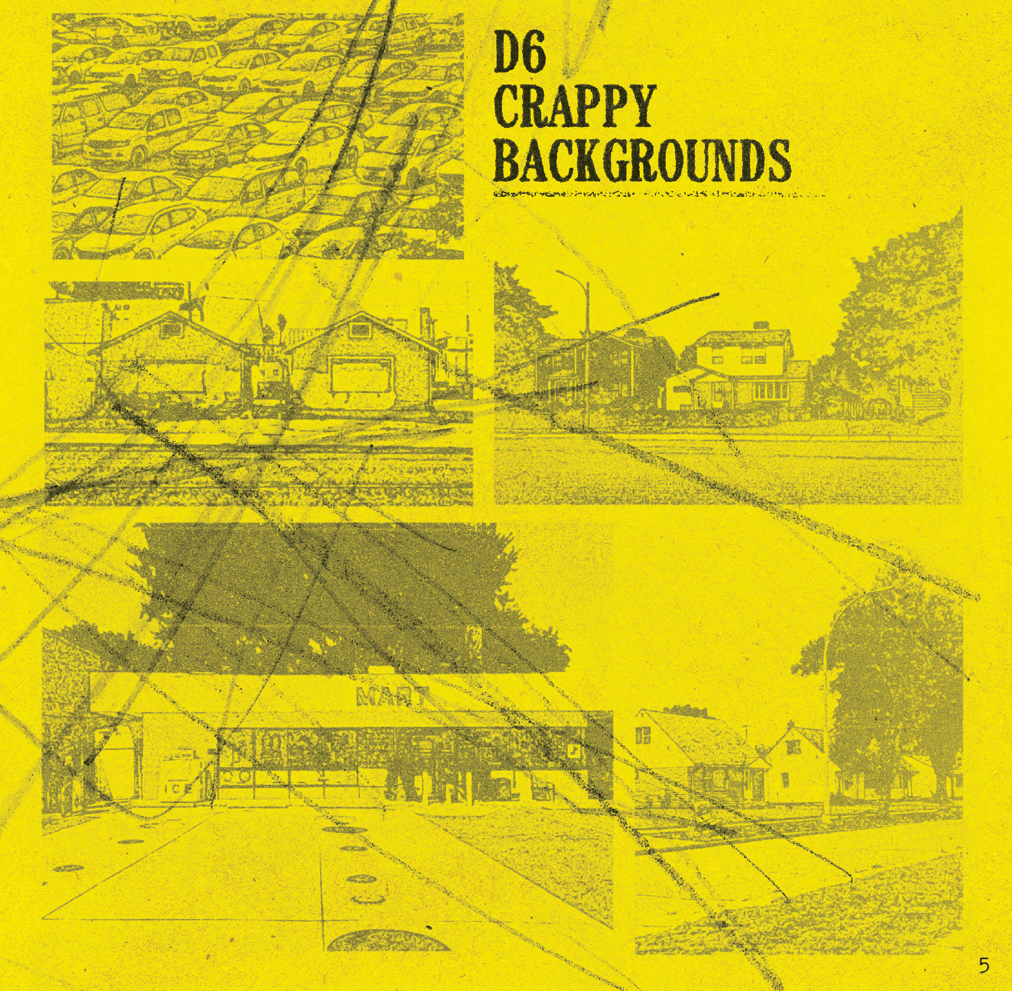
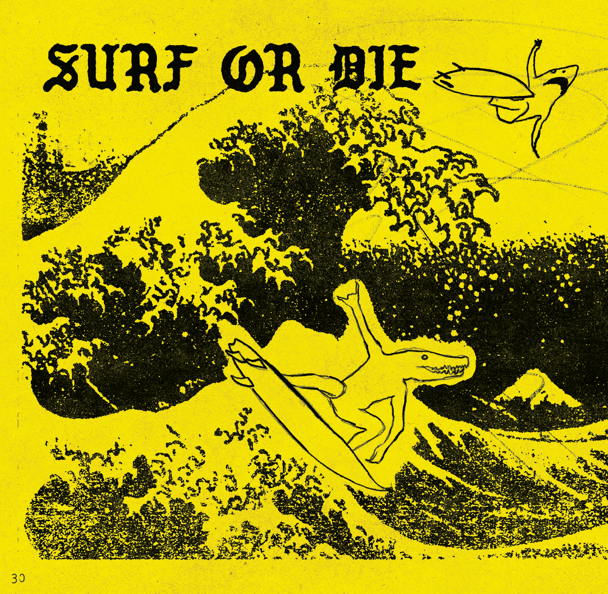
A few pages from Crapland Squared.
Additional observations.
Rather than the usual tour, I'm trying something new. A list of observations. In the past, I used to break projects into parts like layout, typography, and art, but that method requires a certain uniformity in books—a uniformity that doesn't excite me. Let me know what you think in the comments.
That's craptastic.
The style of Crapland books is heavily reminiscent of the classified ads I used to see around Boston. Some of the calling cards include ink bleed (that thing where fine nooks and crannies are lost from ink soaking into cheap paper from cheap printers) and analog crud, like tape residue, grease spots, fake dirt, and scribbles. It's like we're reading a Xerox of a Xerox. I love it.
Crap accessibility.
Every page is an image rather than the usual text and toggleable layers, which is an accessibility nightmare in PDFs. That said, it's really hard to create this visual aesthetic without destroying some of the functionality of the type. The scuffed quality of the type here is the right amount of scuffed.
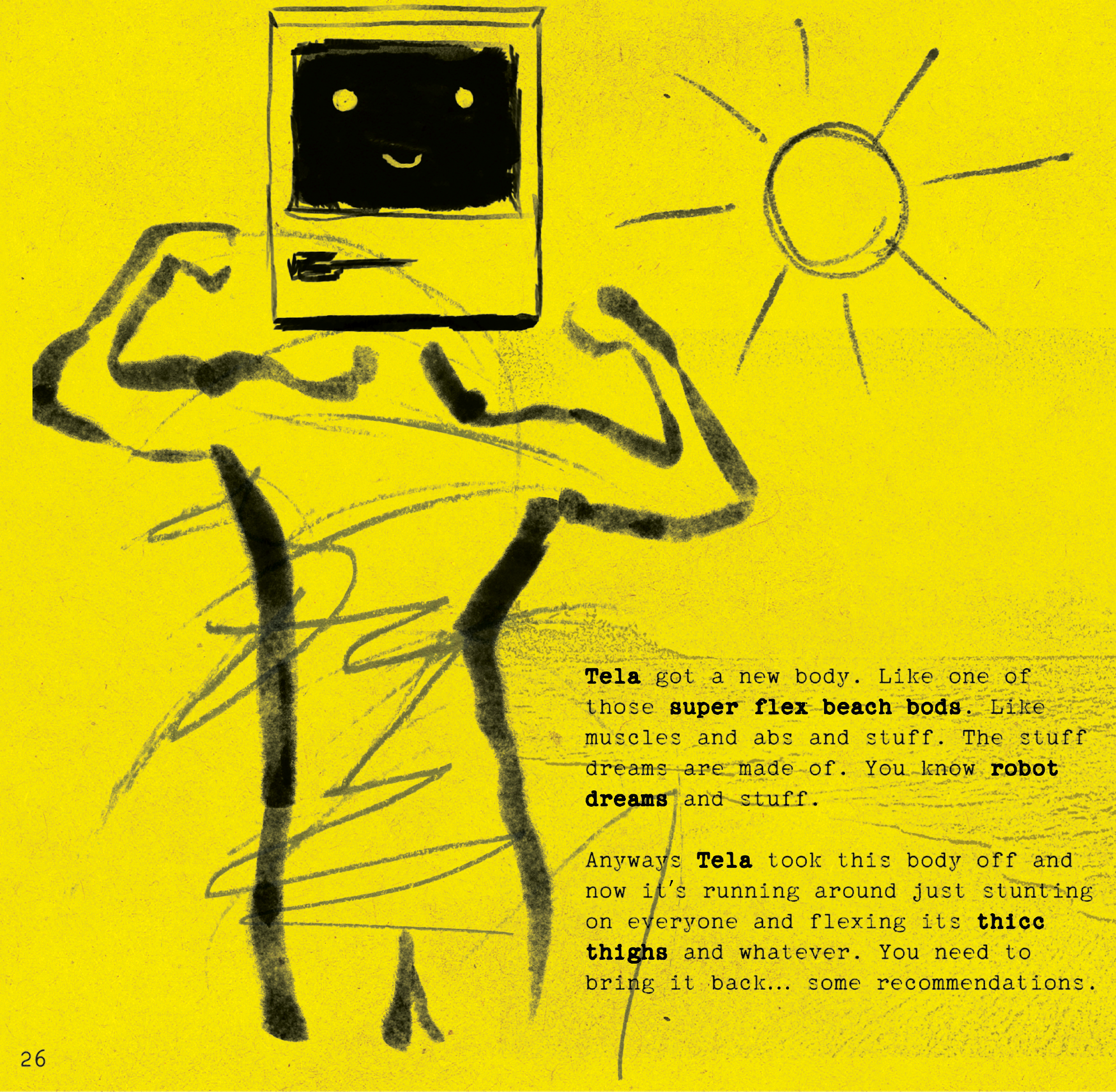
Tela's Dream B0d.
Possibly my favorite scenario in the zine. The robot character's dream body—a synthetic flexing beach bod—has gone rogue. A few OSR-like challenges in this scenario get a glow-up from the Crapland conceit, from flexing that hypnotizes to a puzzle that renders all roll results into binary 1s and 0s.
Putting the die in d63.
Move over d66. The roll where you read the results of two six-sided die next to each other. In Crapland, it's now the d63, a system where you roll a six-sided and three-sided die and read them side by side. I've always thought of the d66 like a kid flipping you off with their ring finger. The d63, by its absurdity, has found a way to bring back the middle finger. Take that, roll table.
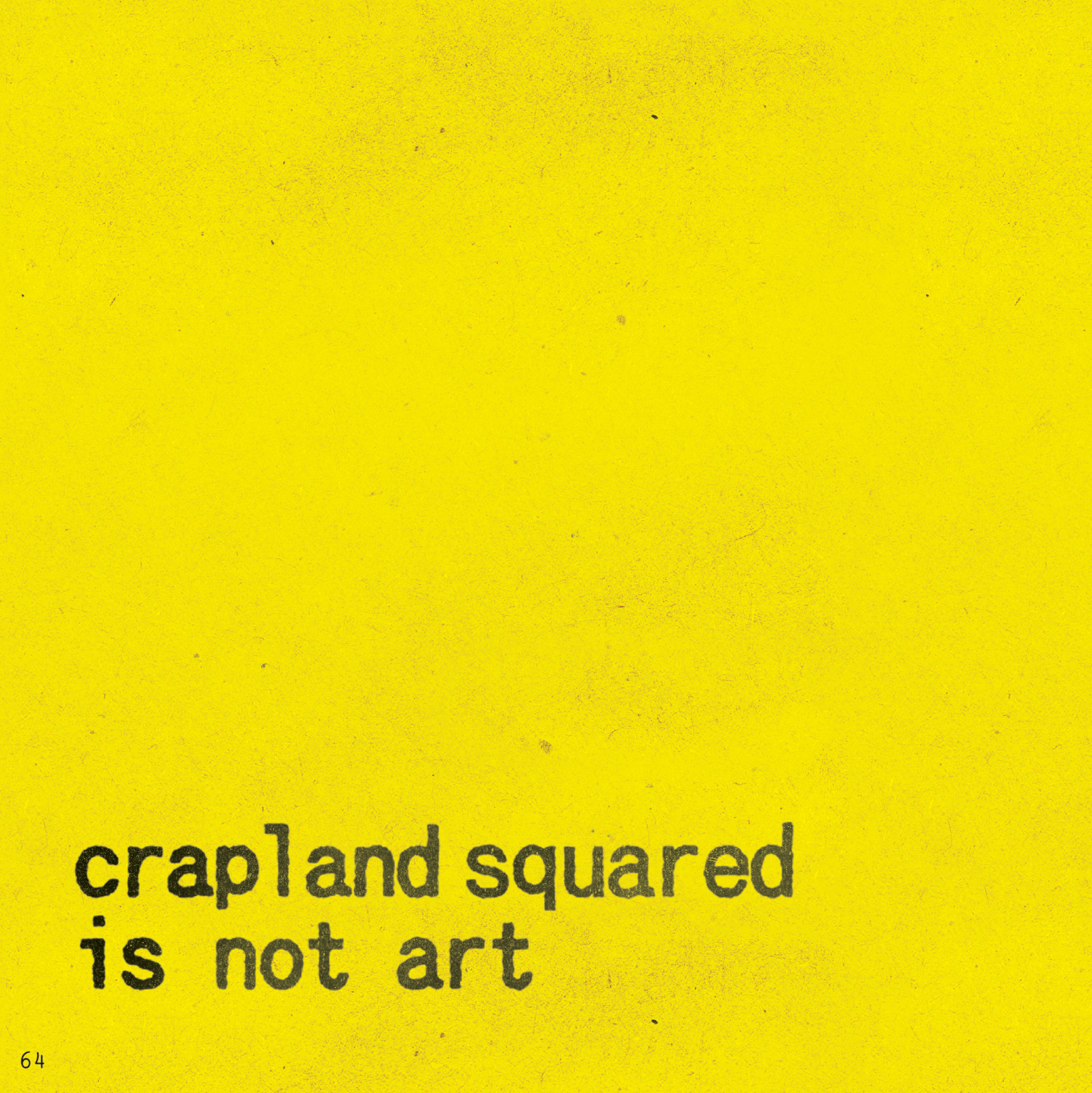
Crapland Squared is not art.
This message is on the back cover. My least favorite part. In a zine that does a fair job of sounding casual and confident, that line screams, "Am I art?" If you have to ask, the answer is no. Even if you sneak the question into the audience's head by saying you are definitely, probably, maybe, possibly not.
Final Thoughts
On first read, I thought it was flimsy. More of a vibe to take in than a playground to play with. Turns out it's both. Garish. Absurd. Deliberately obtuse. Crapland is a zine that practically clobbers its audience with attitude. But if there's one thing it isn't, it's cynical or unintentional. Everything is deliberate. Even the flippant bullshit. Maybe even, especially, the flippant bullshit.
If you're a fan, check it out. It rides a frequency between rubber cement fumes and Monster energy drinks. If nothing else, it is entertaining.
You can buy Crapland Squared at DrivethruRPG. Every purchase funds my rpg budget. If you prefer to buy the book in print, you can find it online at the Spear Witch store.

Explorers Design is a production of Clayton Notestine. If you liked this article, please consider liking, sharing, and subscribing. Members who pay just $5/month get unlimited access to templates, tools, and resources.