How to Design Signals in Books
User-friendly definitions, tips, and tricks for tabletop rpg designers.

What are signals, markers, etc?
Signals are labels, symbols, and other design elements that tell the audience what they're looking at and where they are in the publication. They're like proverbial road signs and mile markers in your book or zine. Examples include page numbers, running headers, and section titles.
Markers are the designer-facing markings in your grid system for where signals should go. They're consistent by design. A constant as the page evolves with its content. Readers don't see markers, just like they don't see the grid system or sketches under paintings.
Folio is a lot of things to different people. It's a type of paper, a fold, a page size, a library section (based on page size), and—to designers with wire-frame glasses—it can also mean page numbers with evens on the right side of the spread only. It's good to know the word, but it's often too multi-meaning for carefree use.
Live-matter or the "live-matter page" is the area between the margins. In most books I've read, signals are treated as separate from live-matter. To keep things focused, I'm going to do the same thing for this article, but note that the separation is blurry. Content headers, sub-heads, captions, and pull-quotes are signals too. Sometimes, they're as interconnected as the signals outside the live-matter.
Do you like discovering the power of design in tabletop roleplaying games? Sign up for Explorers Design and get the next article conjured in your inbox.
What do signals provide in a book or zine?
Like any layout component, signals perform multiple functions, sometimes only in collaboration with other components. We're going to focus on just three.
Distinction. By definition, signals are noticeable. We design them to be seen and be seen often. That visibility makes them massive contributors to a product's overall visual look and feel. In other words, signals contribute to a book's style.
Orientation. Signals are like street signs. They answer the question, "Where am I?" All you have to do is look at them and you know where you are. This is especially true when the signal is something like a header or section title, it provides orientation without needing to see more of them. They're labels.
Navigation. Signals guide the reader to where they want to be. They answer the question, "How do I get there?" They're a deliberate sequence of clues, giving the book its shape and logic, which empowers the reader to move through it. Think of sign posts in real life. The arrows, border indicators, and stop signs. Books have their own version of that in the form of page numbers and cross-references.
Do I need signals in my work?
The answer is always yes. Even short zines benefit from signals of some kind. I've heard counter-arguments over the years. My book isn't linear. My zine only has three pages. Readers consume the zine in one sitting. All of these are sound arguments for why omission might not harm anything, but they neglect to consider what they might gain.
Signals are great because they encourage readers to focus on important details, allocate resources, and pick books back up. They help readers decide where they can stop, think, and start over. They're also great for sharing your book. "I like this module for the map. The one on page 18 in the undead section."
Use signals. Be creative with them. Remember: signals are more than just page numbers. They're headlines, color changes, symbols, and more. Even a bookmark benefits from subtle cues that suggest which side is the front or back.
Advice for designing signals.
Your project will determine what matters most for your signals. Some projects will value functionality over everything else, but most books are a balance. Consider these options when designing your book.
Make navigational signals easy to find.
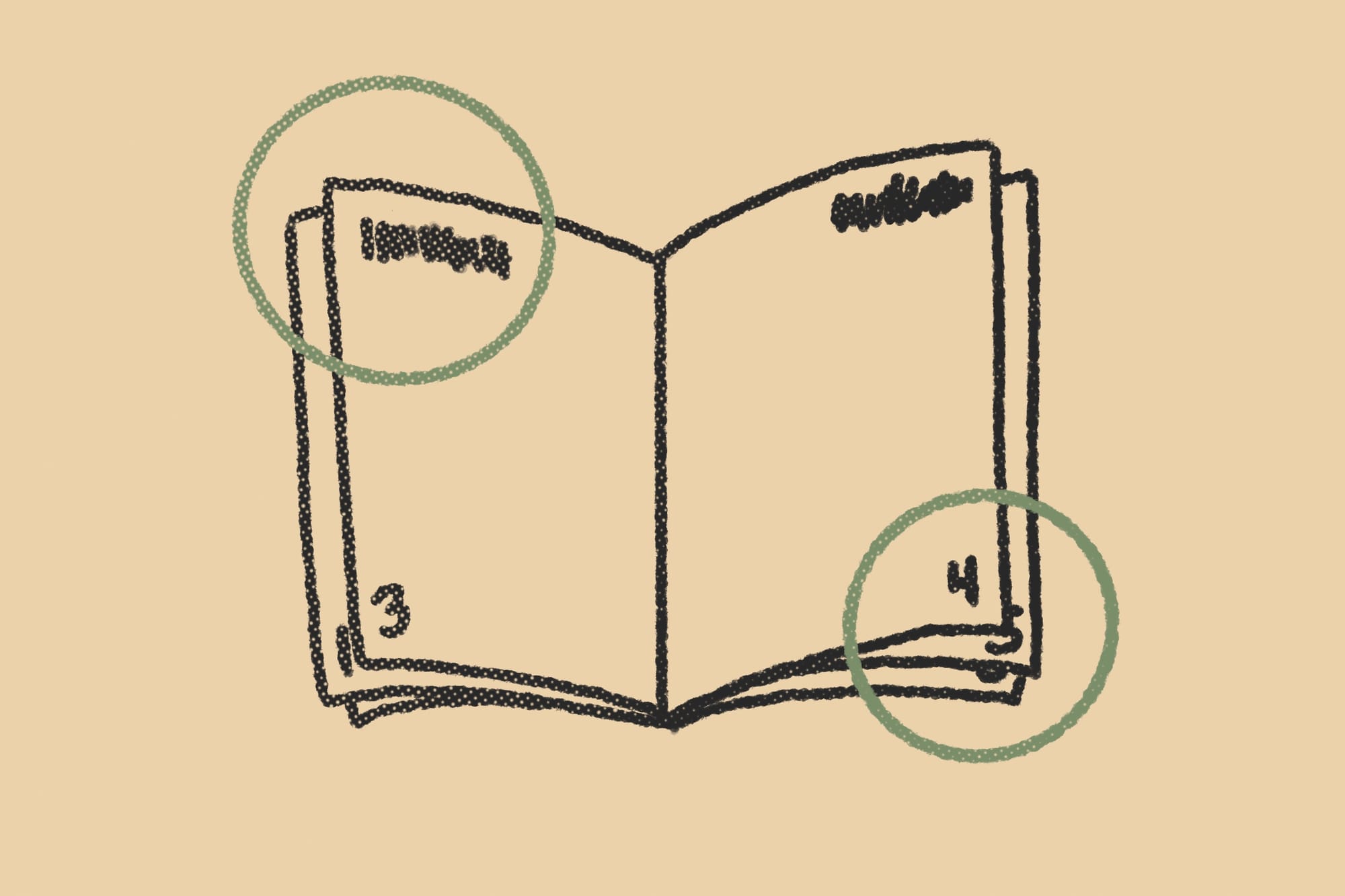
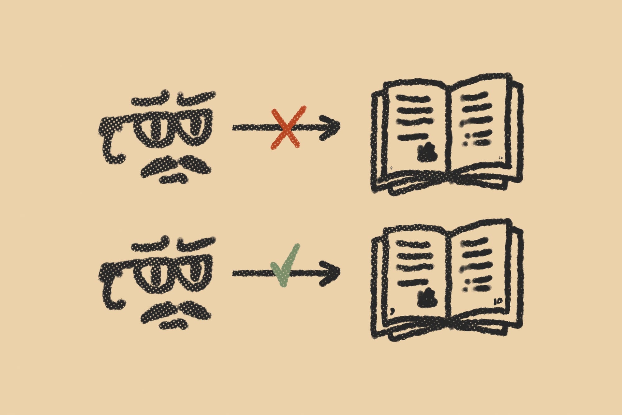
Make them unmissable. The best places for signals are where they get their own space, like in margins. Most books, including Editing by Design by Alexander White, suggest the best real estate is in the outside corners. That's where the eyes start and end. It's also where the eyes linger while page flipping.

Keep signals out of the gutter.
The gutter is where two pages meet in an open book or zine. It's the Bermuda Triangle for signals. Send them there to die. They're invisible and fail to do their job when you put them there, especially in tabletop games, where glued "perfect" binding is the norm. Those gutters are especially ravenous.
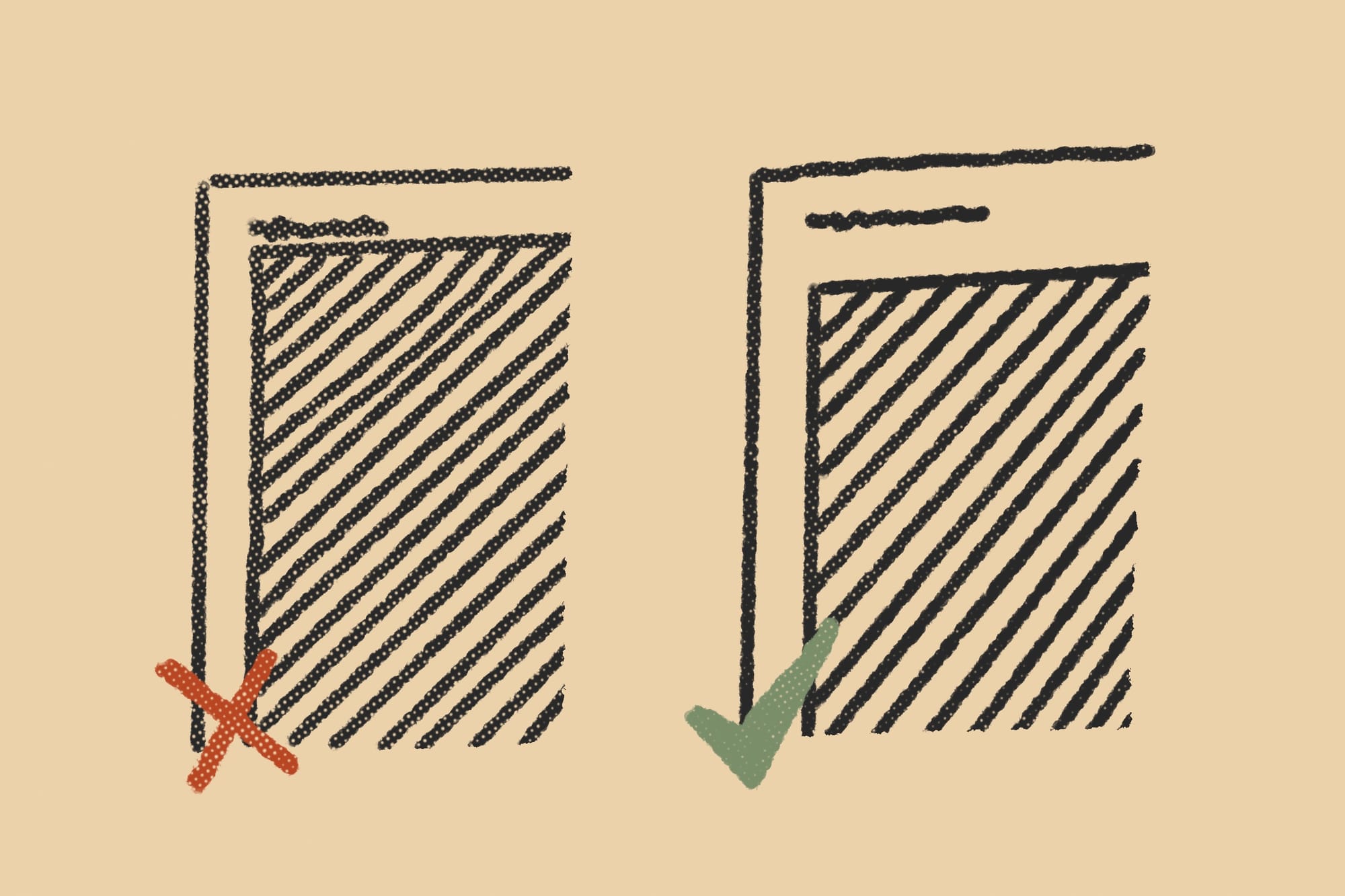
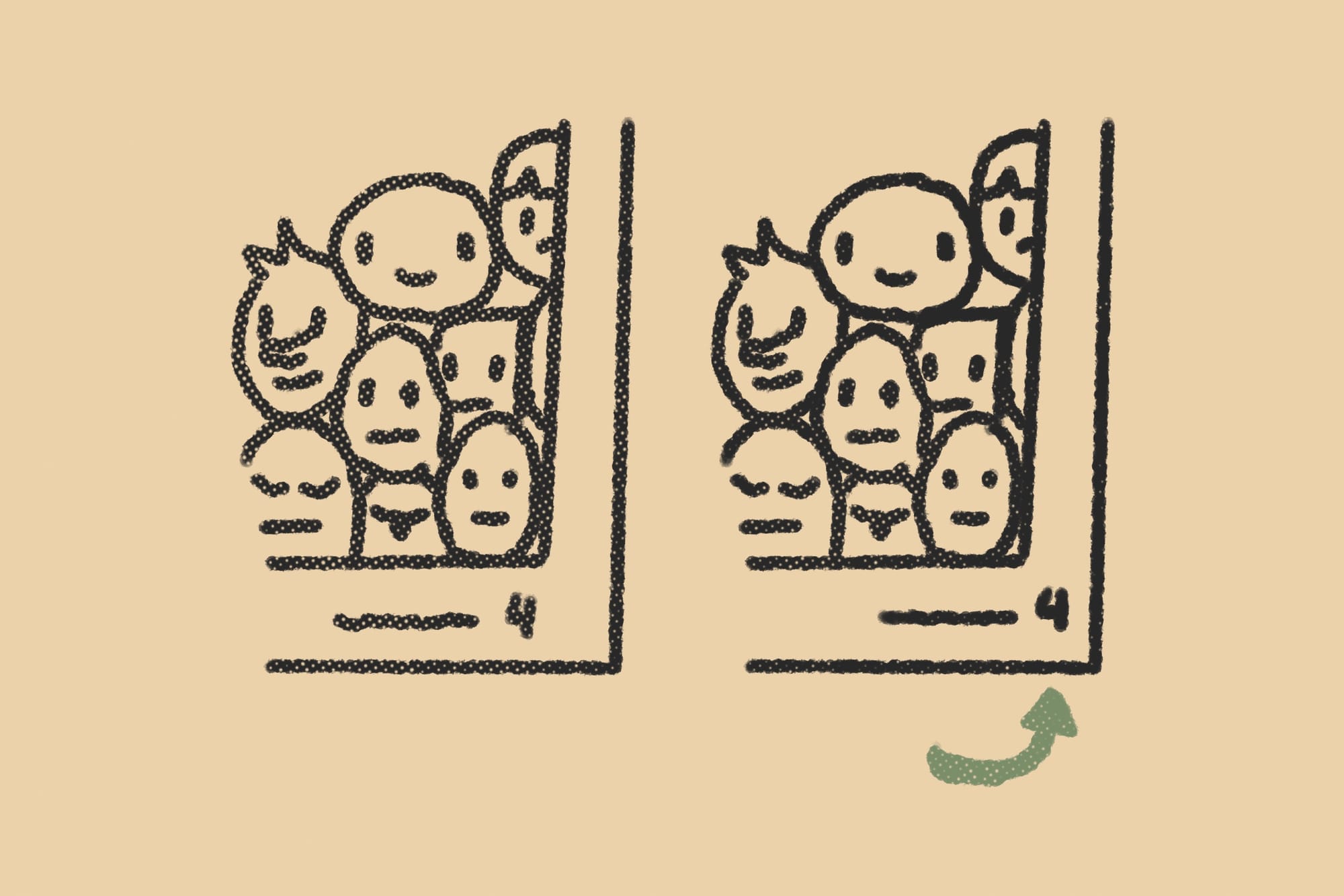
Add white space to improve visibility.
The closer your signals are to content or "live-matter" the harder it is to separate them from that content. Don't crowd your signals. Give them room to breathe, take shape, and assume their own character. Make sure the usual fantasy marginalia doesn't crowd out your signals.
Use placement to create visual associations.
There are cultural assumptions in the way we place our signals. Old novels tend to place them in the center of the margin. Textbooks in the bottom right. Play on these associations when appropriate. If you have no opinion, put them in the top right for pure functionality. That's where the readers' eyes linger the most.
Design signals to match the visual identity.
A common mistake I see from new designers is using fonts and colors that don't match or compliment the rest of the book. Your page numbers are not separate from the content, they're what link it all together. Use page numbers to reinforce your look and feel. Recycle existing design elements when making your signals, or make them pair with it.
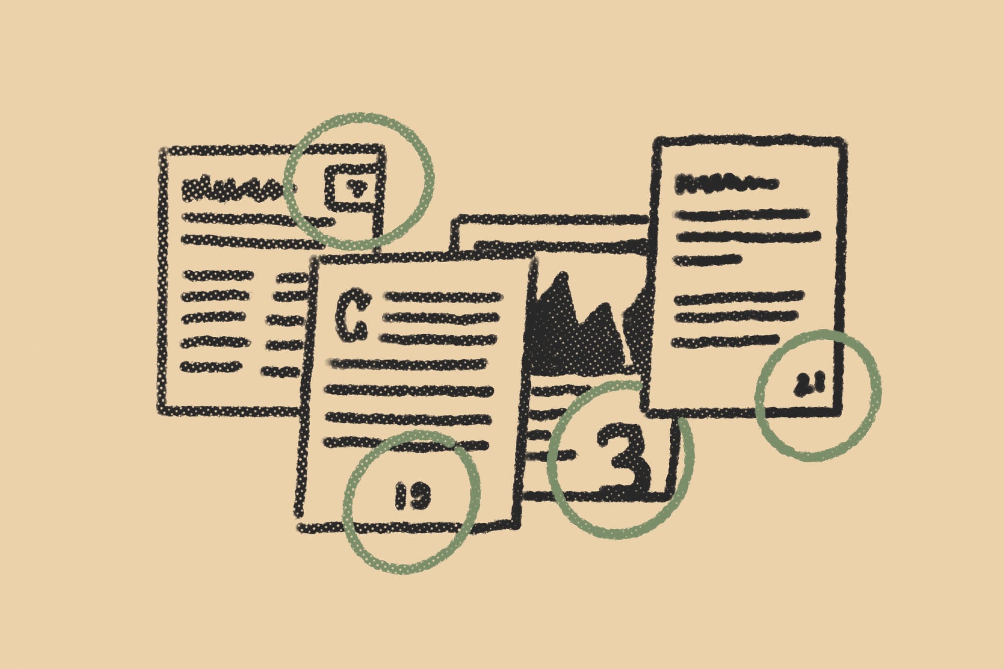
Combine design elements to highlight signals.
A lot of signals are type-based, like page numbers and section headers, but not all of them are, and few are exclusively type. All signals convey meaning with shape, weight, and color. Sometimes (to great effect) without a single number or word. Remember to utilize your entire design toolbox. The possibilities are endless.
Make page numbers big enough for page-flipping.
Signs on the highway need to meet a minimum size for drivers. The same goes for page numbers. Pretend all of your readers are page-flippers who like to read in dimly lit bars. Pretend they're two drinks in and they're obnoxiously reading it at arms length. You need to make the page numbers just big enough for them to see it. I'm being slightly hyperbolic here. Never make your page numbers smaller than you'd feel comfortable with doing for a caption or footnote.
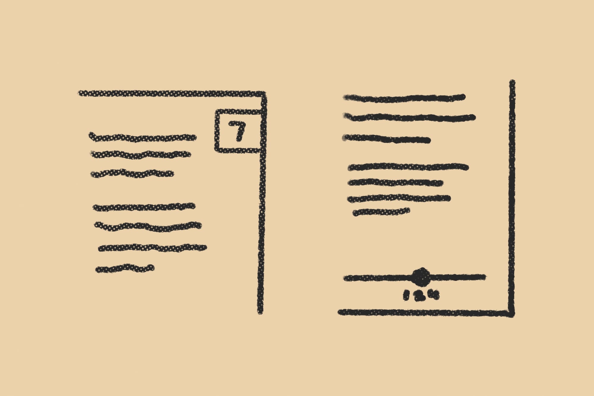
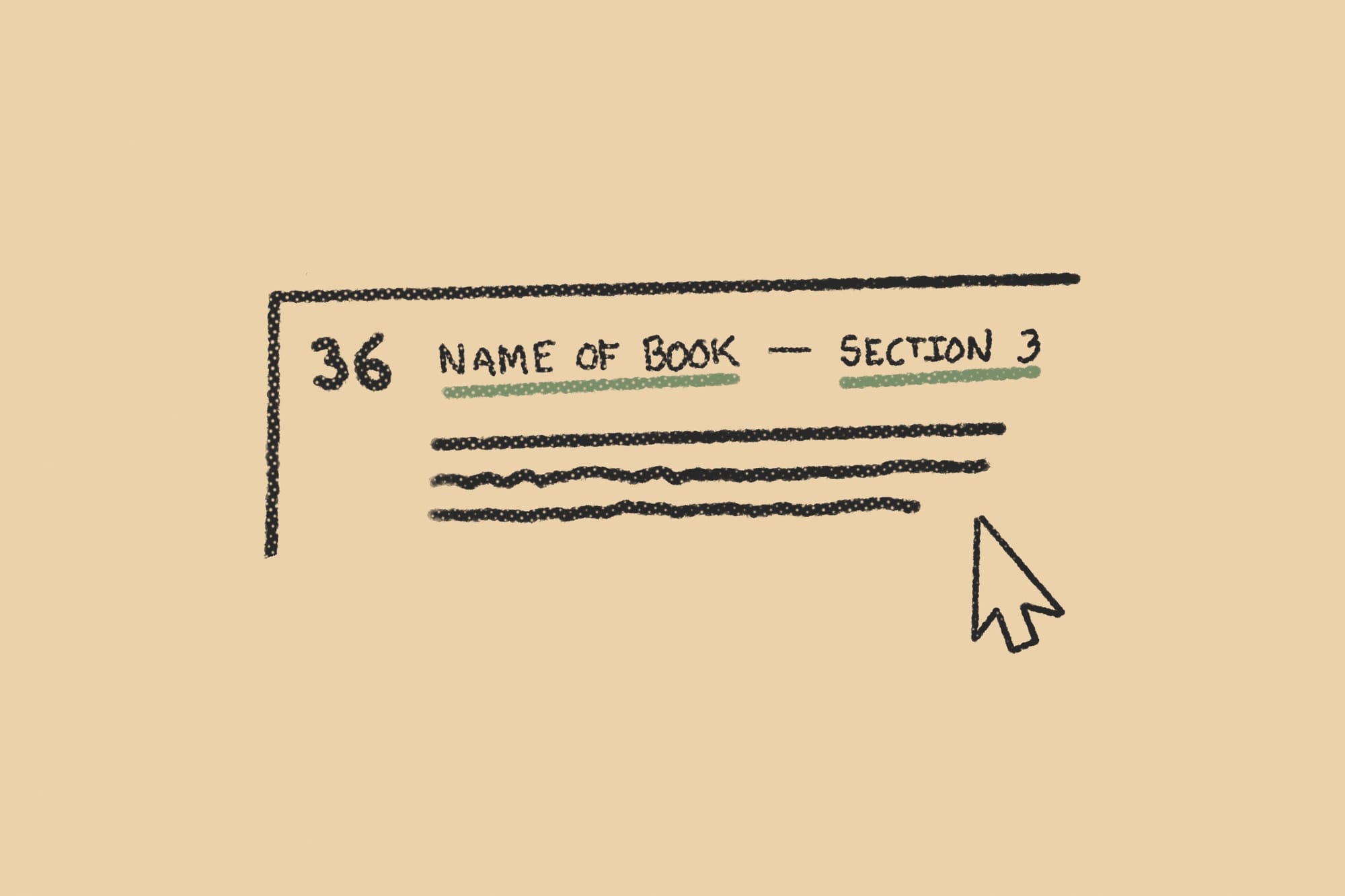
Pull the label out of alignment.
The natural inclination is to align the signal with the content's edge. That's perfectly fine for most books. But if you want to make the label stand out even more, break the grid, make it poke out from the content's silhouette like a hanging sign. This break in the pattern draws attention to it.
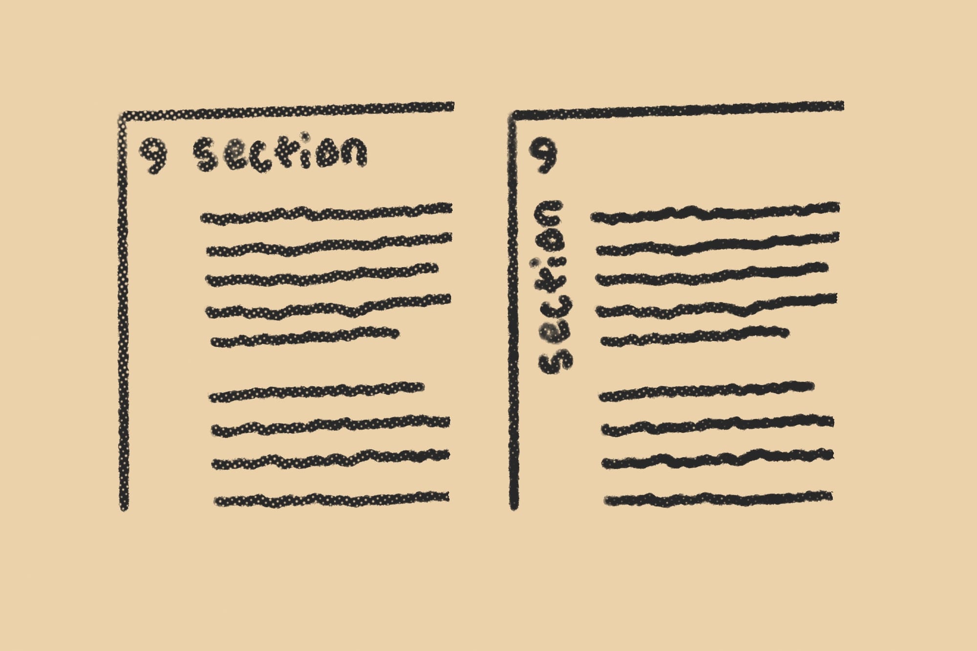
Sideways orientation creates separation.
It won't always work stylistically for some books, but a sideways label can really stand out in a cool way. It also encourages your reader to flip through the book even more rapidly than usual. An interesting way of nudging them that way if you choose to do so. Be aware that vertical type doesn't always mesh with some genres.
Beware of false signals.
Readers subconsciously look for patterns and can misinterpret decorations for signaling. This is a common problem with spot art and marginalia. When you repeat them, they look like they're part of a set, which makes tiny alterations to that set look meaningful. But if there is no meaning, it will confuse and even mislead your audience. So, instead of decorating to fill space and add spice, brainstorm functional elements that are substantive and pleasing to the eye.
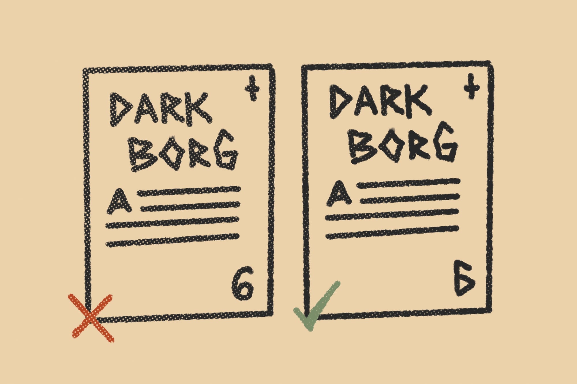
Use shared language between signals.
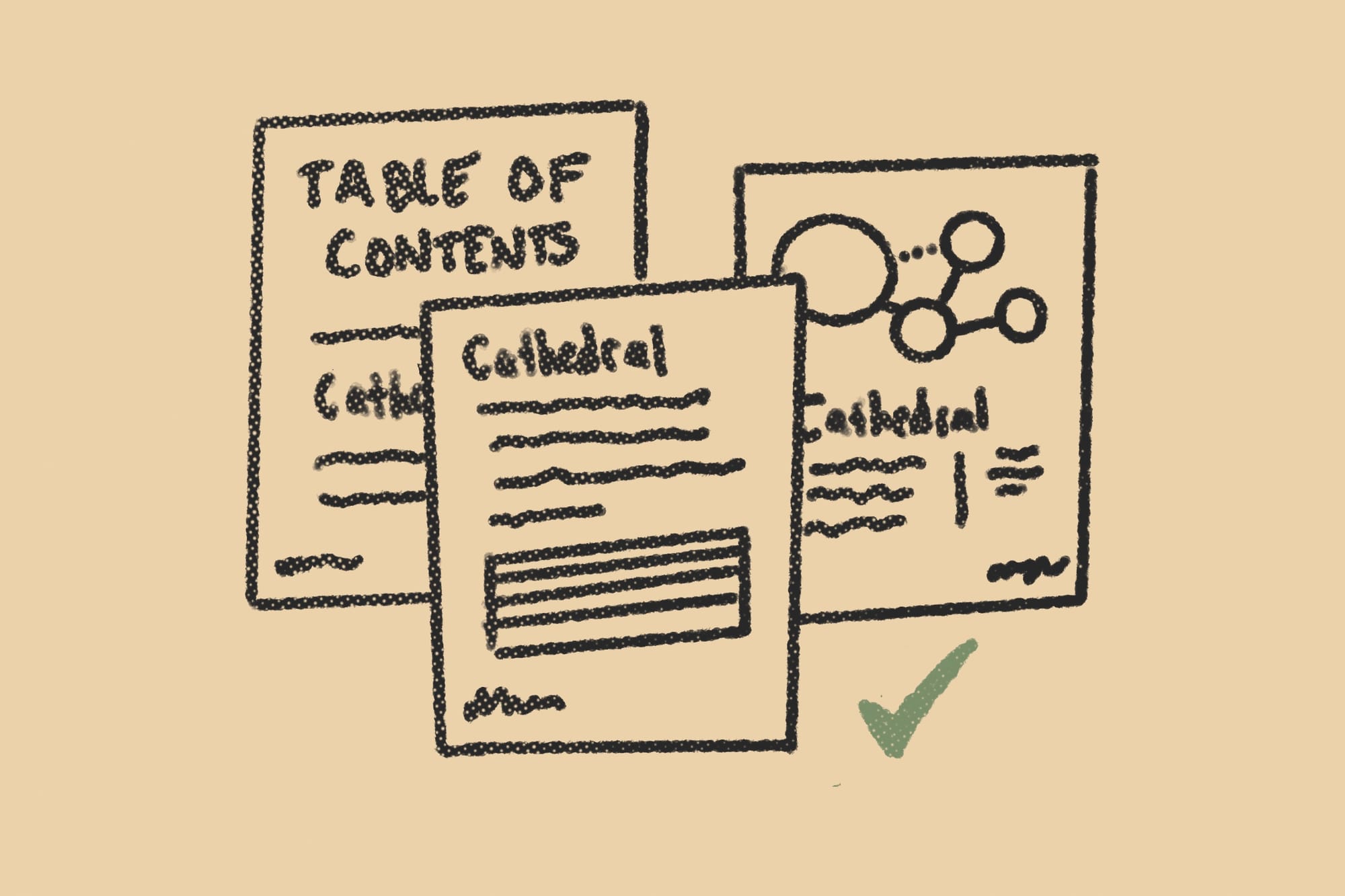
There should be no interpretation when the reader moves from the table of contents, to the page, and to the content. Use identical words. It's a mistake to try and add variety of prose through the signals. If the table of contents says, "cathedral" the section header should also read "cathedral" and not "ruined church" or even "crumbling cathedral." I've made this mistake too many times.
Use hyperlinks for added navigation.
If you're not adding hyperlinks to your pdfs, you're missing out. Most designers use them for cross-references, but the underrated hyperlinks live in your pages' running headers. Use them to create links between the table of contents, section intros, and index. The trick is linking them between nodes of navigation.
Use paper stock to make signals tactile.
This one's for the bookhounds, craft nerds, and budget-daredevils (I'm talking to you, Explorers Design friends). Paper color, weight, and texture can signal different content—transforming a solely visual system into a tactile one. This is an expensive, labor-intensive option. Don't plan for it without checking your budget and printer. Most shops won't even do it. That said, they're pretty rad, right?

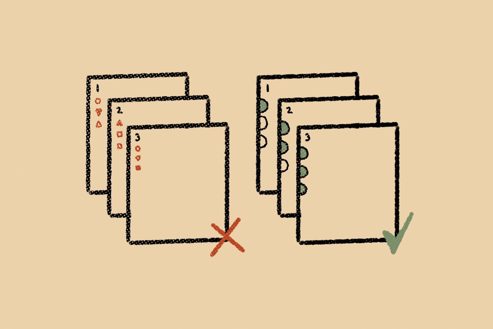
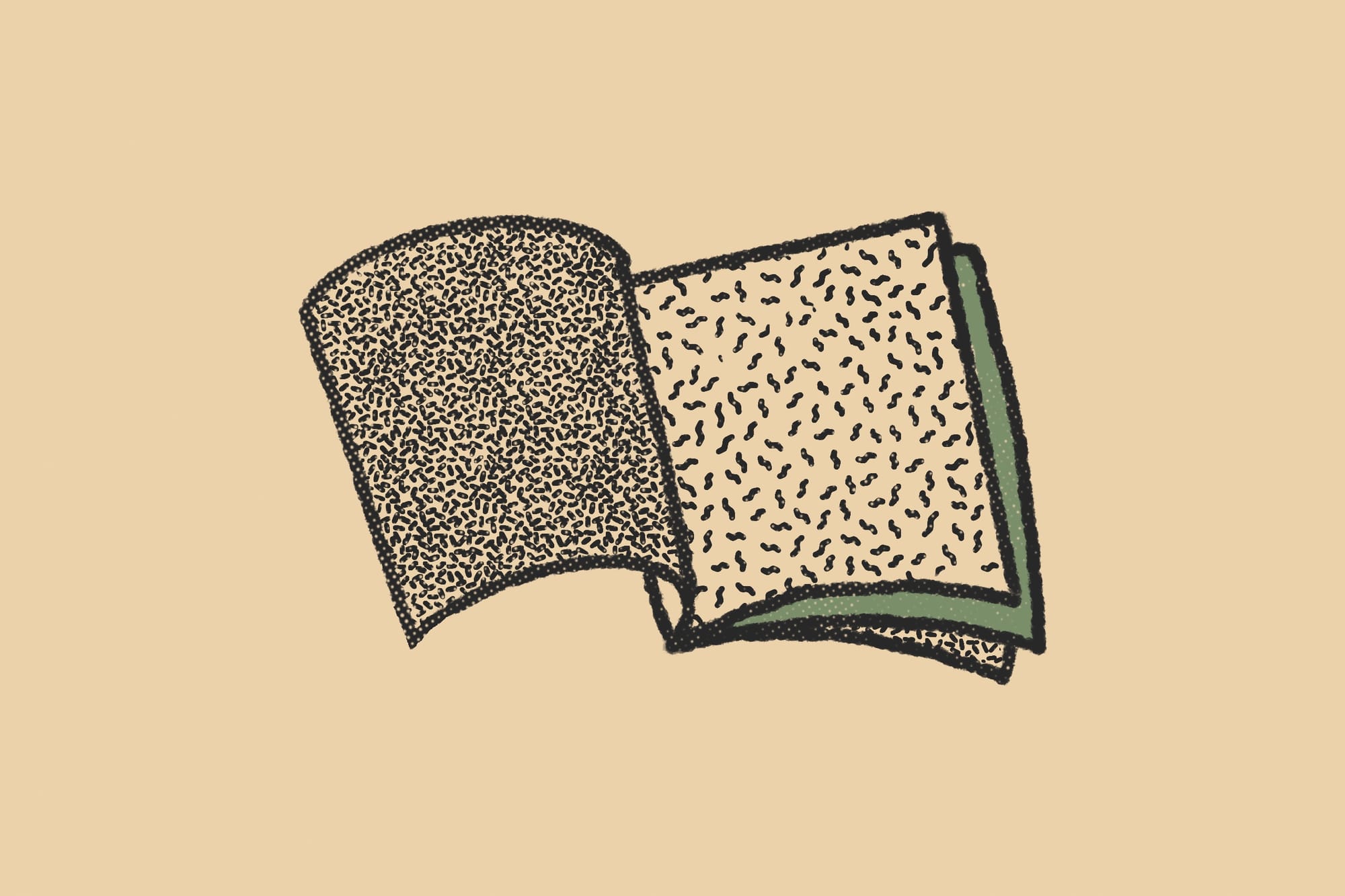
Use bleed to make signals three-dimensional.
If you have a recurring signal at the edge of your page, like a color bar, you can extend it into the bleed to create a colored edge along the trim. This colored edge, when layered on top of others, creates a three-dimensional signal that readers can thumb through without ever opening the book. Don't know what bleed is? I got good news. There's an article for it.
Summary on signals and markers.
Some quick definitions:
- Signals. Labels, symbols, and other elements that tell the audience what they're looking at and where in the document they are.
- Markers. Placement indicators for recurring signals. They're put in the grid system by the designer to maintain consistency.
- Folio. A word with many meanings, including page type, fold, size, category, signals, and more. Use it with caution.
- Live-matter. The area on the page, between the margins, where the book or zine's primary content lives. In a way, headers, captions, and labels in the live-matter are signals, too, but that's beyond the scope of this article.
Final recommendations:
- Design your signals to provide differentiation, orientation, and navigation.
- Pick and choose design elements that match your book's tone, look, and feel.
- Decide how much functionality you want your signals to have. Be measured.
- Always design your signals with an audience in mind. Needs can differ.
Additional Reading
This article wouldn't exist without reading Editing by Design by Jan V. White. It's a masterpiece. Ironically, the layout is not to my tastes, but the actual advice is brilliant. I've shamelessly recreated some of its best ideas in this article with a tabletop spin. A special shout out to my colleague, BESW, who recommended it to me about a dozen times before I finally bought it.
I also want to thank all of my design friends who read this article and gave me notes and words of encouragement, including, Pidj, Spectacular Jean, Elmcat, Luke, Binary, Markus, Asa, Brian, Dante, Char, and Jimmy.
What did you think of this week's article? Let me know what you think in the comments, and don't forget to like, share, and retweet on social. Until next time, I'll keep exploring.


Explorers Design is a production of Clayton Notestine. If you liked this article, please consider liking, sharing, and subscribing. Members who pay $5/month also get access to additional tools, templates, and inspiration.