Exploring Knave 2E
Is the Questing Beast book all bark and no bite? We'll have to find out.
You're entering a Design Delve, A semi-regular book critique. You can read previous episodes when you subscribe for free or become a member.
For the sake of transparency and learning purposes, this review will stay up.
Starting the delve.
Most adventures start with a rumor, but this design exploration likely needs no introduction. Knave 2E is the project of Questing Beast showrunner, Editor of the Glatisant, YouTuber, writer, designer, and influencer—Ben Milton.
This is one of the rare instances where the designer's tastes, preferences, and personal bugbears are publicly known. On the Questing Beast, "good" roleplaying games are marked by their functionality, value, and adherence to OSR principles espoused in the Principa Apocrypha. However, this grading rubric also has a few unwieldy kobolds, like a general suspicion of whitespace, an obsession with random roll tables, and a few information design maxims that can't be backed by academic rigor outside of what is conventionally understood by the play culture.
Still, knowing what we do, we can confidently compare this book with the author's intent. If someone else had made this book and mailed it to Ben Milton, it would have gotten a glowing review on The Questing Beast. His tastes are consistent, and his design decisions are cogent. This is good. The only mark against this book, by Questing Beast standards, is that its construction lacks one hyper-functional form factor Milton often gushes about in other reviews. It doesn't lay flat.
Besides that, Knave 2E doesn't levy any surprises save for a few.
The basic delve.
The greatest criticism I can levy against this book (besides where its profit goes) is its familiarity. Most of the design, especially the visual design, can be found in the bedrock of the OSR's mid-2010s. It's a slightly nostalgic venture with some familiar design misgivings.
Treasure: Random Roll Tables. Don't assume this exploration is entirely negative. Knave 2E will be a staple on many bookshelves for a reason: random roll tables. They're excellent. Milton knows exactly what makes random tables great. The magic isn't in the individual entries but in the emergent gameplay and negative space created by mixing, matching, and interpreting the results. The best of these tables are in the bestiary (64-67), the NPC generator (54-59), and the spell generator (27-31). These are good toys adopted, evolved, and refined from Milton's experience playing and running hundreds of OSR games.
Treasure: Designer's Commentary. The second standout of this book is the designer's commentary. Better described as an Appendix N with notes, or to borrow academic terms, the citations. Nearly everything in this book is an evolution of another game, blog, or previous work (which is good; that's the nature of creative work). What I like about this section is that it doesn't hide its influences and how they were incorporated into Knave 2E. It's pure candy for other designers and a loyal continuation of the OSR's cross-pollination of play.
Kobold: The Core Rules. Sometimes, while reading OSR games, core rules can feel like a designer's shell game. By this, I mean that nothing changes in an emotional or practical sense. The math is shuffled around by tweaking the base difficulty class or changing the order of operations. That's what Knave 2E does. Maybe the math is better or more logical. In practice, it means re-learning a slightly different version of old-school Dungeons & Dragons. Wisdom modifies ranged attacks, target numbers are now 11 + difficulty class, and other things change in small, sometimes logical, often tedious ways.
The "perfect" OSR rules are different for everyone. This game's core rules are Milton's version, which might be 5% closer or further from your version. This is the occupational hazard of making OSR games feel like OSR games. Knave 2E tries to create a new version of play without experimenting too much with the formula.
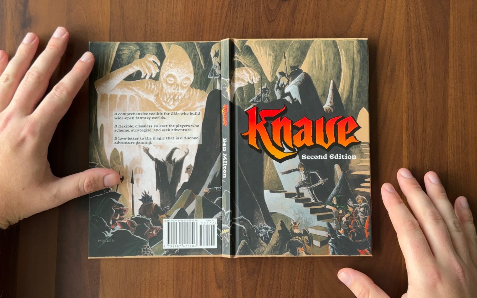
Kobold: The overall graphic design. The cover is good. The secondary typeface, Basteleur by Velvetyne, is a fine choice for the subhead and a great example of how typefaces can impart a certain feeling. The back cover, meanwhile, is okay. Product copy on a transparent background with little padding feels like an afterthought. It's also putting Basteleur in a much less favorable position. It keeps the cover art from being blotted out at the expense of looking unplanned. That theme carries through into the interior compositions.
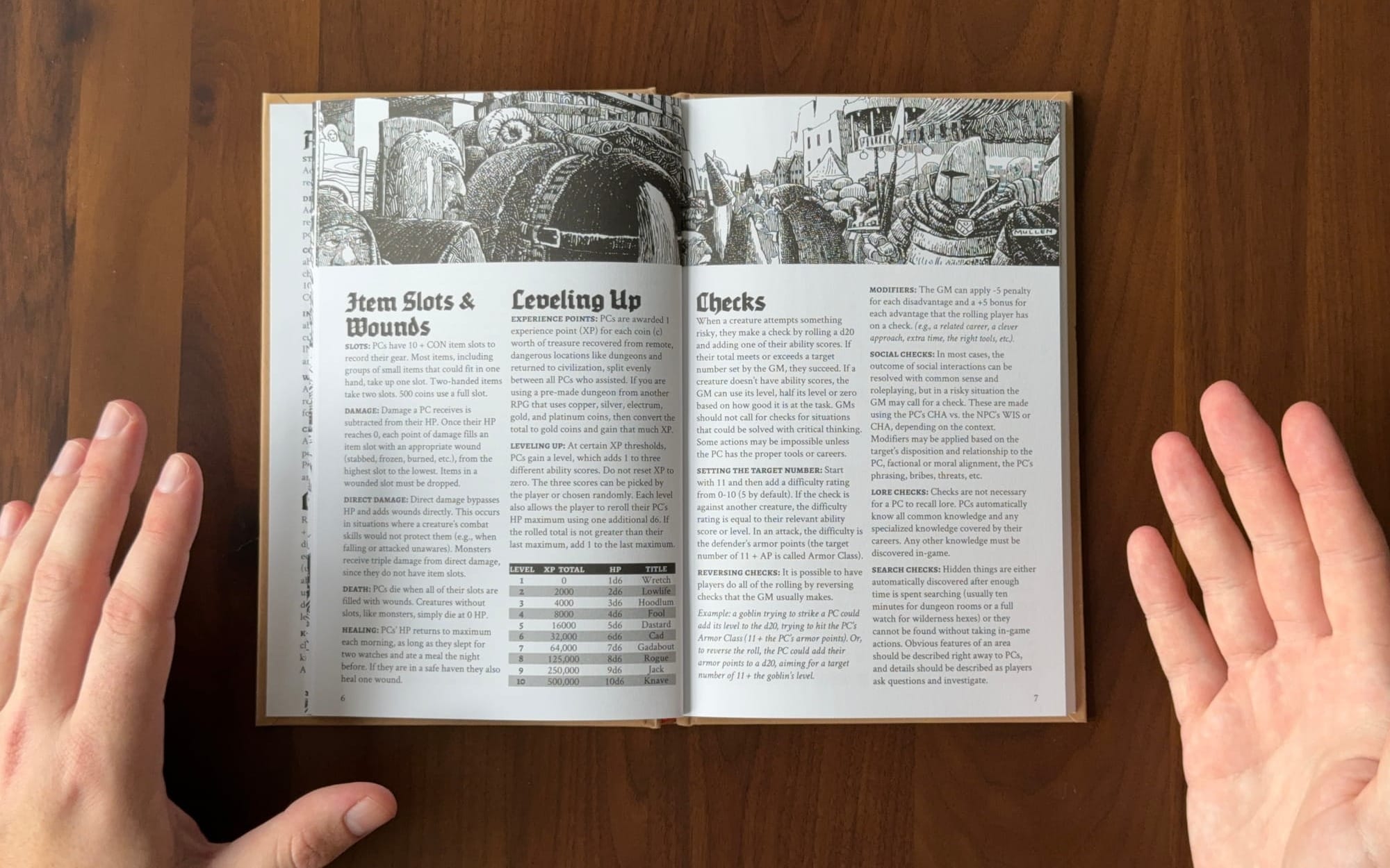
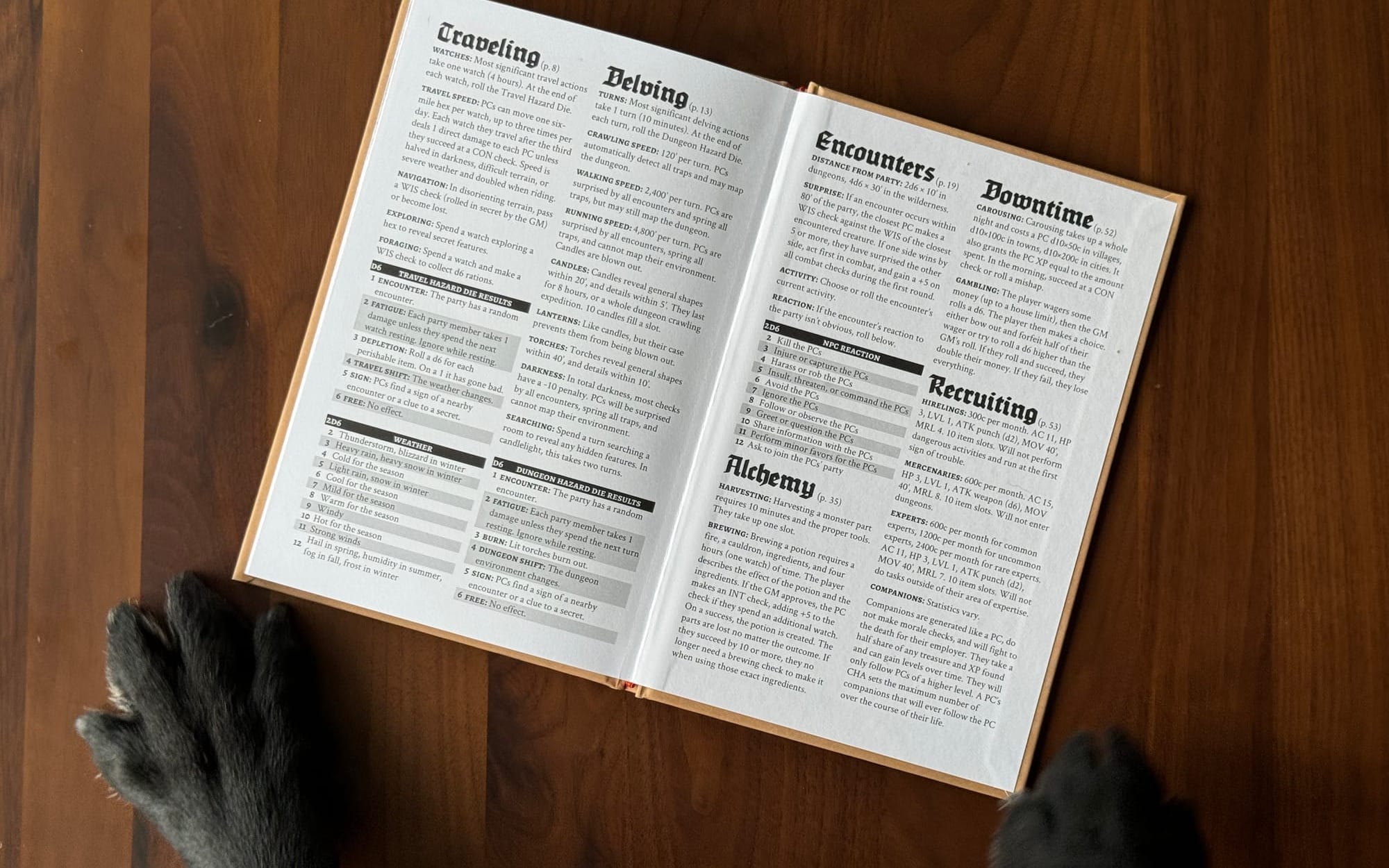
Overall, the layout is functional. For example, content is compartmentalized into pages and spreads. In roleplaying games, this is called the control or work panel layout. Knave 2E never slips up in this regard. However, everything feels cramped. The margins are tight. The space between headers and their content is no larger than the average leading (spacing) in body text. Generally, you need a little extra space—otherwise, the weight of the headers (which are bigger and bolder) crashes into and blurs the resulting text. This isn't an opinion. This is a known phenomenon that affects how our eyes perceive and separate objects. Filling the pages edge-to-edge, while economical, leaves every page feeling like a cluttered blur—which works against the game's usability at the table.
When players scan a manuscript, they use illustrations, contrast, hierarchy, and patterns to navigate. Whitespace, even a small amount, makes the contours and silhouettes of a page more obvious. When that space is removed, every page looks the same when flipped through. That means the consistency found in Knave's design, like its typesetting and tables, starts to work against it.
The work panels are too dense and same-y to be obvious at a glance, and the type is too similar and blurred to make for a comfortable reading experience. If Knave 2E were a car, it would be ill-tuned for off-roading and uncomfortable to cruise in. Knave 2E rides an awkward middle ground in service to its genre's stale aesthetics. The inability to deviate means certain visual design mistakes, however small, live on despite the game's design goals.
The expert delve.
Today's expert delve is about illustration. Knave 2E has fantastic illustrations.
The power of illustrators. Kyle Latino provides the two maps found in Knave 2E. If this were a map-heavy or a map-centric publication, I think the work would deserve greater praise. Unfortunately, they're mostly extra because they are relegated to the back of the book.
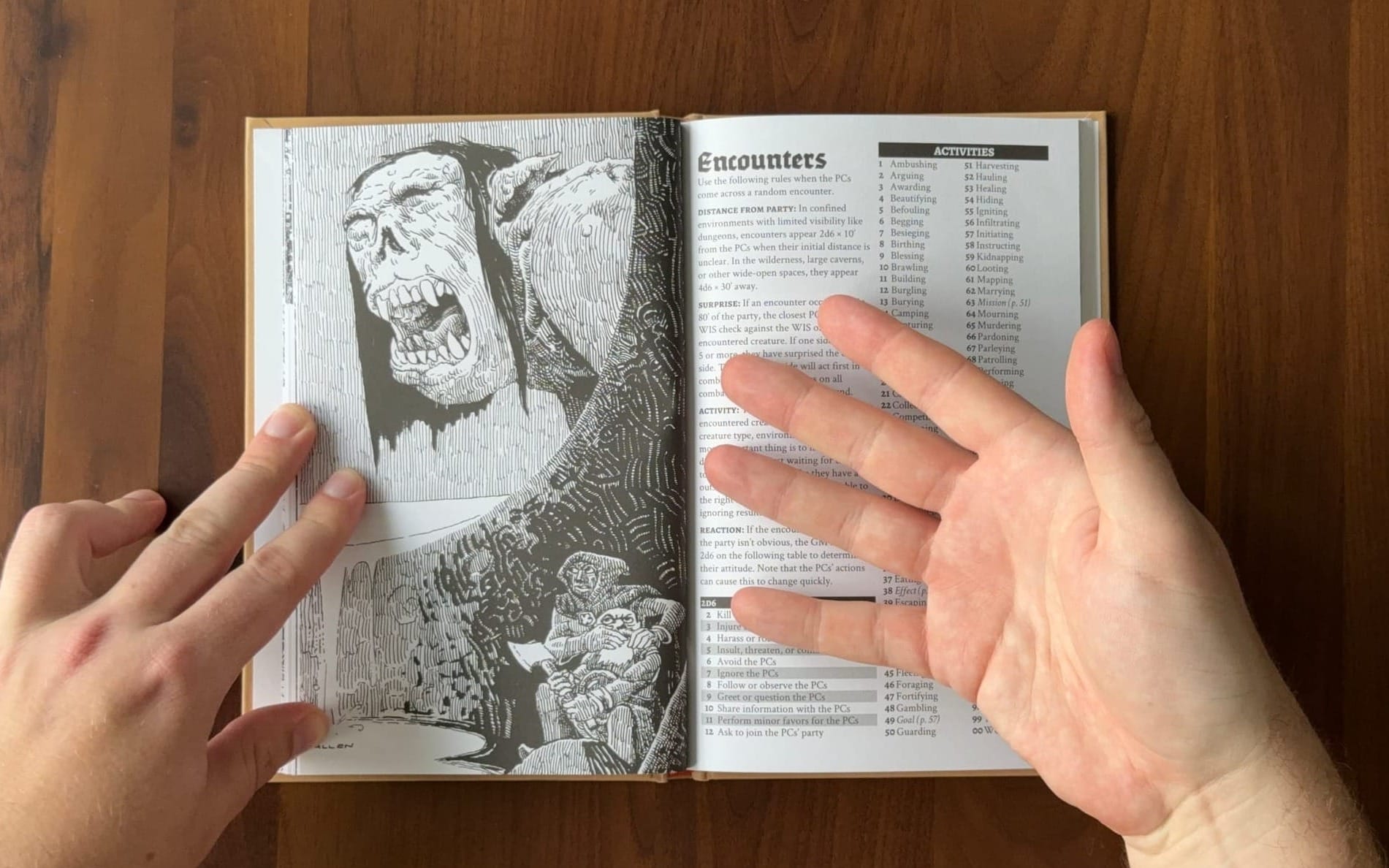
My soapbox for today's design delve is the illustration work by Peter Mullen. Most rpg books deploy multiple artists. Knave 2E does not. The challenge with hiring illustrators is that the most exciting ones have a distinct style, and multiple distinct styles can make books feel unfocused and disjointed. This is why Wizards of the Coast gets criticized for having a generic, muddled look. It's by design. They hire illustrators with the same compositional style to create a more unified feeling product. Their workflow and business model are not set up for diverse visual styles. That's why their most exciting work is often limited to alternate covers. It avoids risk.
By comparison, Knave leans hard on Peter Mullen to look and feel unique without including additional artists to bulk up its art. It's a gamble that pays off.
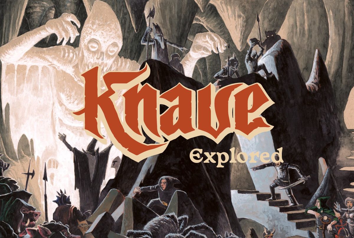
Peter Mullen's visual style is the perfect blend of technical expertise and playful caricature. Characters have elongated, cartoonish limbs that convey their feelings in broad strokes. Their faces, likewise, are evocative with distinct features like wide eyes, blunt noses, and mawkish chins. Every illustration is a playful scene of adventure. Knaves are checking for traps, stifling screams, and running for their lives. It's fun. But more importantly, it's distinct.
Every collaborator is a co-designer. Illustrators included. Like a writer, Peter Mullen sets the scene with his work, framing the rules for the players and GM. His work is also a constant throughout the book. As the rules shift from dungeon delving to overland travel, Peter Mullen's art persists. The same overarching themes in a new crosshatched landscape. This is important because the writing in Knave 2E is terse. Therefore, the grungy, goofy, glatisant tone of voice rests solely on the art.
The lesson from Knave 2E is to be selective about your collaborators. Think of them as co-designers. One good illustrator is often better than twice the amount of art. What you lose in broad marketability, you get in differentiation.
Final Carousing
Knave 2E's random roll tables will find their way into other games. They're that good. Meanwhile, the art tugs at my nostalgia and will live next to my other rpg books. As a mostly digital customer, that's a rare spot in my collection. I'm a sucker for wizards in pointy hats and pig orcs—though it probably won't make it to the table in its entirety.
Hopefully, this release signals future adventures. Ben Milton's The Waking of Willowby Hall is still one of the better examples in its genre.
Explorers Design is a production of Clayton Notestine. If you liked this article, please consider liking, sharing, and subscribing. Members who pay just $5/month also get unlimited access to templates, tools, and resources.


