Exploring Nighthawks
In this week's design delve, we inspect how tabletop games engage with fine art.

The painting Nighthawks by Edward Hopper is bigger than you'd expect. It's almost as big as one of the expansive landscapes found elsewhere in the Art Institute of Chicago, but instead of sweeping mountains, rolling hills, and crowds of people, Nighthawks is austere, empty, and lonely.
You're entering a Design Delve, A semi-regular Explorers Design book critique. You can explore previous delves in the critique section.
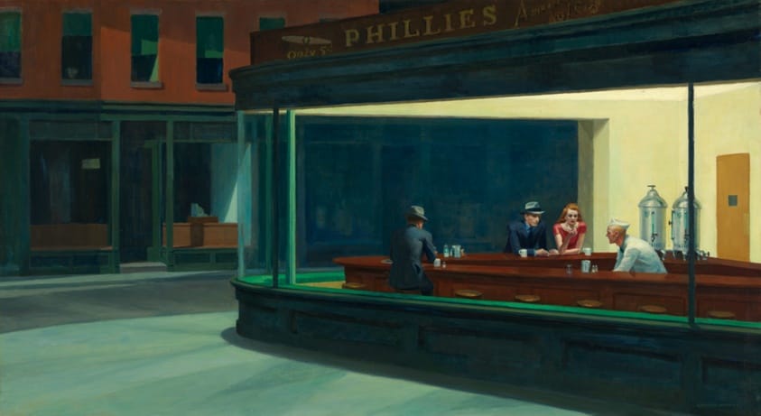
The painter, Edward Hopper, was obsessed with loneliness. That and windows. In Nighthawks we're looking into the platonic American diner through its glass prow. The magic of the painting, especially when you're standing in front of it, is that it's quiet. You can feel the glass withholding the sounds of the diner from you. Even its warmth, the sanitary glow of the diner lights, is out of reach. Standing there, shoulder to shoulder with strangers in Chicago, the frame slowly expands, until you're transported into the painting, another lonely person looking at lonely people. Only you're not even inside. You're on the street somewhere, looking in.
What you see is the thing everyone describes about Nighthawks. The strangers. The more you look at them, the more wrong and isolated they become. The diner isn't really a diner. It's something that looks like a diner—a ship or purgatory. And these people are trapped in it like some kind of modernist allegory.
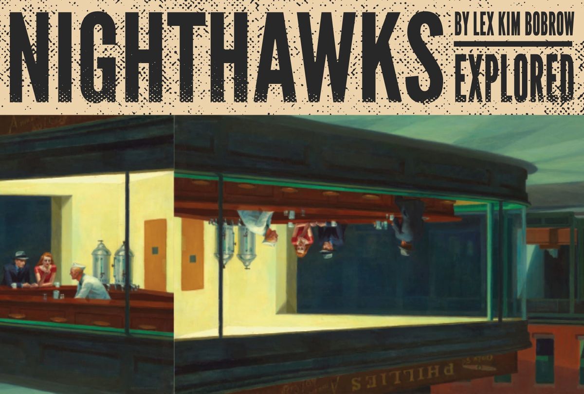
Nighthawks by Lex Kim Bobrow
This 26 page game had my attention immediately. There are shockingly few games relatively speaking that tackle the themes and subject matter of fine art head on. Sure, we get plenty of covers, but few engage with the art as the subject matter. These "frame games" that teleport you into the paint scratch a special itch in the back of my brain.
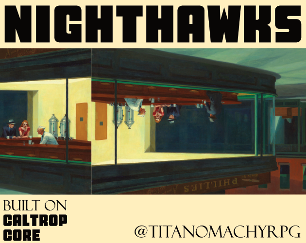
Nighthawks is a GM-less game about loneliness, mental health, and existential dread. In it, players craft a diner, some characters, and then tell a story about their strangers trying to escape the proverbial prison. Play lasts about 2-3 hours. The exact ending is largely left to player consensus. But what's the gameplay? You might ask. Well, I'm happy to report that it has some tooth. The diner has pithy little tags, including a crucial one—"inescapable." The player characters also have tags. One for their proverbial wound, like "heartbroken," and one for their failed attempts at healing, like "religion." Pacing is controlled by rounds called nights, each night, players decide what kind of scene they want to narrate whether it's a daydream, them reaching out to other characters, or trying to push through.
I should mention this system is new for me, Caltrop Core. In this iteration it uses four-sided dice and tokens that increase and decrease depending on the scene. I'm mixed on the tokens. They're a narrative resource whose meaning has to be discovered and created by the table. The author describes their exchange as a kind of representation of loving and being loved. In other words, its a physical ritual to mark the scene. A way to get the story into your muscles as you push and pull chips across the table. Eventually, you'll be able to spend these tokens to increase how many d4s you roll—which decides your eventual fate. I'll have to explore this more. The dice mechanic in particular is delightfully simple for a game with this limited of a scope. Half of the d4 is failure. The other half is success. There are mixed successes and failures. You can probably map the results to which numbers. It's that simple.
The Pitfalls of Nighthawks
The graphic design is simple but practical. Not too far from your average word document. The primary typeface, EB Garamond, is an interesting choice. It's a re-invention of an absolute classic with its roots firmly in the mid-15th century. It's not just any serif, it's an exceptionally antiquated, slightly baroque, iconic old style serif. There are countless iterations of Garamond and none of them blend in.
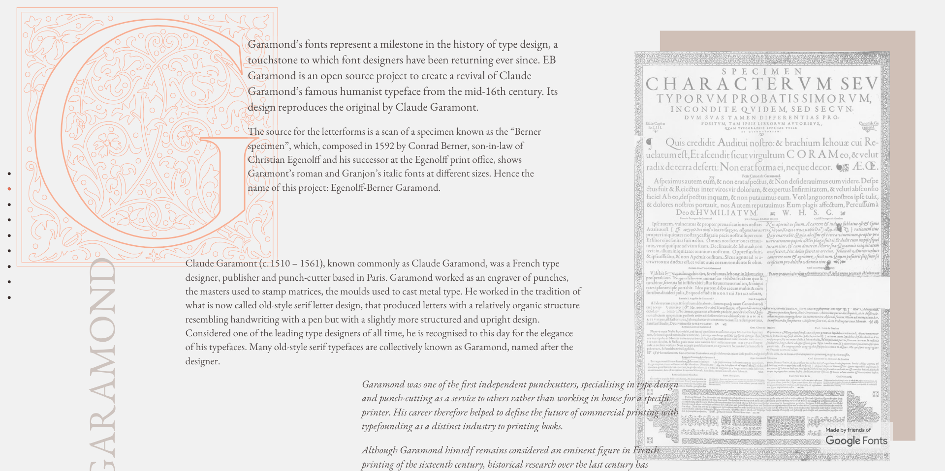
It is, in other words, a contextual and functional mismatch for Nighthawks the painting and Nighthawks the game. The painting was made in the 1940s amid the rise of steel architecture, electric lighting, and cold modernism. It isn't just a depiction of loneliness but a specific kind being invented in a new age. The game, meanwhile, brings the diner's metaphor to the foreground. It can be a diner in space, on a ship, or in Hell—the point is its a cage. None of these things are baroque, humanistic, or warm like Garamond. It might have been better to pick a typeface with similarly cold and modern forms—or to have constrained a more modern, but humanistic typeface in stifling layout. Something to either invoke the alienation or depict it.
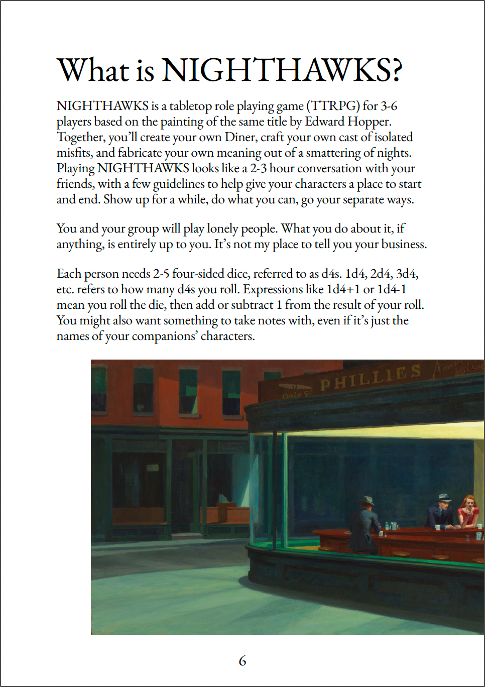
Similarly, the art struggles in this design. I've said in the past that wider format books are good for one particular reason—they preserve wide art. This observation is especially true here where Nighthawks is rarely depicted in its entirety. Lopping off the empty edges of Nighthawks is a little like hiding Mono Lisa's smile. It might work if you're provoking a dialogue with the thing being removed, but I struggle to read the message in this instance. It's possible the crops and rearrangements are a commentary—a visual representation of how play transforms reality, but I think it misses the mark in that interpretation. By cutting away the empty spaces the book makes Nighthawks appear more crowded, busy, and intimate.
Lastly, and I won't dwell on this, the zine spends one too many sentences talking about what the game is, what it could be, and how the players might take it in a different direction. I prefer rules that keep things focused early. Maybe players will ditch the core themes of Nighthawks eventually, but describing potential hacks, like one inspired by It's Always Sunny in Philadelphia, muddles the main idea. Also interspersed throughout is some genuinely compelling poetry and prose, but I think they're betrayed by the slightly horsey typesetting and rules sandwiches.
The treasure of Nighthawks
Despite my quibbles with the visual design and rules writing, I like Nighthawks the game. I'm not so sure about the zine, as you can tell. The graphic design feels like a mismatch, and I find the writing around the poetry a little chatty for an artwork I associate with stillness. Despite all of that, Nighthawks has the thing I love most. An idea.
The painting, Nighthawks, is about lots of things, but most of all it's about the same things your characters will collide with in Nighthawks the game—loneliness, isolation, feeling trapped, feeling processed—yearning to break through the glass. Until I play this game, I won't know how exactly it compares to my time in front of the painting, but if the frames were to widen, and I arrived at that street corner again, I think my characters would return my gaze through the glass.
You can find Nighthawks by Lex Kim Bobrow and Titanomachy RPG on Itch.
Explorers Design is a production of Clayton Notestine. If you liked this article, please consider liking, sharing, and subscribing. Members who pay $5/month also get access to additional tools, templates, and mood boards.