Exploring Rumored Lands
A design delve into three zine-sized settings and their use of risograph printing.
You're in a design delve, an exploration of a book, zine, or pamphlet. Our goal? To discover the new, strange, and novel in tabletop games, to hone our creative blades, and fill our pockets with design lore. Find more in critique.
A journey through riso printing.
The Rumored Lands zines are my favorite kind of zine. Riso-printed, on colored stock, at just 16 pages a piece. They're fun to ogle at, easy to schlep, and an absolute breeze to read. On the credits page, I see two names I've not seen before, Kris Mukai and Arlin Ortiz—illustrators, writers, and talented designers. Along with those credits, and a special thank you to Ramie and Adalberto Ortiz, we get our first taste of the work's voice and tone.
Whispers of a distant frontier riddle your mind. This text holds only fragments of what awaits you in this rumored land.
Simple and concise with no gilding the lily. It's a good and simple intro that wastes no time getting into the dirt and sky of these rumored lands. Let's delve deeper.
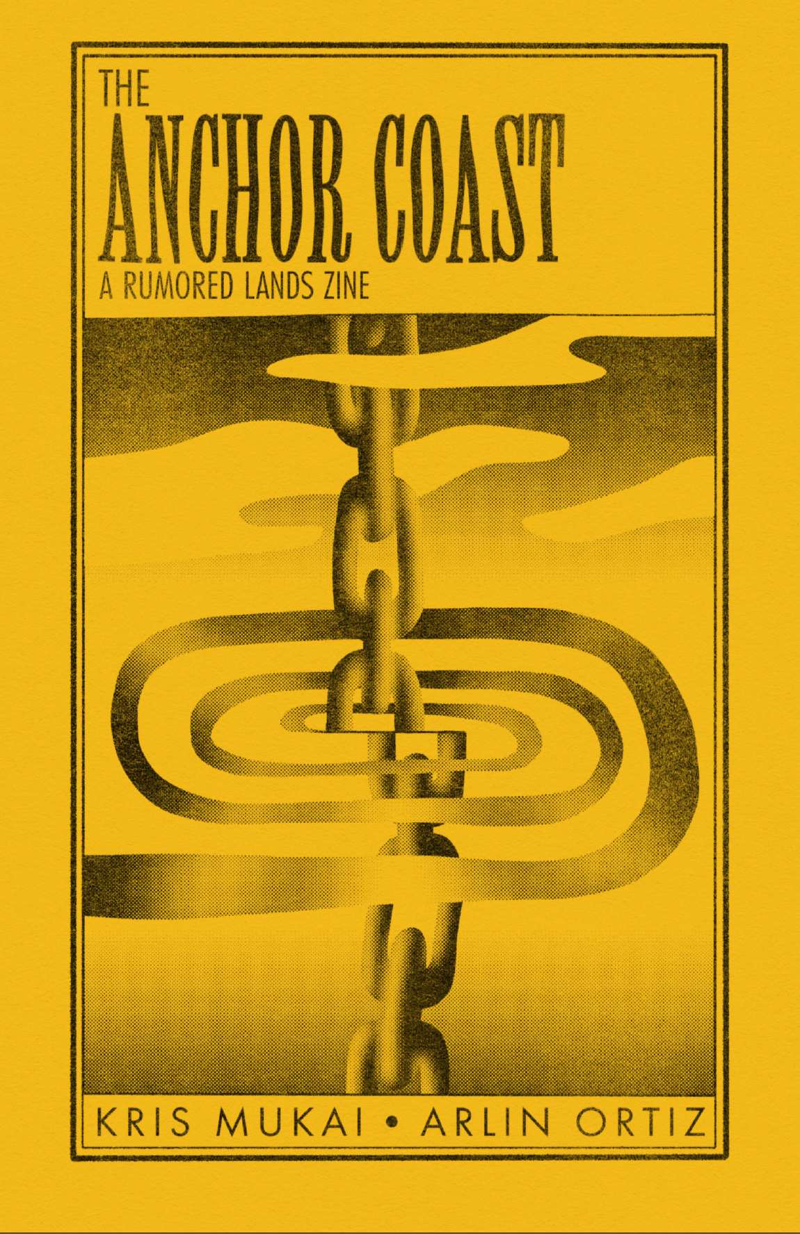
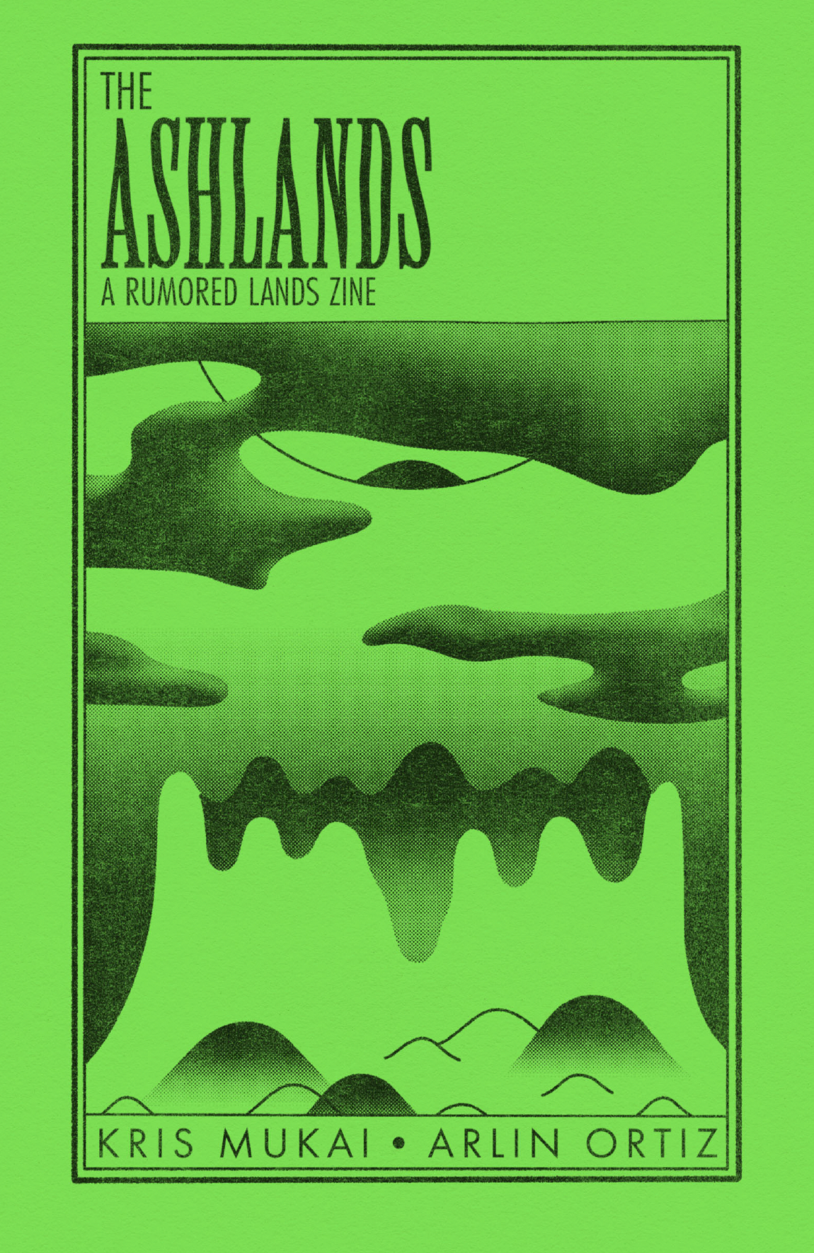
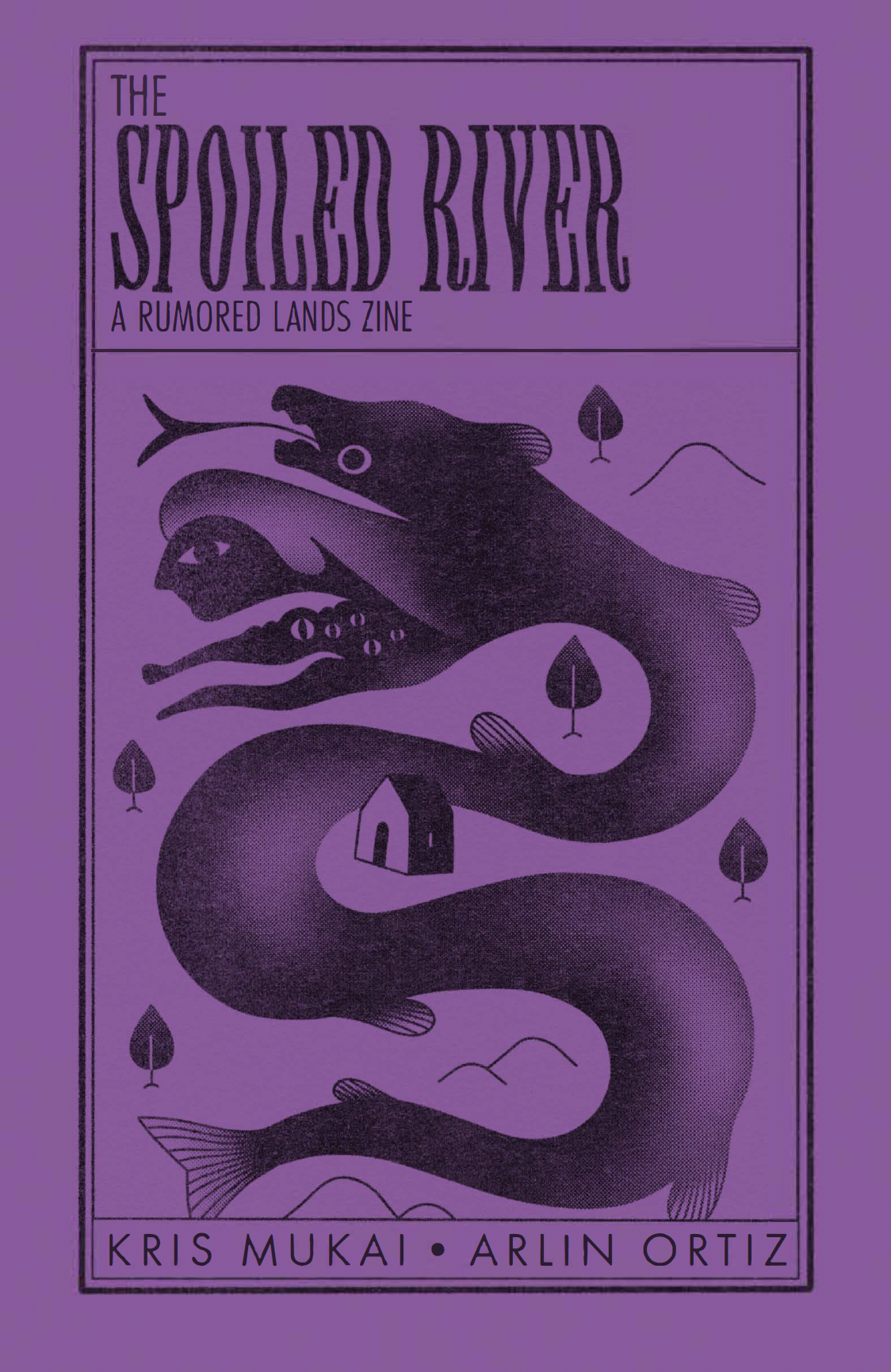
Covers (from left to right); The Anchor Coast, The Ashlands, and The Spoiled River.
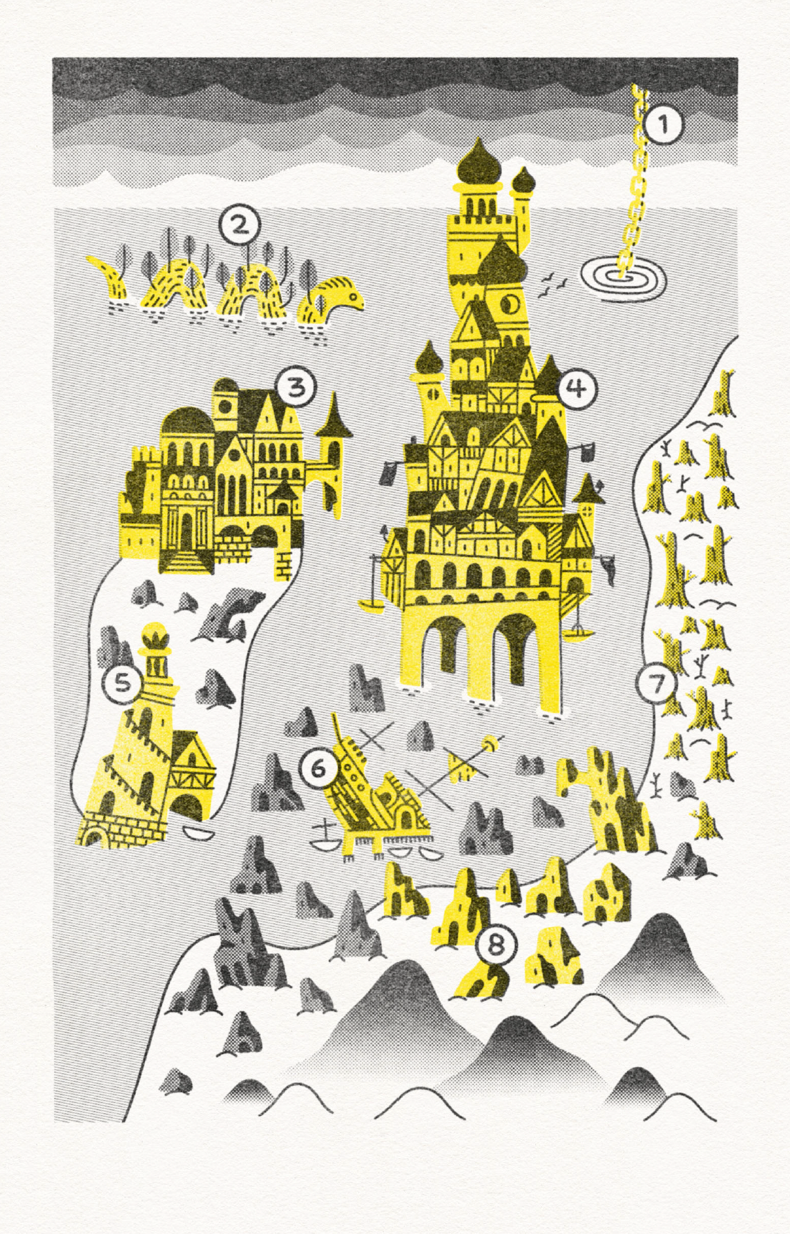
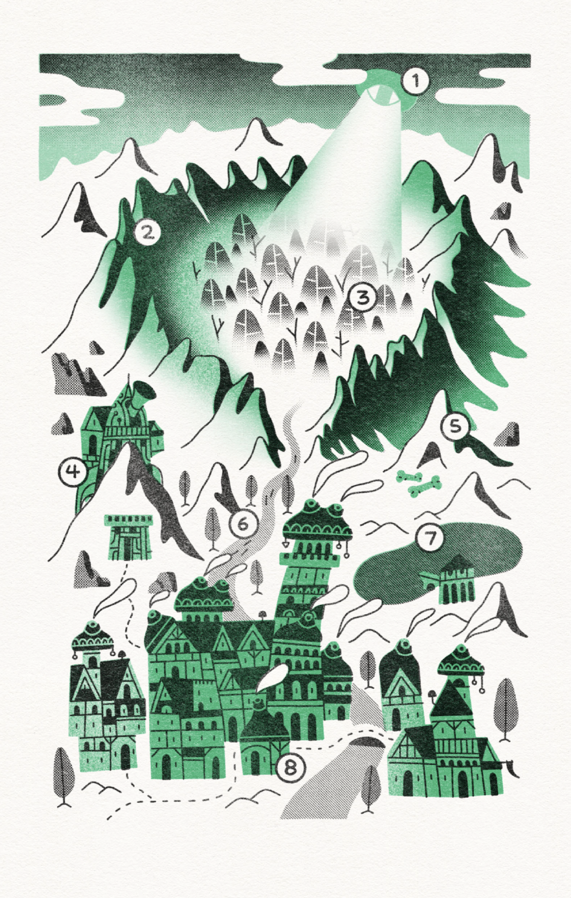
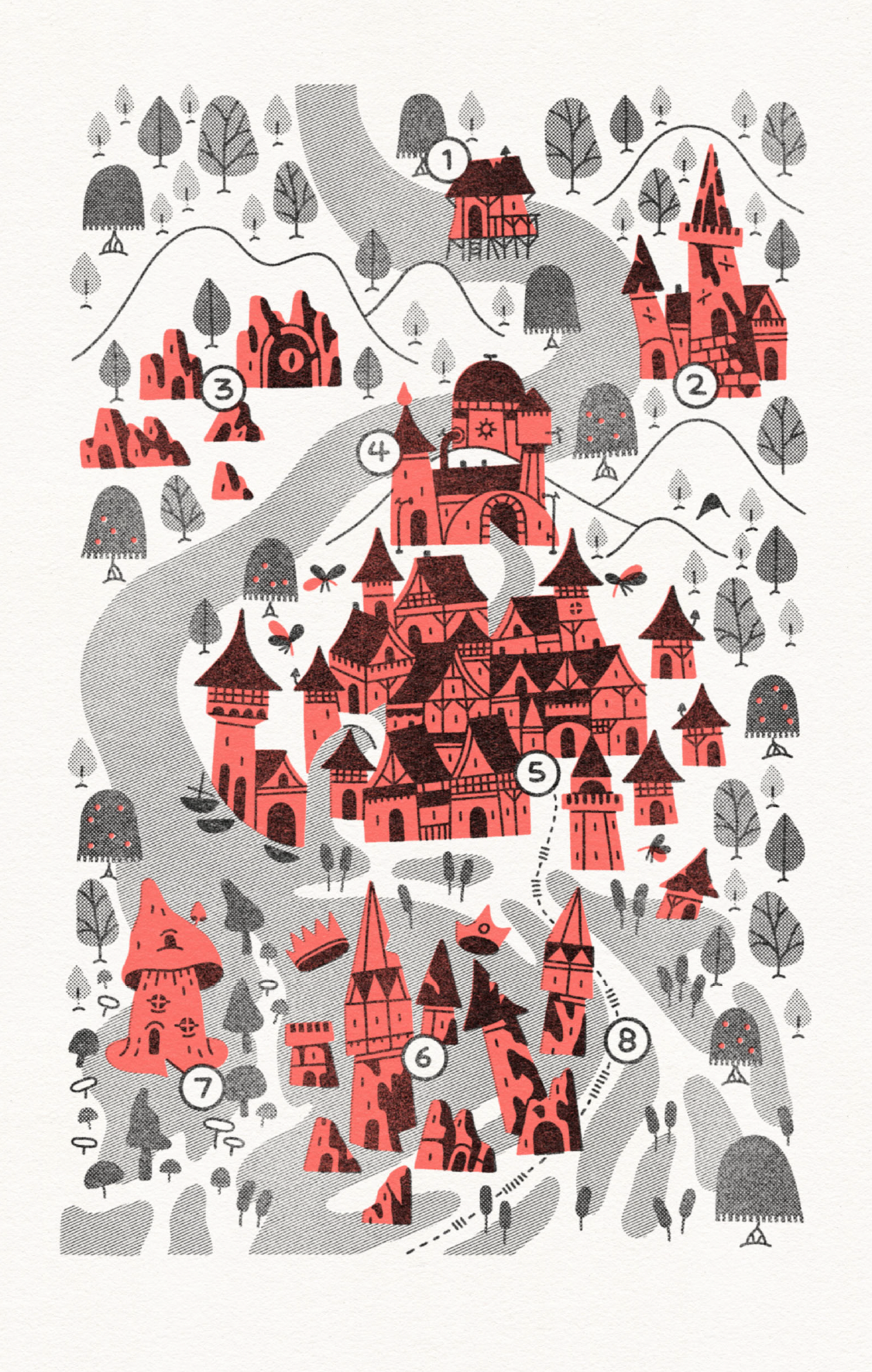
Cartography (left to right); The Anchor Coast, The Ashlands, and The Spoiled River.
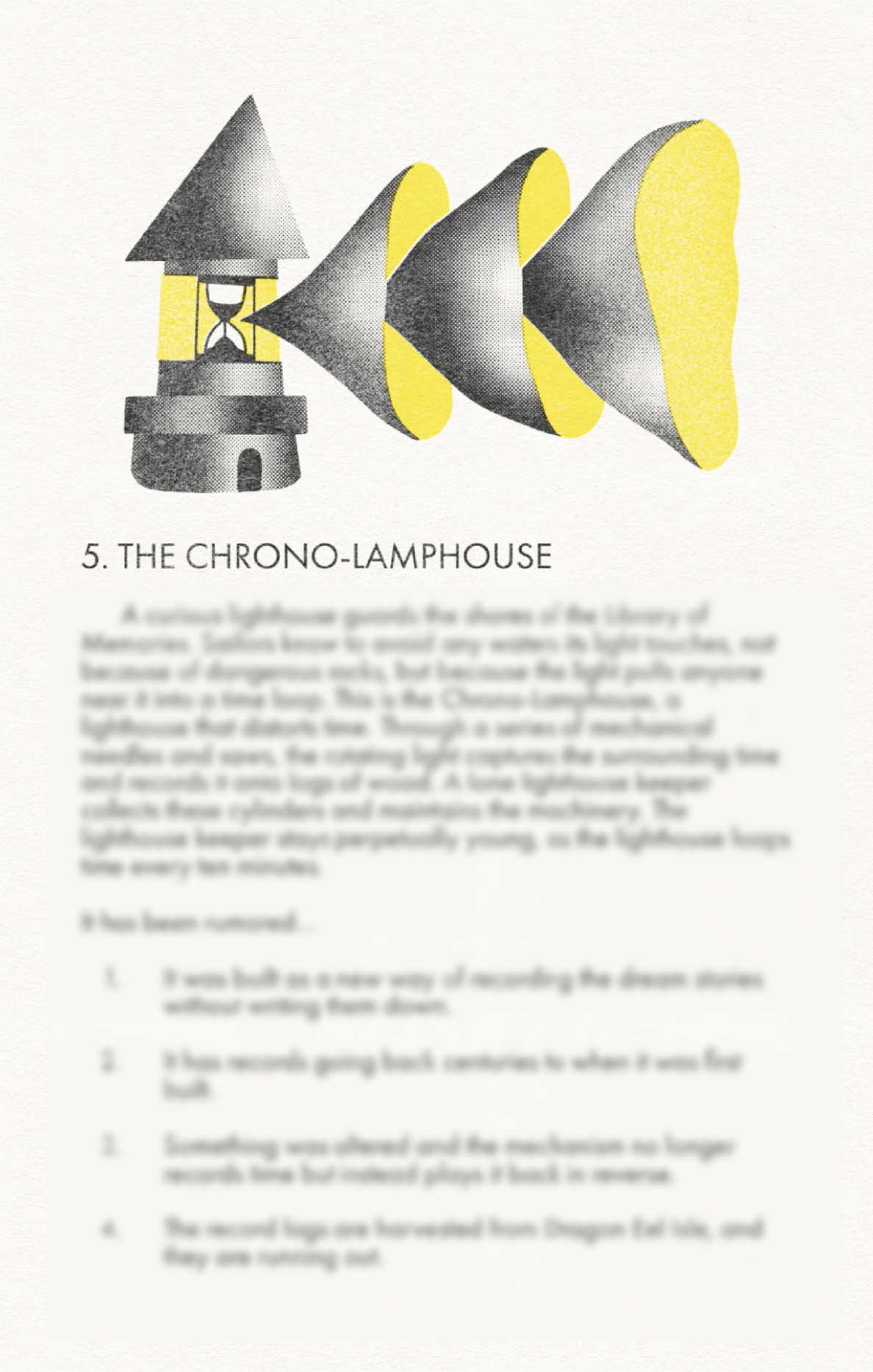
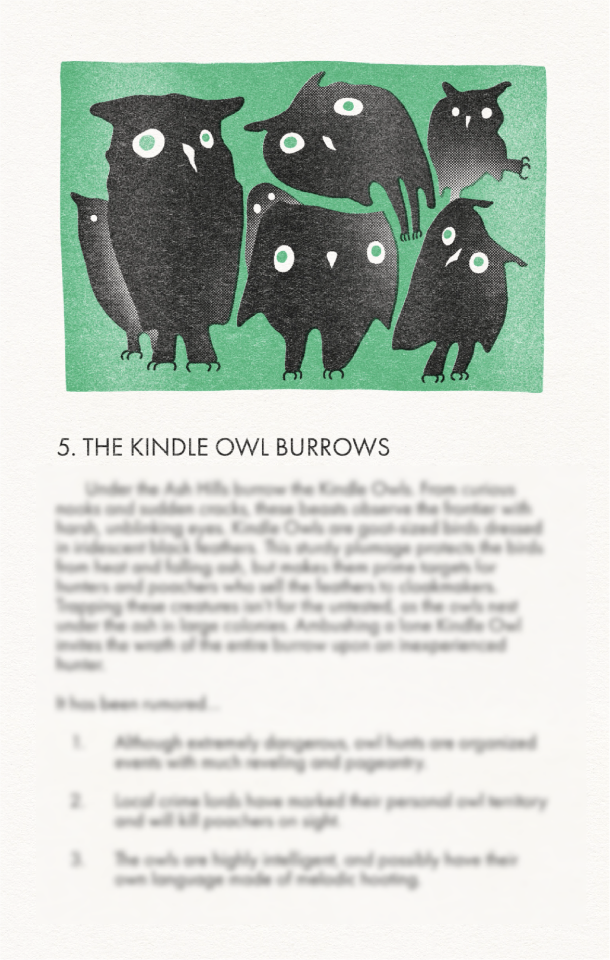
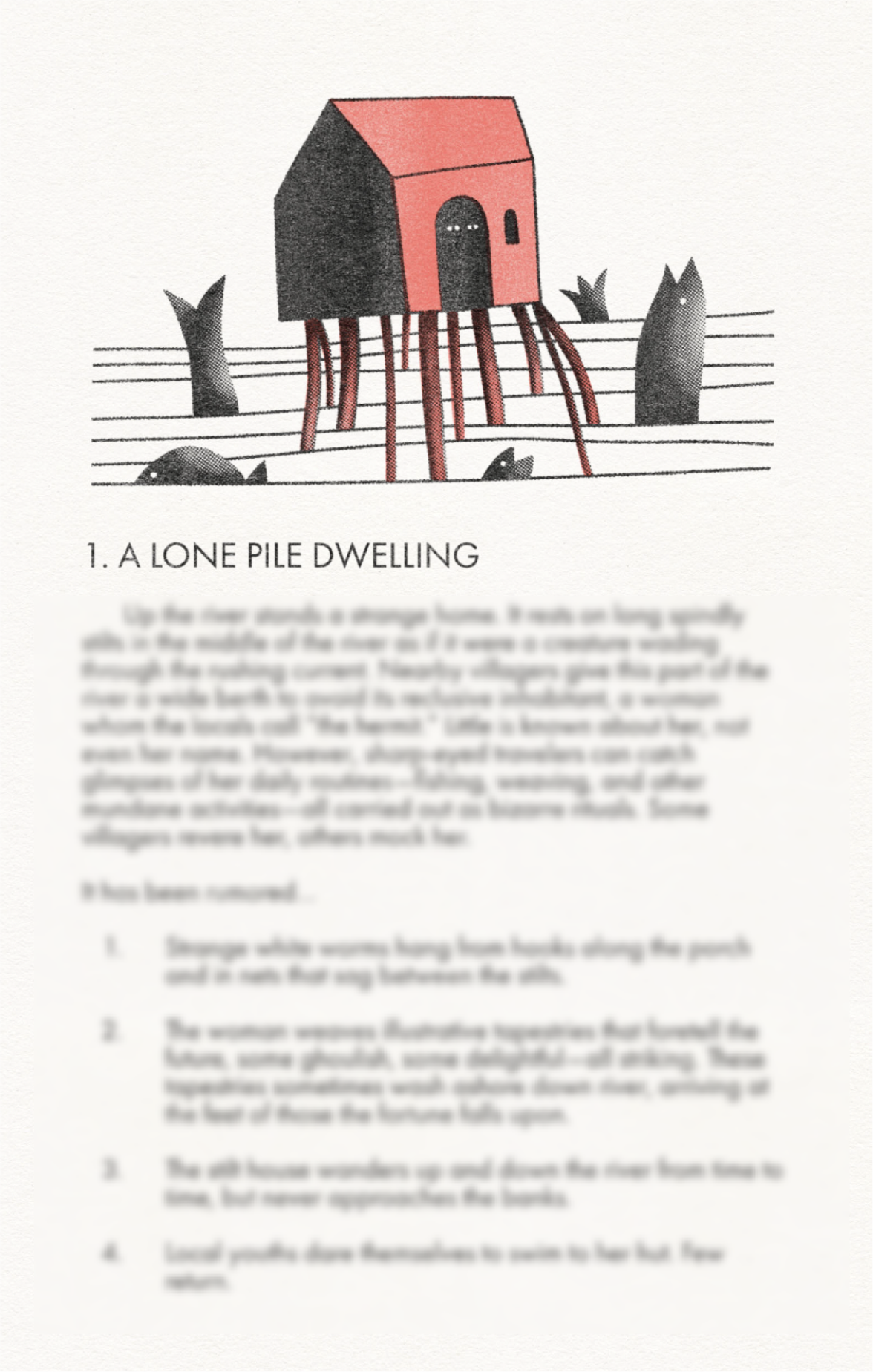
Interior pages (left to right); The Anchor Coast, The Ashlands, and The Spoiled River. (Text blurred by me.)
Delving into Rumored Lands
These zines are essentially location-based rumor tables that have been polished to a degree most zines are not. It's why I picked them up. I'll skip ahead and say right now, "I want to see adventures made by Mukai and Ortiz. The the Rumored Lands will require some work before they get to the table, but like any good rumor in a full-fledged adventure, they've got their hooks in me.
So, let's start with what I love. These three zines are compact little nesting dolls of cool ideas. Looking from the top down, each land is defined by a conceptual idea that warps its locations, creatures, and denizens. The Spoiled River, for example, isn't polluted by just anything, but magic crystals that mutate the landscape. The Ashlands are gathered around a glassy crater with a massive eye floating over it. The Anchor Coast is named for its giant anchor and chain which links the depths of its oceans with an unseen flying ship belonging to sky giants.
What makes these ideas good is how they domino into the resulting pages. Mukai and Arlin have done a good job of using the top-level conceptual ideas to formulate the smaller, more intimate creatures and scenarios at the player level. My favorite example is probably in The Spoiled River zine where spawning mosquitos on the aforementioned river's muddy shores have mutated into horse-sized monstrosities. Monstrosities that the setting's npcs have no problem using as pack animals in a city that now literally hums with industry.
This work isn't without its limitations, though. The Rumored Lands is not immediately gameable. There are no stats, dungeons, or any of the smaller details that fill out the beats of an average rpg session. Just a paragraph description and 6 to 12 rumors that (as far as I can tell) are all true. For some locations, this works out fine because the locations are small—like a hut. The real challenge is when the locations get big. Some GMs might be able to run a a night of city adventuring on one paragraph and 6 fun facts—I'm not that GM. I need all the help I can get.
But let's go back to those rumors. They don't feel like rumors in the traditional rpg sense. There's no conflicting information, ambiguity demanding interpretation, or even tension. They read like facts about the setting, person, or thing. Sometimes sequentially like a timeline. They're still compelling. Trees that explode will always compel me, and that was one "rumor" among a list of 6. But they don't have a stickiness for the players. There's not really any implied call to action, or a secret being divulged, it's mostly just detail that sets the stage.
For those reasons, these rumors feel like they're written for the GM and not the players. In fact, Rumored Lands feels less like three adventuring locations and more like three lite campaign settings with thought starters.
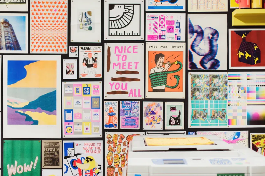
Picture of riso prints and printer via Risotto Studio.
Design Lore
Rumored Lands' physical edition was made with riso printing. The digital editions are either direct scans of that end product or they're well made digital facsimiles. Both versions look fantastic. But what is riso printing? It's like if traditional photocopiers and screen printing had a baby. Paper goes in and colors are added one layer at a time by metal rollers. First goes the "bottom" stencil forms inks, then layer by layer, we get spot colors applied, with a little overlap here and there.
Check out this explainer for some visual aids.
It's a beautiful physical process that creates tiny imperfections with every page, often the result of variations in the paper's pulp, saturation in the ink, or the metal rollers which skip and trundle across the page. What's magic about these imperfections is that they draw the senses to the stuff people are starved for in our digital age—paper, ink that creates depth of color in the light, and small indentations on the page that only our fingers can feel.
Rumored Lands shows off these details really well. It's clear both designers have experience and mastery over this process. Their art is bold, geometric, and symbolic—a perfect fit for the stencil and color construction of riso.
Another thing that is particularly powerful about riso, which we don't see as much here in Rumored Land's one-color execution, is that it's range of colors are famously limited. This might sound like a weakness or limitation for creativity, but it's secretly its strength. In order to achieve a wider range of colors, the spot colors of a riso project are layered on top of each other. The result is a new color made from layers of bright inks just 2 to 4 microns thick, stacked on top of each other, like stained glass windows. This is why risograph prints are so rich and textured. When you see one in person, you are are seeing light penetrate and ricochet between the imperfect layers of specially formatted inks. Inks that are inherently brighter and more volatile than the stock consumer-grade stuff that goes into an inkjet.
A brief note on typography (which looks perfectly weathered but legible in this work): Recently Adobe updated their PDF viewer with overly confident AI, which means I can't be 100% certain what fonts were used in these zines because I can't turn it off. The AI says this book is set in Trebuchet, Times New Roman, and Arial. Maybe those fonts are somewhere in here, but if this isn't Futura, I'll be damned to hell. Feed me to the horse-sized mosquitos.
Design Loot
- Consider using colored paper. A lot of printers, especially specialty ones, have paper with colors and textures you can't recreate with ink (or do so cheaply and reliably). These zines use colored pages for their covers with black ink.
- Give your illustration a bit of caricature. The more I see it in rpgs, the more I love it. For example, if your adventure has owls with big eyes, give them stupid-big eyes in the art. GMs have to transmit these details to players and conveying these details through exaggeration isn't heavy-handed, it's using every tool in the toolbox. Some GMs might show the art to the players. Either way, a bit of caricature makes the images indelible on the collective imagination.
- Create a layout that plays well with your format. Rumored Lands uses a fairly narrow page size, something narrower than US Half Letter or Crown Octavio. That means horizontal space is scarce. Any additional columns would squeeze the type into short, choppy lines. Their use of the one-column manuscript grid is the correct one. They even use Futura (I swear they do) which is a little wider than most type, which in this case fills out the space just right. Lines have just the right amount of characters.
Final Thoughts
The Rumored Lands was my first dive into the work of Kris Mukai and Arlin Ortiz. After reading these zines, and writing my thoughts, I had to dig deeper. Not surprisingly, I saw a note that Ortiz is making maps for Dolmenwood (which is a combination that feels inevitable). I've been holding off on Dolmenwood until the official release, so this omission is on me. I also learned, while writing and scheduling this design delve, that they did release an adventure set in The Spoiled River setting. I'm looking at the preview images and I can feel my hand reaching for my wallet like it's a sidearm.
I'll have to grab that adventure, Trouble in the Gladden Brook Reservoir, along with Rumored Blades, and Ortiz's Monster Pamphlets.
Thanks for reading, let me know if you've picked up these zines. Did you get the physical edition? Have you played the adventure? Drop a note in the comments or tag me on BlueSky. Until then, I'll keep exploring.
Explorers Design is a production of Clayton Notestine. If you liked this article, please consider liking, sharing, and subscribing. Members who pay $5/month also get access to additional tools, templates, and inspiration.


