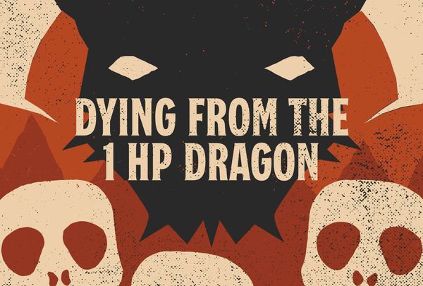
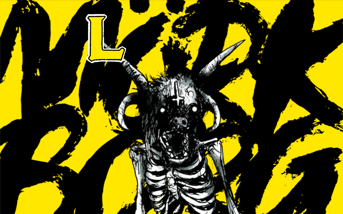
Mörk Borg (Layout Exhibit)
The doom metal roleplaying game with a masterclass layout.

Layout is dead! Long live layout!
Mörk Borg. A doom metal album of an RPG. A spiked flail to the face. Light on rules, heavy on everything else.
When the dark fort lifted from the RPG swamps, thousands of third-party creations barfed forth—gridless and loud. Yet few have come close to the original's technical finesse.
This is an exhibit of Mörk Borg's layout. Many describe it as chaotic, but our goal is to dispel that notion. Mörk Borg's graphic design is incredibly technical and a masterclass in fundamental design concepts.
Wretched design magic.
Most of Mörk Borg doesn't use a grid system, or any grid, for that matter. Instead, it has something far scarier—the blank page. An empty canvas for scribbled skeletons and one hundred different typefaces (you read that right).
There's a method to the madness, though. (Which I'm hoping to illuminate in this exhibit.) Despite its chaotic death metal energy, Mörk Borg is a perfect example of fundamental design principles being used to tremendous effect. This is how metal relates to music, by the way. Most of its sub-genres create surprisingly sophisticated compositions compared to other music genres—but I digress.
 Clayton Notestine
If the concepts in today's article excite you, check out the official Explorers glossary.
Five Explorer observations.
Click on an image to see it up close.
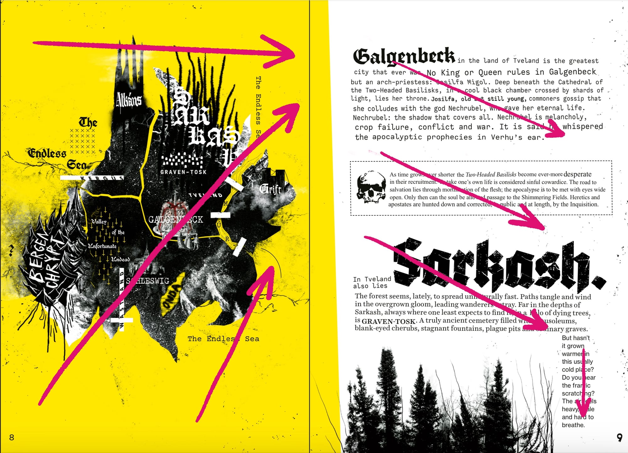
1. Follow reading patterns (or The Gutenberg Principle)
The most important secret to Mörk Borg's layout is knowing the audience. Westerners read left to right, top to bottom, and their eyes gravitate diagonally across spreads to the lower right corner.
The Gutenberg Principle, or the "z-pattern," takes this one step further. It suggests that the eye starts in the top left, moves to the top right, briefly returns to the bottom left, and then terminates in the bottom right. In other words, the left page is where everyone starts (looking for keywords, art, or a "value prop"), and the top right is where they expect to see substance.
I'm not convinced of the literature on the Gutenberg Principle. But I am convinced that you can use left-right dominance to meet and guide your audience.
Additional notes:
- When in doubt, the next relevant piece of information is always to the right or below where your eye is. Information never flows in the opposite direction.
- Art favors the left page for visual interest, like illustrations and maps, while the right page usually has gameable subject matter like rules and tables.
Click on an image to see it up close.
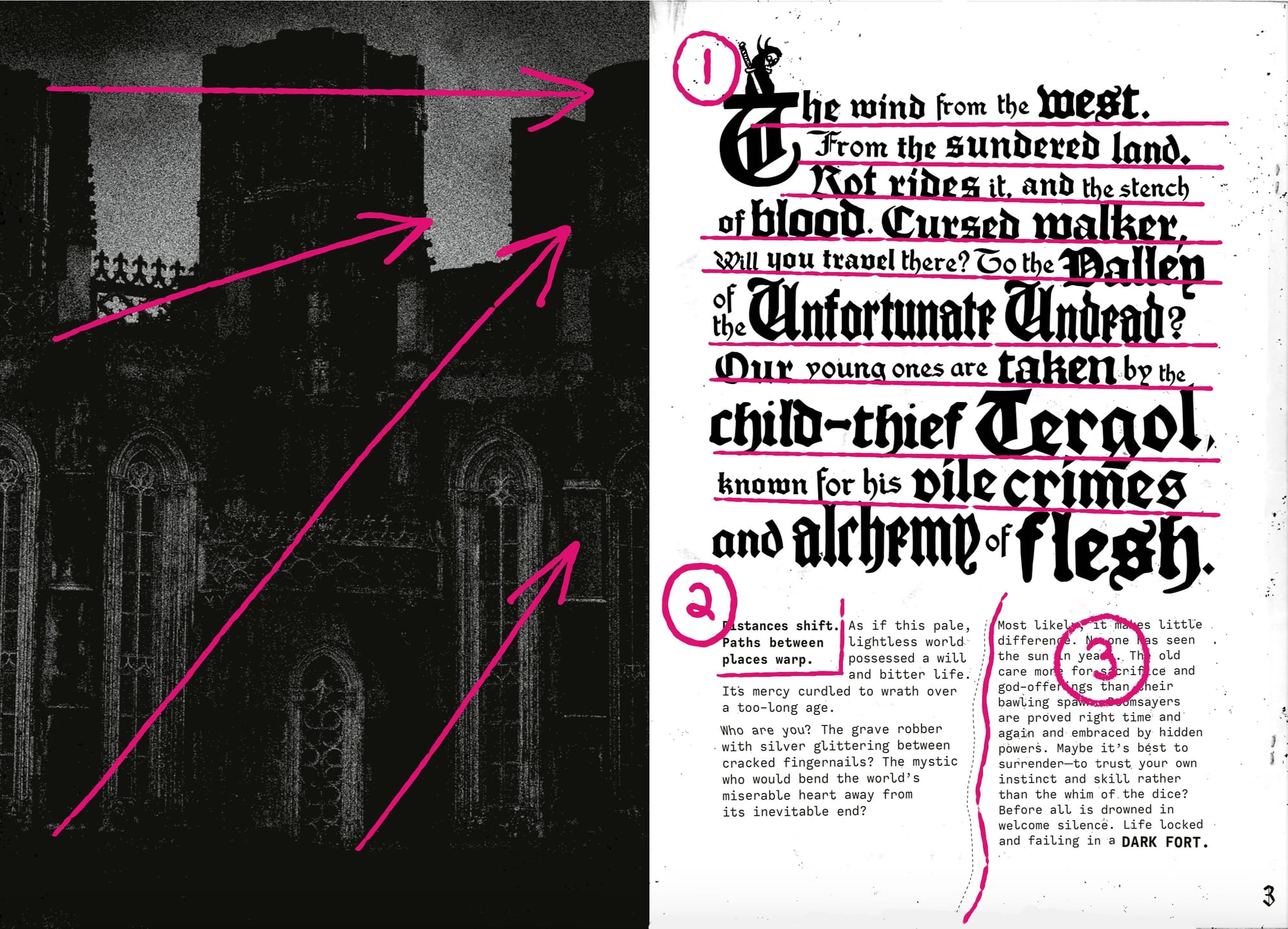
2. Create a sense of hierarchy on every page.
Every spread in Mörk Borg has a sense of progression, whether from contrast, balance, emphasis, proportions, whitespace, movement, or all of the above. Hierarchy is when certain elements are first in the pecking order, while others assume dependency.
The trick to hierarchy is meeting (or drawing) the audience's eyes to one place and then guiding them from there. Nearly every spread in Mörk Borg starts in the upper left or uses design principles to guide the eye to where it needs to be.
Additional notes:
- The drop cap is the largest (and highest) design element in the first example. This greater proportion (besides its placement on the page) means the eye is drawn there. After that, the smaller type keeps it moving.
- As the opening paragraph progresses, the type gradually becomes larger and heavier. This reinforces the left-to-right reading pattern by making the bottom right area anchor the page diagonally.
- After the opening paragraph, the type grows small. The heavier contrast on the top left column ensures we start there—after that, it's a simple manner of reading a two-column spread.
- The second example shows a more streamlined hierarchy through contrast, balance, and proportion.
Click on an image to see it up close.
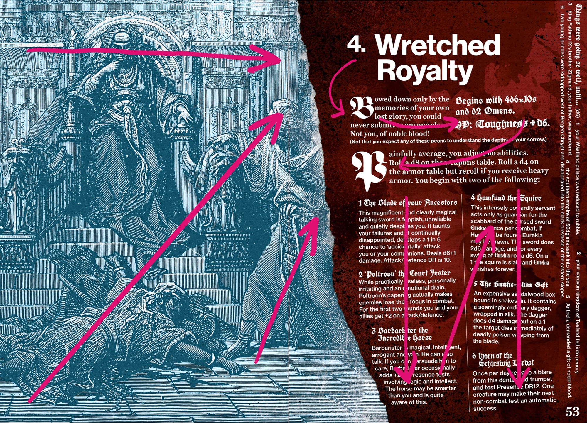
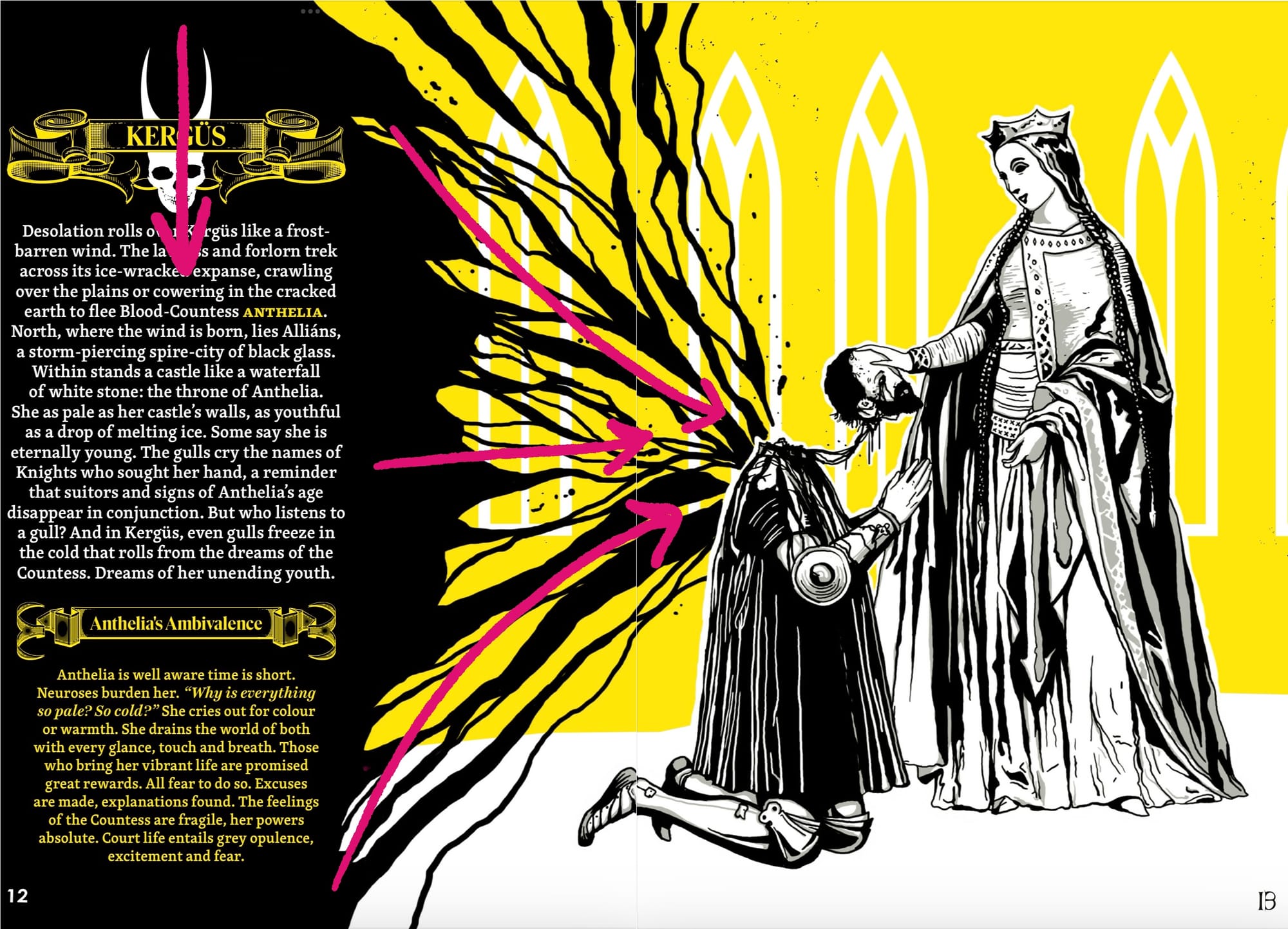
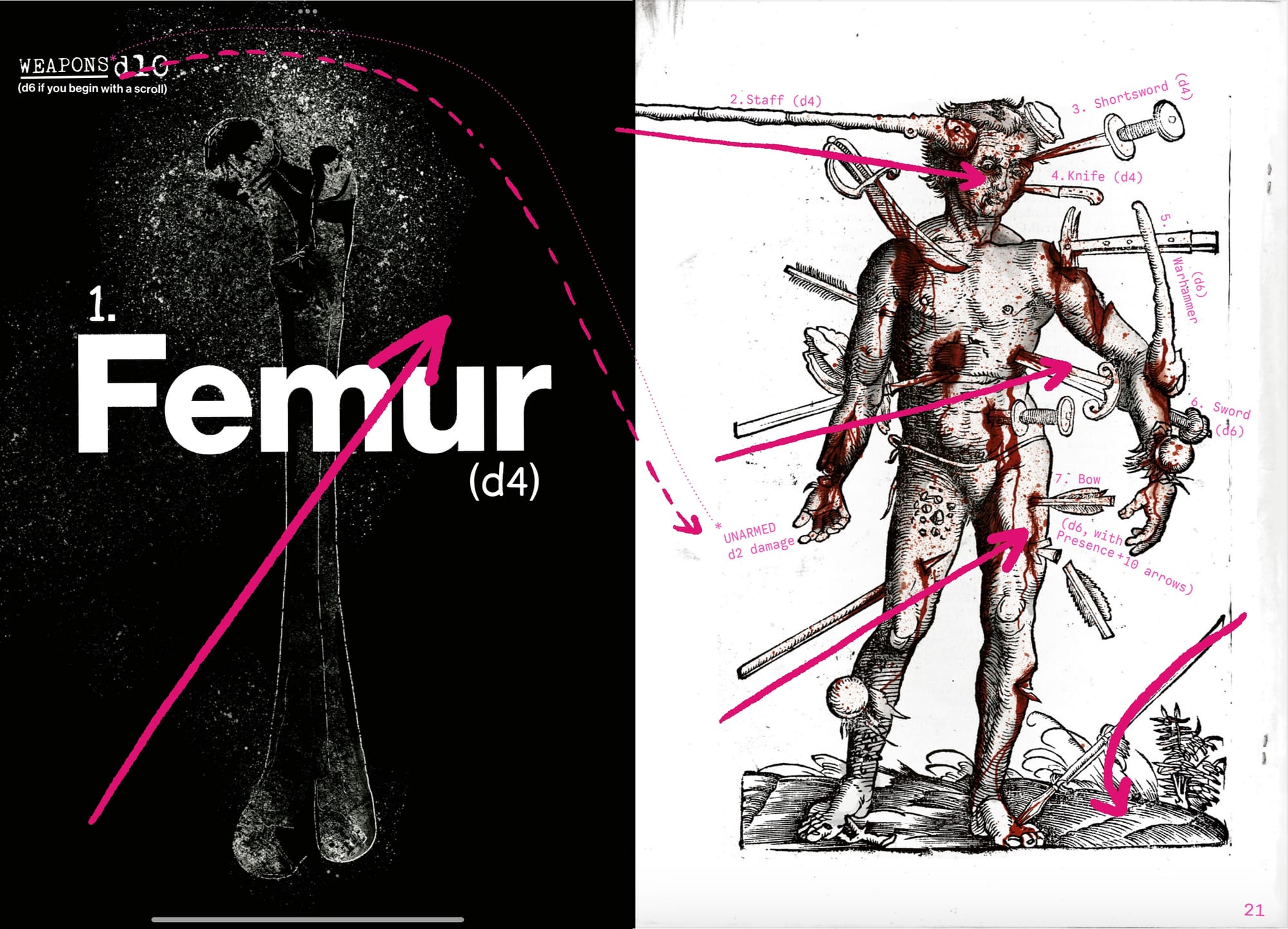
3. Use movement to guide and excite readers.
Movement, or "momentum," is how a design or element guides the eye across a composition. It can be achieved with positioning (re: reading patterns), hierarchy, and—last but certainly not least—movement lines (literal and metaphorical).
In the wrong hands, lines and arrows can feel like bandages. We've seen it before. When the omission of a line makes it impossible to navigate a page, the page was flawed from the beginning. By comparison, Mörk Borg's movement lines only reinforce and serve as backup for the audience. They never go from right to left or force the reader to do the opposite of what the rest of the spread would suggest.
Additional notes:
- Sometimes, movement doesn't convey information but a feeling. In the first example, the art's lines thrust the reader forward to the next page.
- Movement lines can be literal or figurative. In the second example, we see a dotted line connecting two different pages by physically linking "Weapons d10" with the page of weapons. (The femur, meanwhile, is unmissable anyway.)
- The right page is studded with natural movement lines. The eye can't help but stab through the body from one weapon to the next. Intentional or not, this page displays how movement can draw focus in fun and exciting ways.
Click on an image to see it up close.
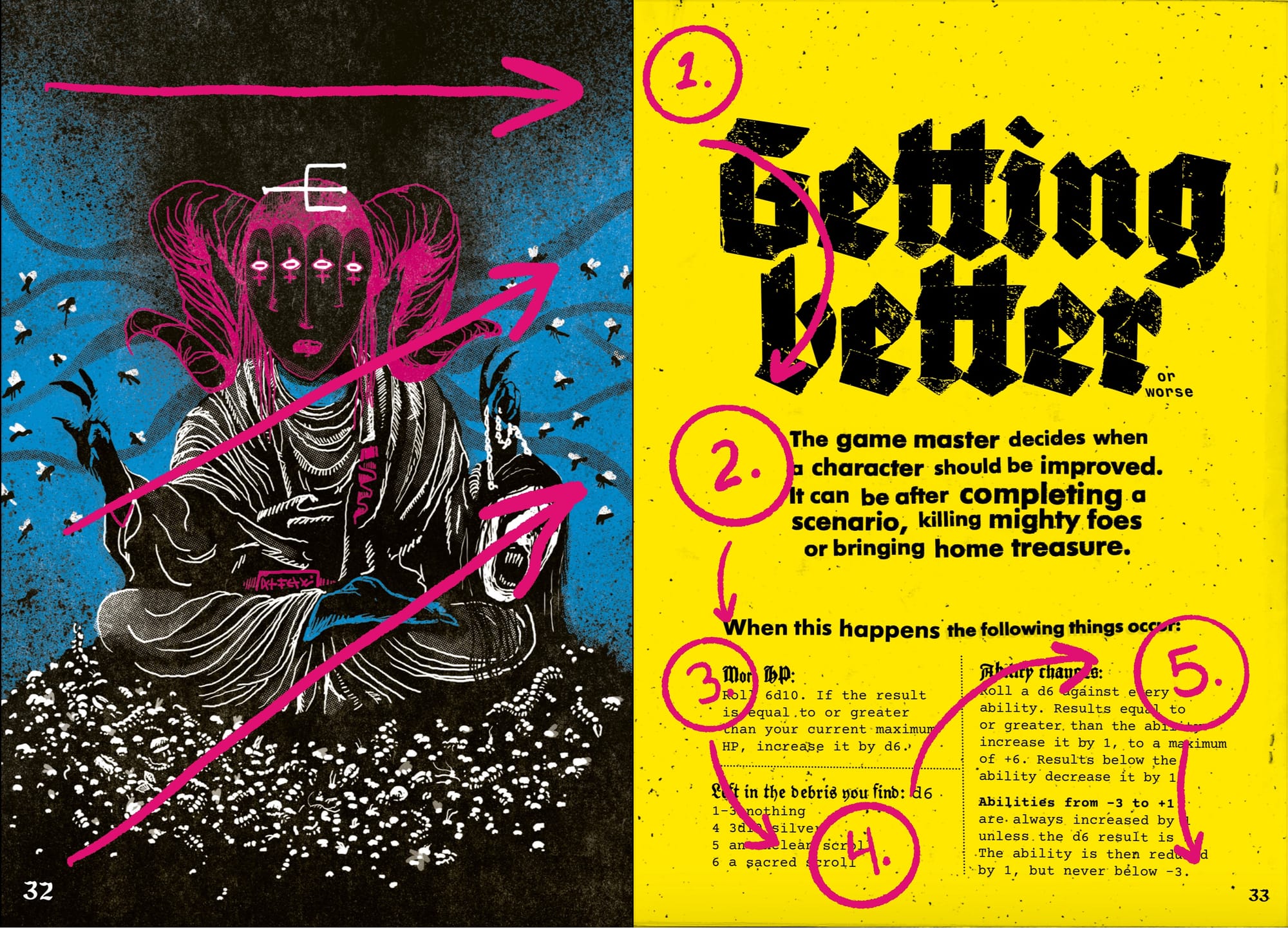
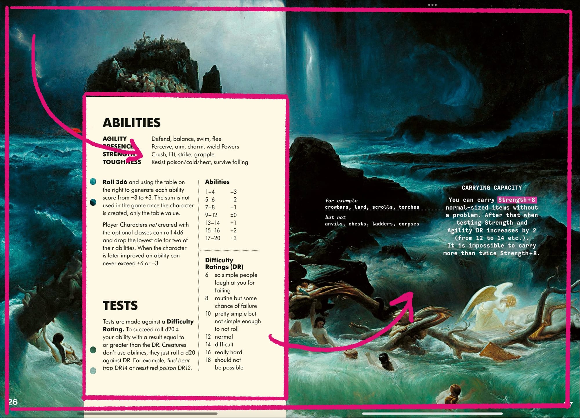
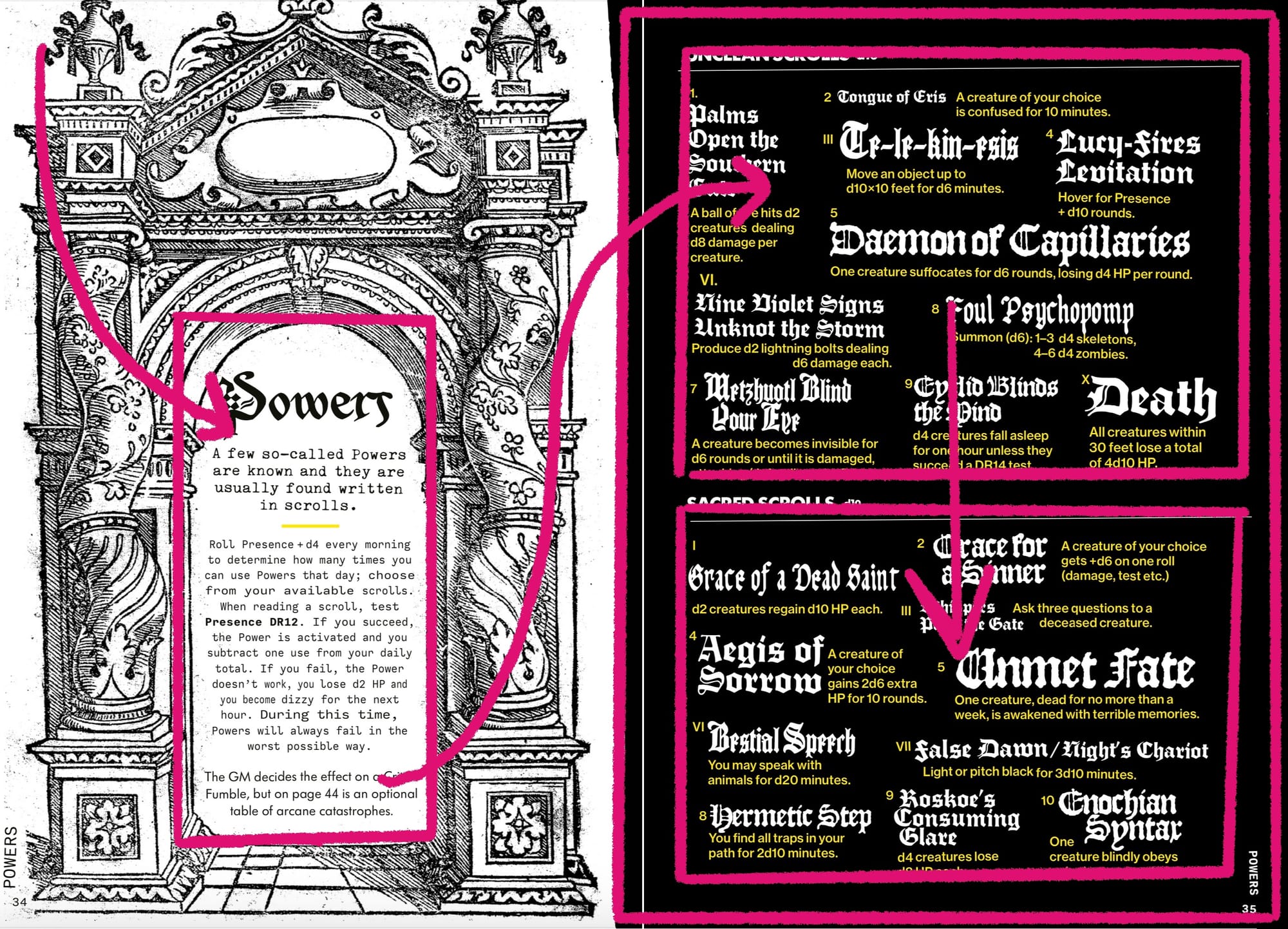
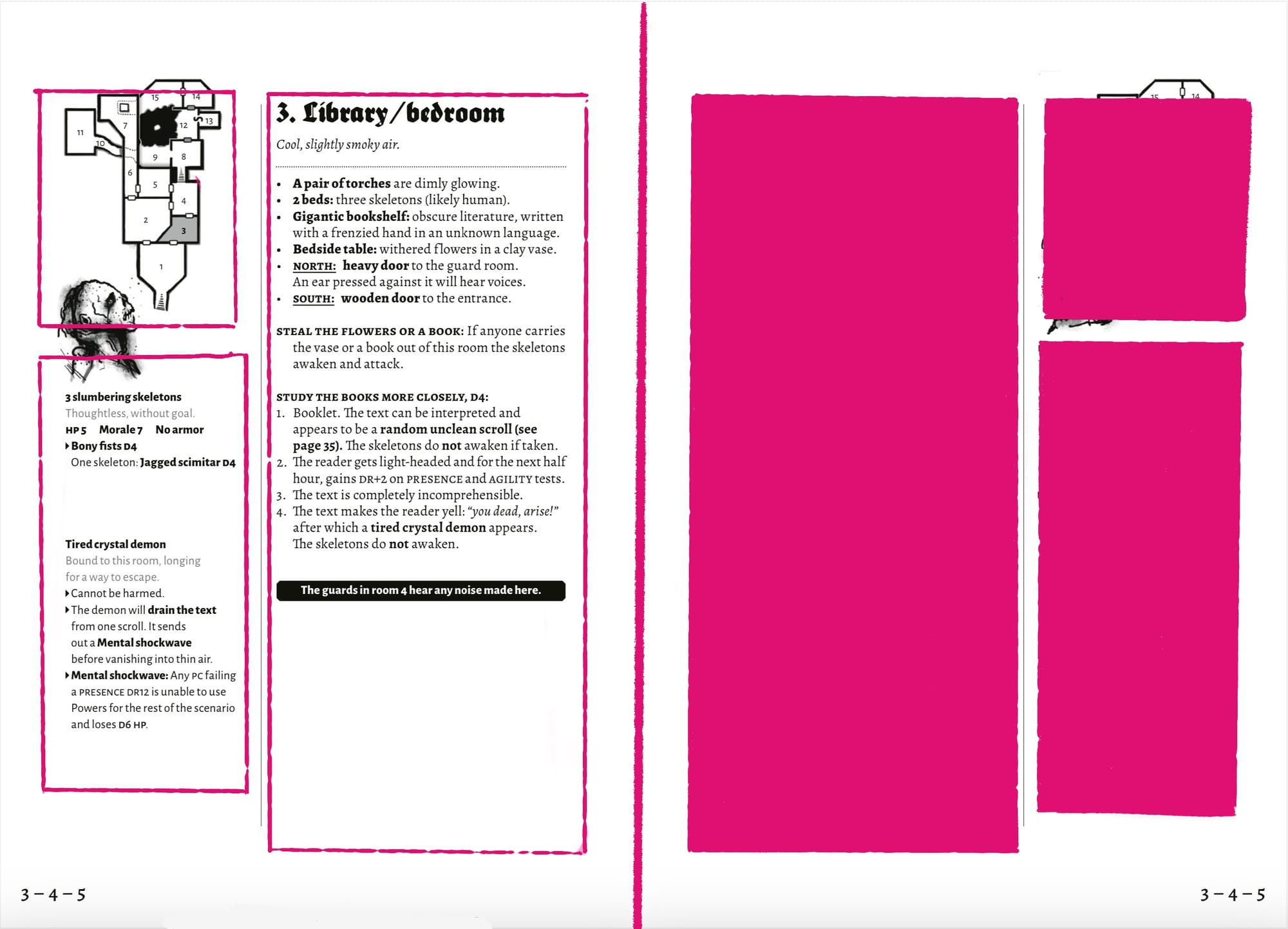
4. Create common regions to group information.
Common regions are spaces defined by boundaries. When multiple elements share a common region, they're perceived (and read) as a group. This subdivision and compartmentalization of information can turn big, unwieldy texts into easy-to-understand, bite-size pieces.
Mörk Borg is a masterclass in compartmentalization. It uses its pages and spreads to break apart its contents. In the OSR, this technique is called paneling, but Mörk Borg (partly out of necessity) takes it one step further. In addition to making every spread about one particular subject matter, it also uses art, color, and graphics to subdivide it further.
Additional notes:
- In the first example, the entire spread is a common region. This inherent relationship is reinforced by the color blue—a rare color for Mörk Borg! This makes it stand out from the other spreads.
- On the left page, the content is separated into a contrasting paper visual, drawing the eye toward it. This emphasis and position prioritize it. It also creates a region within the larger region.
- On the right page, additional rules live outside of the other rules. They're still related (because they're in the same spread), but the message is clear: they are secondary and dependent on each other.
- Common regions often nest inside and subdivide each other. Therefore, it's important that smaller subdivisions don't confuse the order of operations. In this case, the overall effect is sustained. The additional common region reinforces the other design principles in a visually striking way.
Click on an image to see it up close.
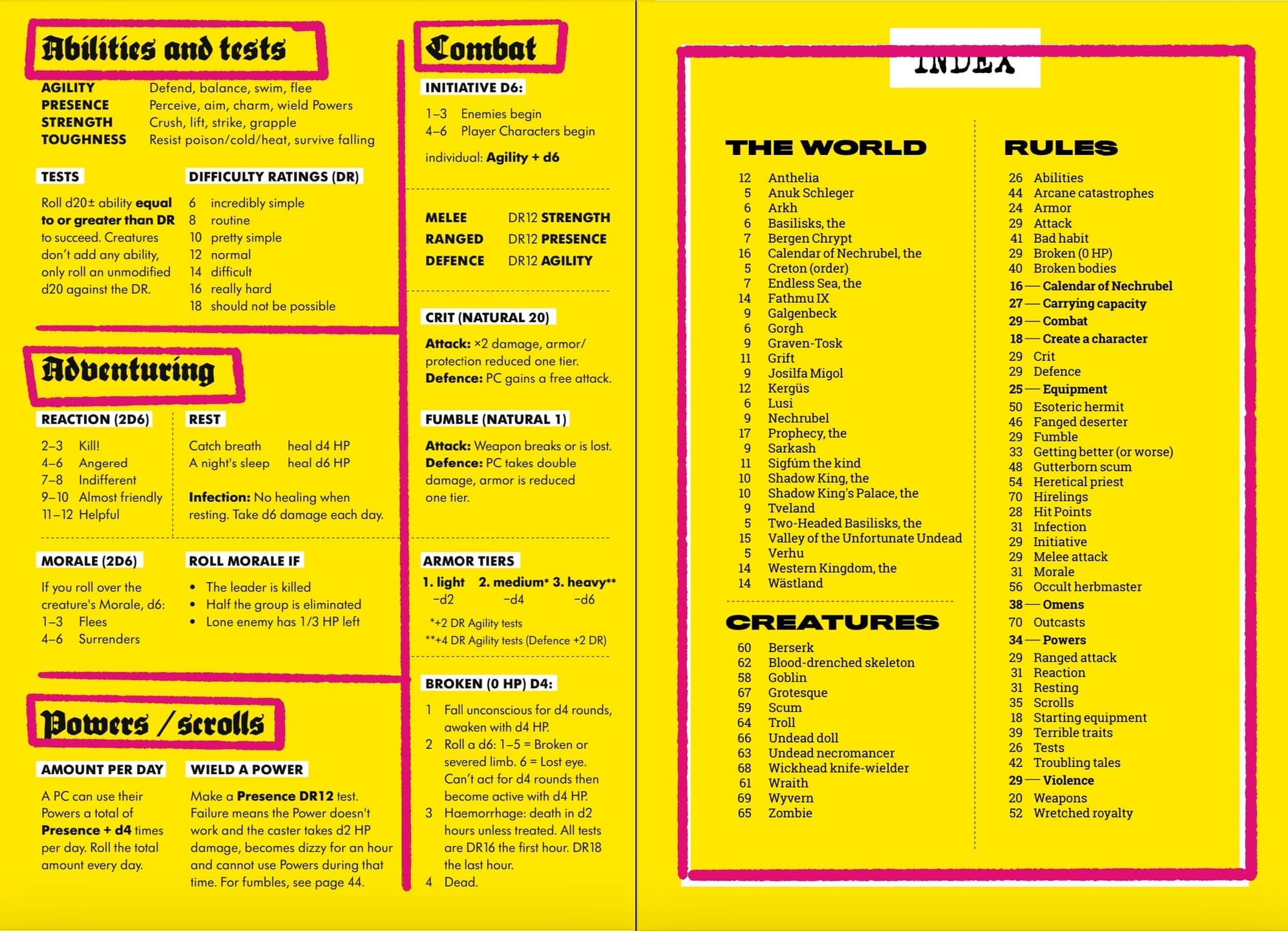
5. Use repetition and patterns to create order.
Mörk Borg will always be infamous for its rich interior pages, but its adventures will never receive enough praise. There's a limit to how much deconstruction, reinvention, and experimentation an audience can take. If you bounced off Mörk Borg, you likely have a lower tolerance for it, but I recommend looking at the rules summaries and adventure spreads in the book's back half to see the other side of this monumental text.
Things like repetition, predictable rhythms, and patterns create stability, trust, and confidence in the reader. It's one of the core tenets of usability design and is executed perfectly in Mörk Borg. This book has a grid system—it just happens to be after the rules and setting explanation.
Additional notes:
- Notice how information like monsters and room descriptions have reserved spots on every page in the adventure spread.
- The mini-maps serve a function similar to page numbers. They're even in the corner of the page where page numbers (or "markers") tend to be.
- When a room has less content, the designer doesn't try to fill it with spot art. Instead, they let it remain empty because space conveys information. The human eye subconsciously consumes the whole image before drilling down.
- The headers and white highlights on the rules summary page create natural groupings, while the dotted lines and space make the implied common regions explicit.
- The dotted lines that separate columns and sections are one of the few repeated visual devices throughout the book. Even the most intricate spreads—like the ones shown earlier—usually have one or two.
Liked this? Check out the other exhibits.
Clayton Notestine Clayton Notestine
Final Takeaways
Mörk Borg is a masterclass in how complicated work is built on fundamental concepts. There's no secret recipe or mystery to its success, except that Johan, the graphic designer, is very good at what he does. So, next time you hear someone say, "It breaks the rules," or "It's chaotic," remember it's not breaking rules—it's using them.
I highly recommend Mörk Borg if you're a designer, publisher, or player who wants a game with super simple (but familiar) rules. Few tomes can offer this much excitement in such a small package.
If you buy through my DrivethruRPG affiliate link, you'll help support Explorers Design at no extra cost to you. There's also a bare-bones edition of Mörk Borg for people with accessibility difficulties. It's everything you need for free!
Thanks for reading,
Until next time, never stop exploring.
- Clayton