Exploring Picket Line Tango
The noir-inspired murder mystery strikes a balance in this week's Design Delve.


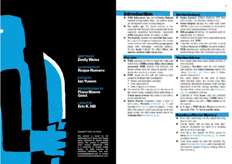
Picket Line Tango is a noir-inspired murder mystery adventure for Mothership 1e. Originally published in 2021, it was written by Emily Weiss, illustrated by Roque Romero, laid out by Eric K. Hill, edited by Ian Yusem, and proofread by Fiona Maeve Geist. The publisher is Anodyne Printware.
The people of mining colony Norton Outpost are addicted to murder. Kith slaughter kin over petty conflicts and bad habits. A union strike raises tensions to a boiling point. The true killer stalks unseen among protest signs and workers on the edge of chaos in…
Picket Line Tango.
You're entering a Design Delve, Explorers Design's semi-regular book critique. You can read previous explorations on the website. Subscribe for free or support the studio by becoming a paying member.
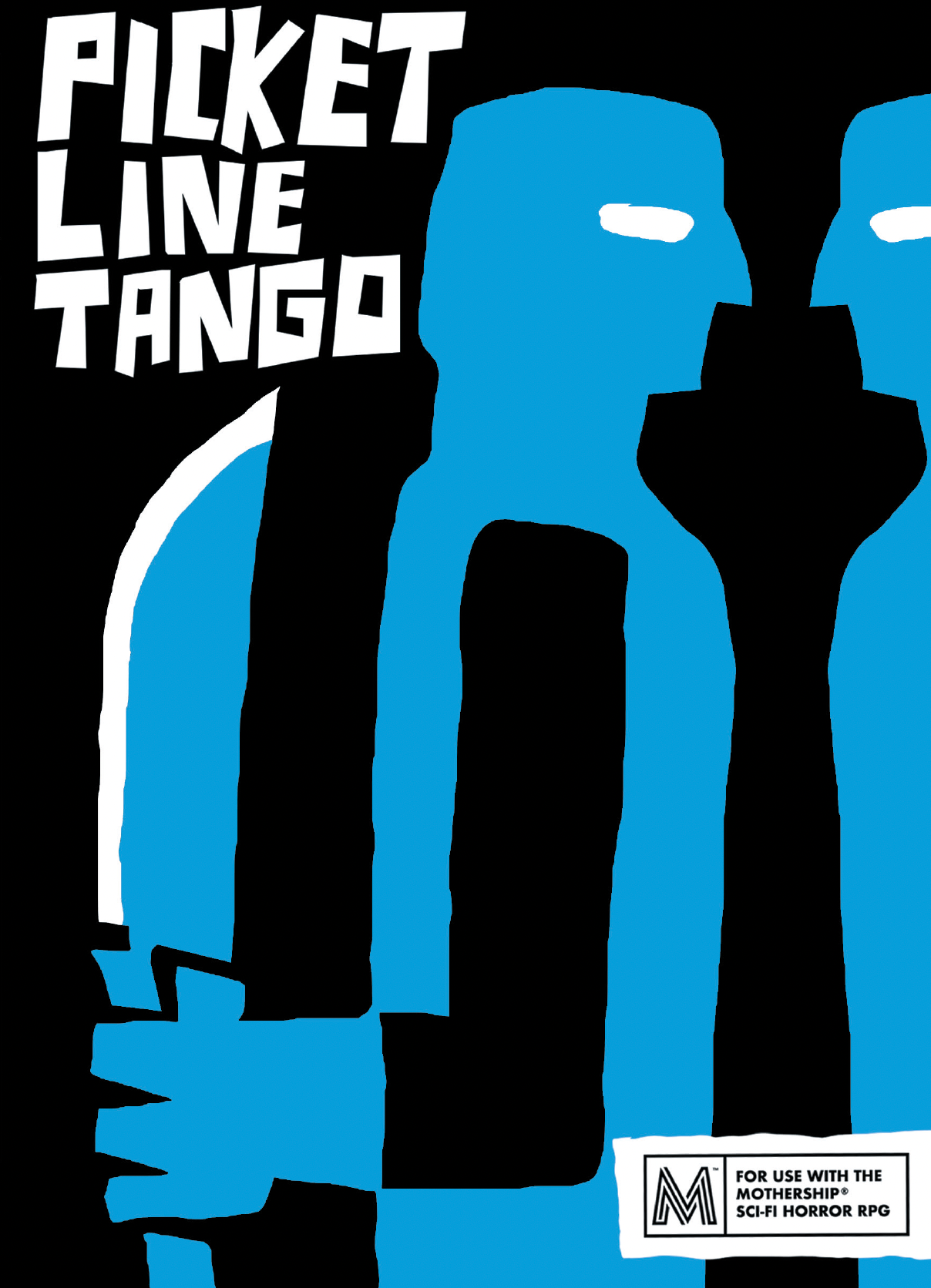
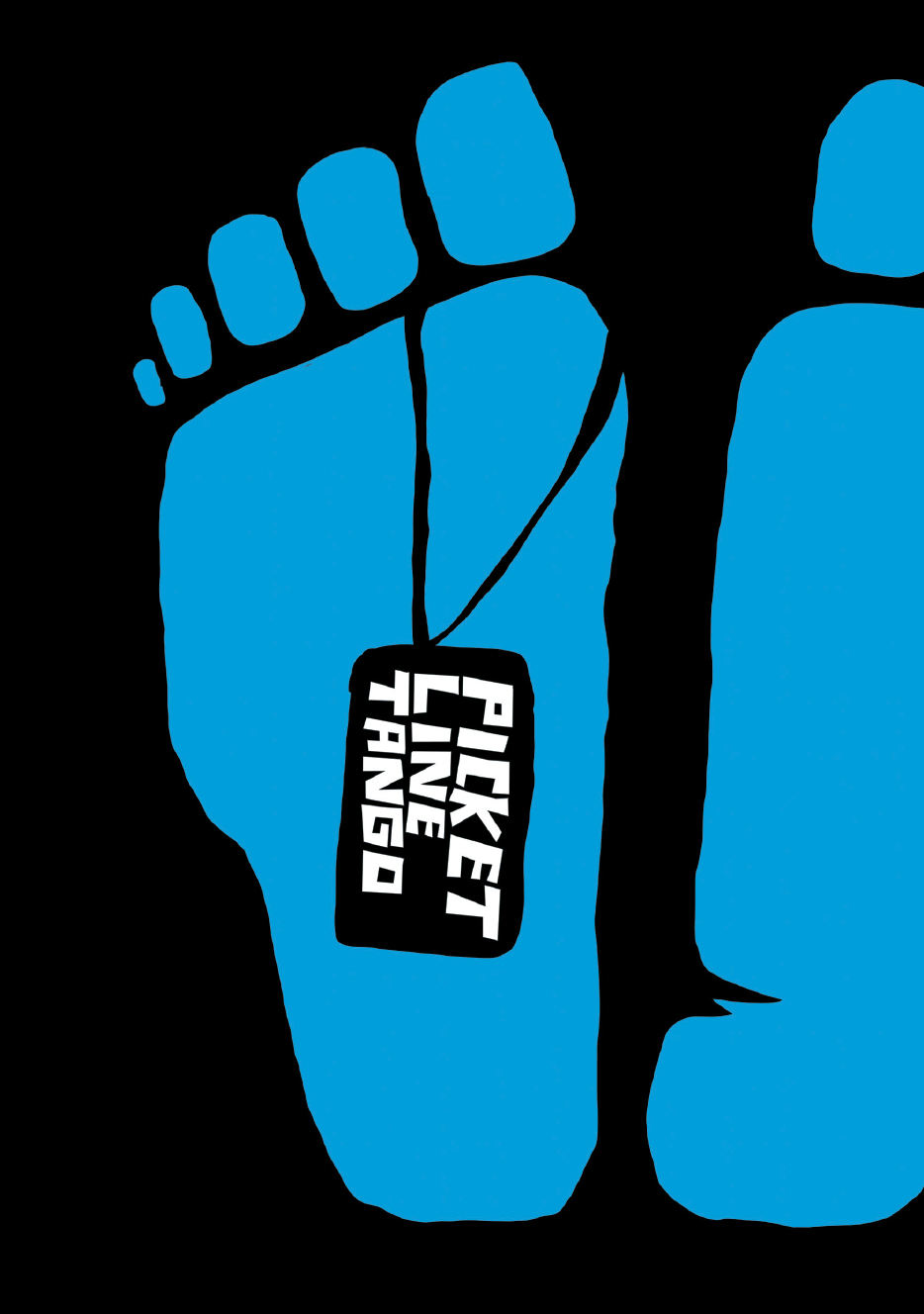
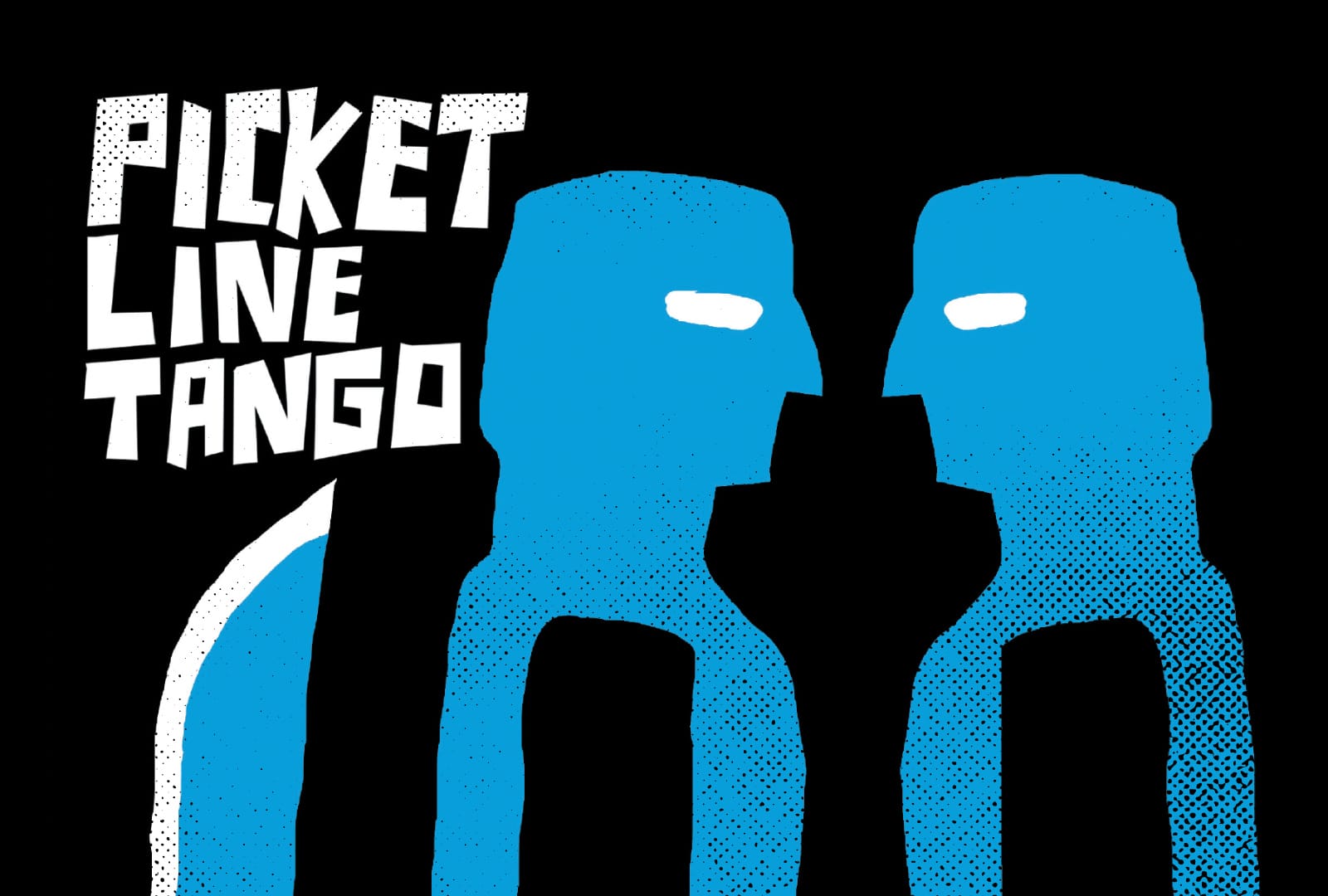
The front and back cover of Picket Line Tango.
Hypnotizing. Striking. Pretty killer.
In 2022, I was lucky to review a couple hundred games as part of The Awards. In that massive pile was a 12-page little MOSH adventure called "Picket Line Tango." It had the perfect name, a refreshing cover, and an absurdly talented team. Here's a spoiler for anyone still living in 2022—it was one of the winners.
The premise is simple: brutal murders have caused an asteroid mining colony to descend into chaos. The player characters, hired by a corporation, are dropping into the boiler to investigate the crimes, restore order, and break the strike.
It's a classic Mothership scenario. A corporate overlord, a primed-and-ready death trap, and a paltry amount of credits to make it all worth it.
Art by Roque Romero.
No mystery here. The art kills it.
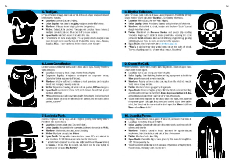
Let's talk about the art because it's excellent. The style resembles Matisse cutouts, Bauhaus, and Saul Bass. In other words, it's geometric and expressive. The character portraits benefit from this, especially because it means the occasional but exaggerated features get to the table un-muddled.
Try describing any of those characters to your players. "This guy's got a middle part and a dumb smile. This guy has a collared shirt like a priest, a butt chin, and looks at you with big eyes. And that woman over there? You can't even see her eyes past her ball cap. She looks unenthused."
Other takeaways from this art:
- Simple but essential forms convey information quickly. This reinforces the game's overall form factor and Mothership's use-at-the-table design ethos.
- The art style resembles "Anatomy of a Murder" and early mid-century post-industrial art and propaganda. In my opinion, this relationship only makes the union/industrial setting and mystery more prominent.
- It's fresh. Nothing in the Mothership resembles this. And yet, it still makes sense. The roots of this art and Mothership's influences are the same: industry, obsession with manufacturing and raw materials, capitalism, and anxiety and abandonment of more romantic or impressionist sentimentality.
Writing and design strike a balance.
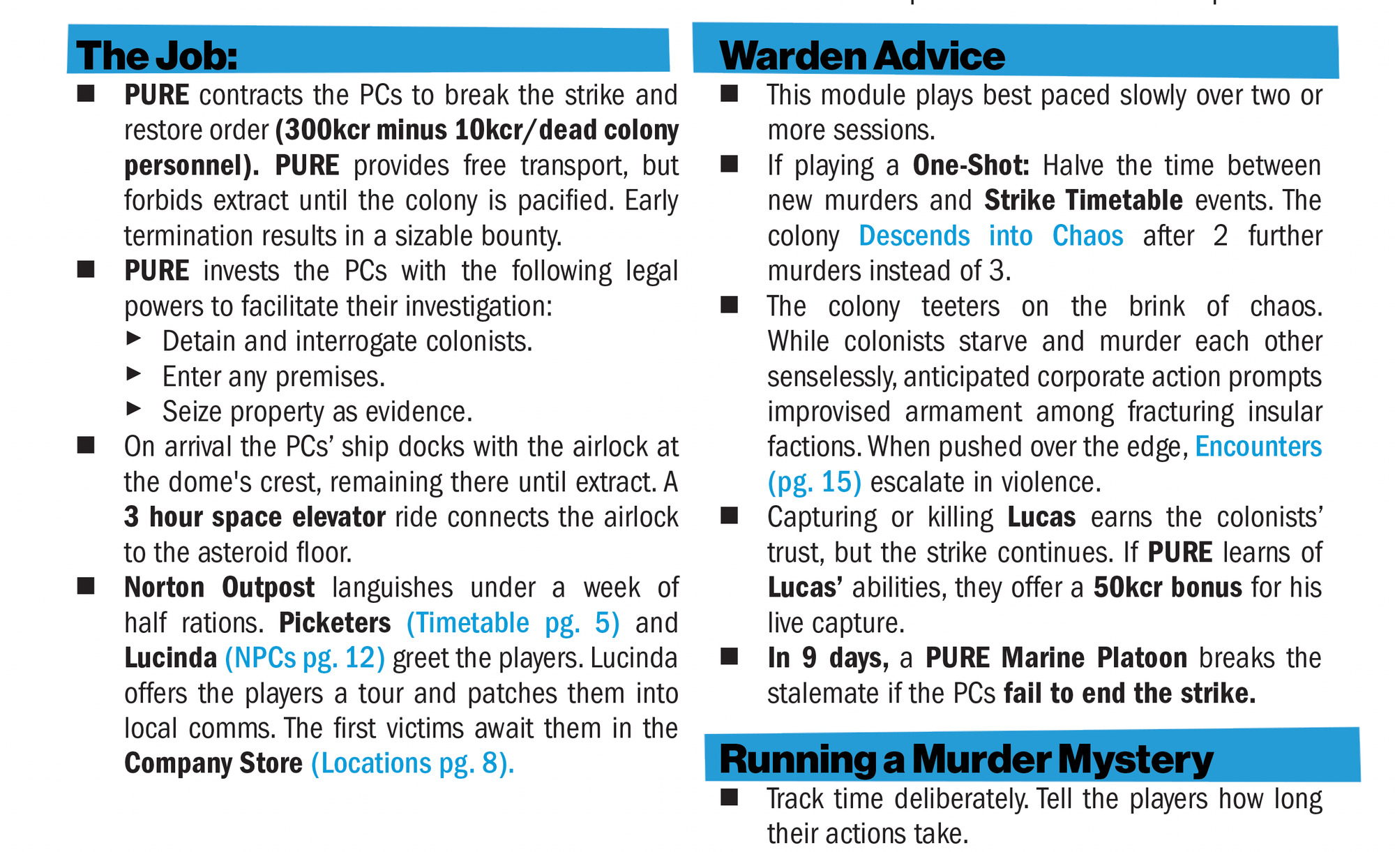
The adventure design is deceptively good and follows my preferred recipe for adventures: a cool concept, a simple goal, and a pile of interactive elements that wait around like powder kegs.
The writing is dry but not inert. Simple sentences with choice verbs and descriptions keep the action moving. You will not be reading this zine before bed, racing to see what Emily comes up with next. While that's great for other reasons, this zine is about getting the adventure onto the table between the chips and dip. The fewer the words, the fewer elements that get lost in transmission.
What I like about this adventure is how volatile everything is. NPCs die like fruit flies and light fuses on their way out. One death might spark a riot, while another will lead to a literal nuclear meltdown. Odds are both will happen at the same time.
Elements like these don't need much to be exciting. Just light 'em and run.
Layout and type are left un-mined.
Unfortunately, the layout leaves me feeling unsatisfied. It's not bad by any stretch. The graphic design preserves everything, so you won't struggle to read this zine, find important information, or enjoy the other elements.
The problem is that it doesn't feel bespoke to this adventure or Mothership. And it's not expressive enough to make the zine more than it already is. Layout and typesetting should reinforce what the other elements (art, writing, and mechanics) are doing or add a new dimension.
Typefaces
The typefaces in this zine are Franklin Gothic (body), Neue Haas Grotesk (h2), and what appears to be custom hand lettering (h1). The latter does a lot of heavy lifting, linking the art and copy together.
The other two typefaces have great roots that match the art. Franklin Gothic rose out of the industrial age in the early 20th century. If we found art from the 1930s that resembled the art in Picket Line Tango, there's a good chance we'd see the original Franklin Gothic typeface there, too. The same goes for Neue Haas Grotesk—later called Helvetica—which came out in the 1950s alongside similar art movements.
The challenge here is font and typesetting. Tracking, spacing, and line width feel too tight and compressed in this zine to show off their innate personality. Neue Haas Grotesk, meanwhile, is too sterile even here. The way it rests in the blue stripes is awkward. It's not messy enough to look like it was stenciled/pasted on like the art and not neat enough to feel precise like the writing.
Graphics
Other minds will have something to say about bullet points and bolding. I don't hold any prescriptive opinions about it. I've seen all methods work well, depending on the execution. In this case, I think it does a bang-up job.
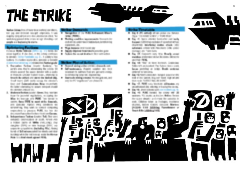
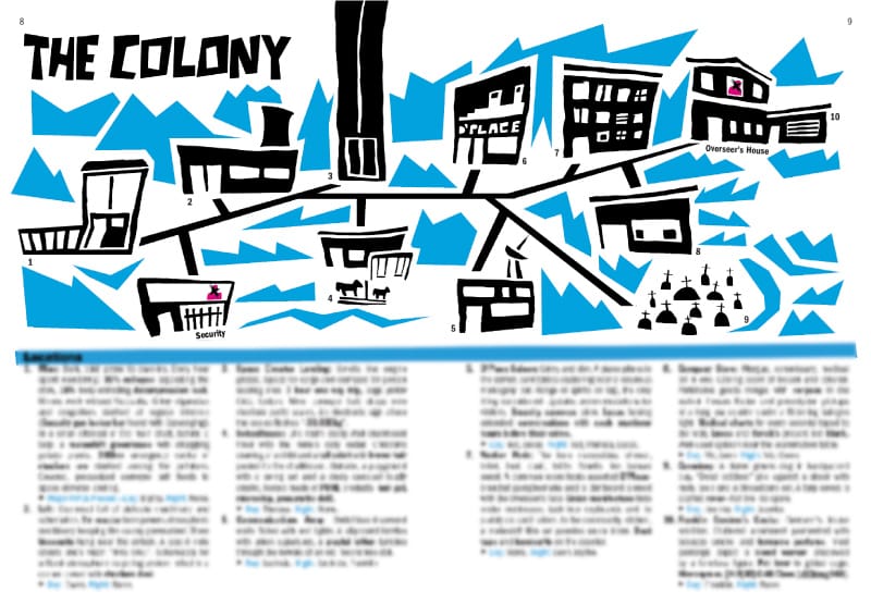
Instead, I want to talk about balance and framing. Some spreads, like the locations and characters, shine in this regard. Others suggest the team got into a bind with word counts and fitting things. For example, the "strike" spread looks lopsided. The art of the riotous workers would have made an awesome bottom-third, spread-spanning visual if it wasn't pasted over by the leftmost column.
This is why I pity every graphic designer who does layout. The pieces arrive, and the assembly is a puzzle. In Picket Line Tango, that puzzle got the best of some spreads. The layout and graphic design do a good job; their biggest problem is that they still have unmined potential.
Final Thoughts
Overall, Picket Line Tango is fantastic. It has a great conceptual idea (with some unspoiled surprises), effective writing, and stylish, idiosyncratic art. I pause at the overall construction, but if you've read Explorers long enough, you know that cool ideas will get you far. This book has a lot of cool ideas.
You can buy Picket Line Tango at DrivethruRPG to support this design studio. The affiliate link above will kick me a small percentage of the sale to fund future delves. However, if you're especially excited by this game, go directly to the source. Anodyne Printware is making some truly awesome stuff for Mothership these days.
 Anodyne Store
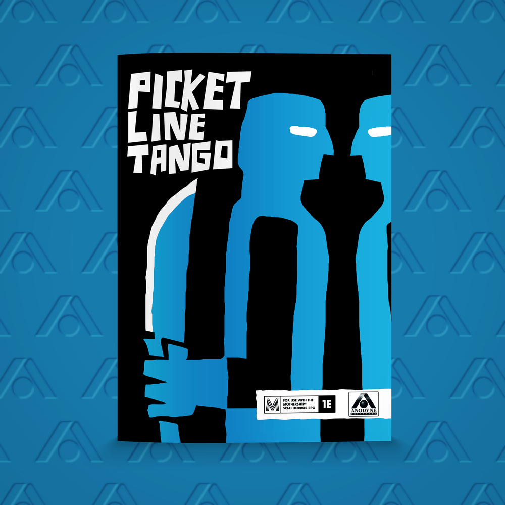
Explorers Design is a production of Clayton Notestine. If you liked this article, please consider liking, sharing, and subscribing. Members who pay just $5/month also get unlimited access to templates, tools, and resources.