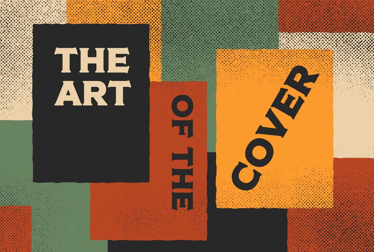
The Art of the RPG Cover
How to make your roleplaying game's cover stand out (with examples).

Judging books by their covers.
Below is the cover for the new D&D 5.5 player's handbook. It was recently unveiled by GameInformer and—like all D&D things—sparked fierce debate over whether it was good or bad on social media. Next to that cover is the original 1977 Traveller boxed set, commonly referred to as "Classic Traveller." They're very different games with very different covers. You don't have to be a designer to notice.
Putting aside "good vs bad," which is the most interesting? I think they're both interesting to look at. There's certainly nothing boring about monsters, spells, and dragons. Yet, for a lot of us, the D&D cover is fully baked. There's nothing new to see, interpret, or expect. It ticks all the boxes of being a D&D cover in a workerly way. But is that interesting?
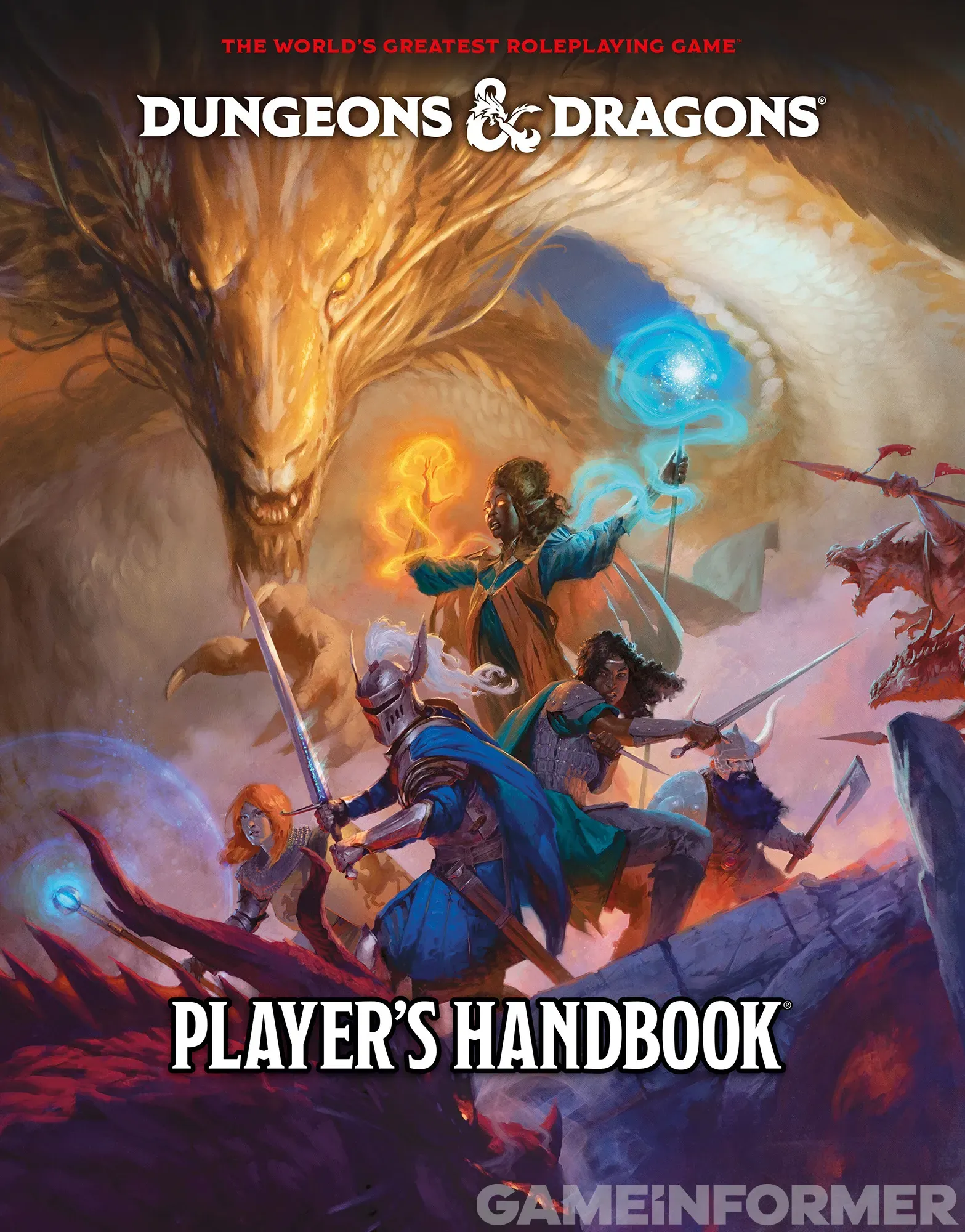
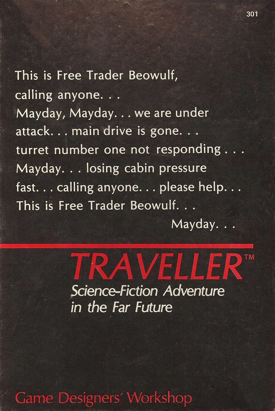
D&D 5.5 (left) and Classic Traveller (right).
Dwiz, on the blog Knight at the Opera, breaks down why many think Traveller has the best rpg cover of all time. If you're interested in learning why you should—at the very least—appreciate the old cover, give Dwiz a read.
In this article, I challenge every rpg designer to be more like Traveller. Because, if all we want to do is chase the inoffensive success of D&D, we'll end up in a world of cookie-cutter covers. To paraphrase another designer, Joshy McCroo:
"I hereby declare rpg cover art of human warrior, dwarf warrior, and elf sorceress back-to-back against overwhelming odds to be illegal."
The reason is simple: it's been done to death. I can read the posts now: "The point of a book cover is to show what the game is about. If the game is about fighting monsters, you need to show heroes fighting monsters."
That's incorrect.
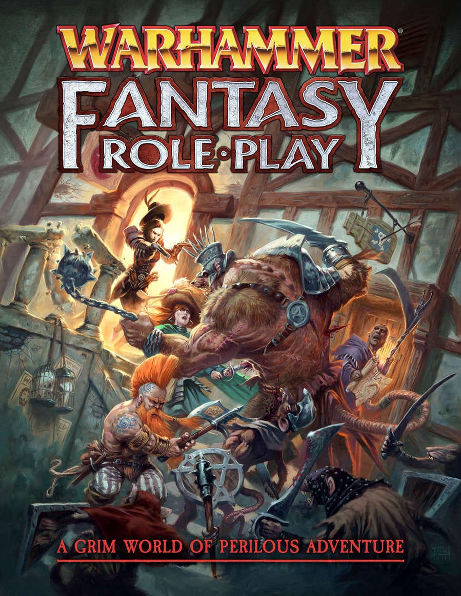
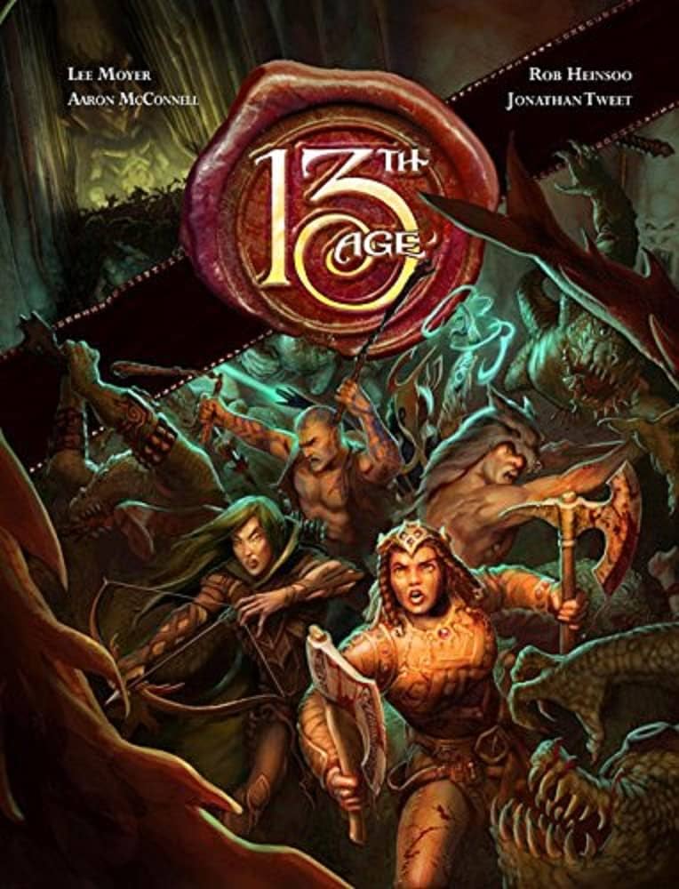
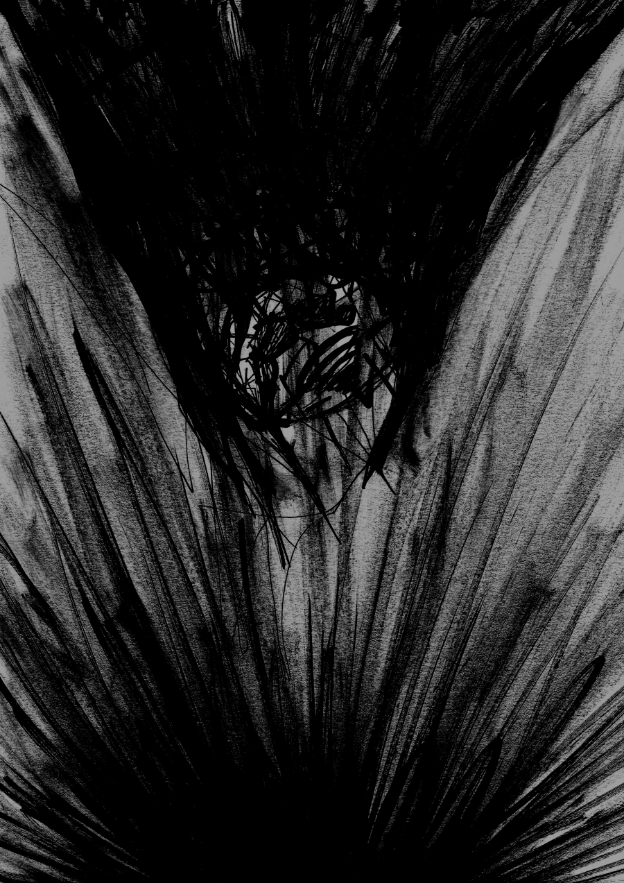
Exhibit A. Fantasy adventurers surrounded by overwhelming odds.
The point of a cover is to make your audience want to buy, read, and play your game. A top-level synopsis, or a summary of contents, is uninteresting. That's the same assumption that gives us spoilery movie trailers and floating head posters. Does it make business sense in a LinkedIn kind of way? Absolutely. Will it sell your book? Not necessarily. People buy things that excite them. Why waste the opportunity if they're not already excited through other methods?
So, what makes a cover great?
A conceptual idea. There needs to be a big idea, story, point of view, or twist. Bad covers say: I'm like the others. Great covers say the opposite. The following categories are neither exclusive nor all-inclusive, but they all have an idea behind them.
If you don't see your favorites, don't hesitate to share them in the comments or on social. The more we celebrate people taking big swings, the more amazing covers we'll see.
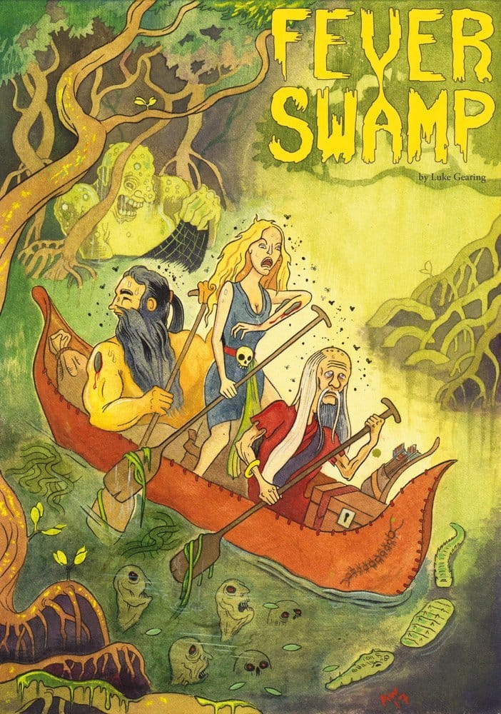
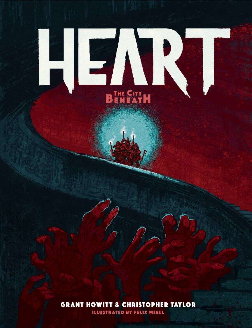
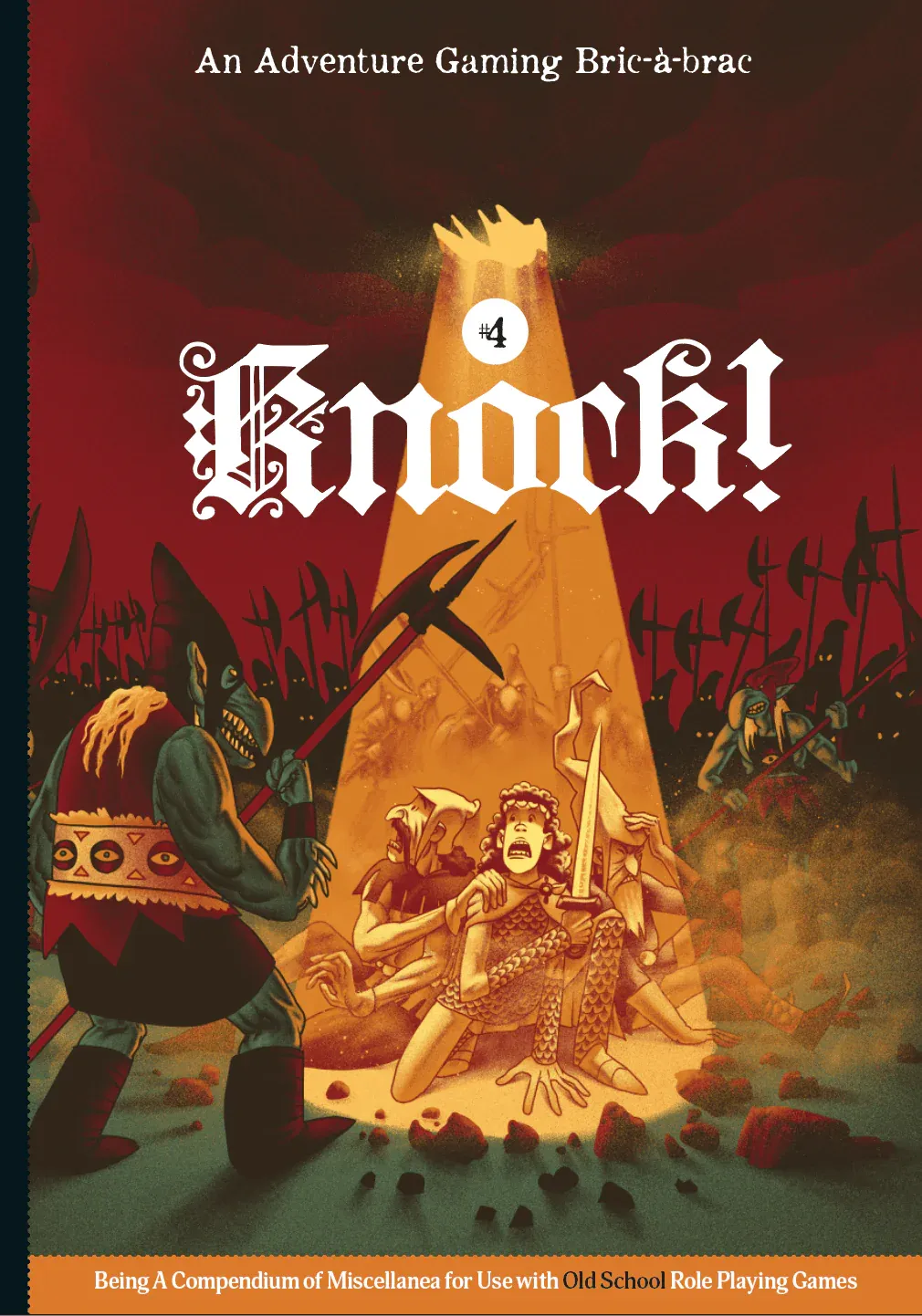
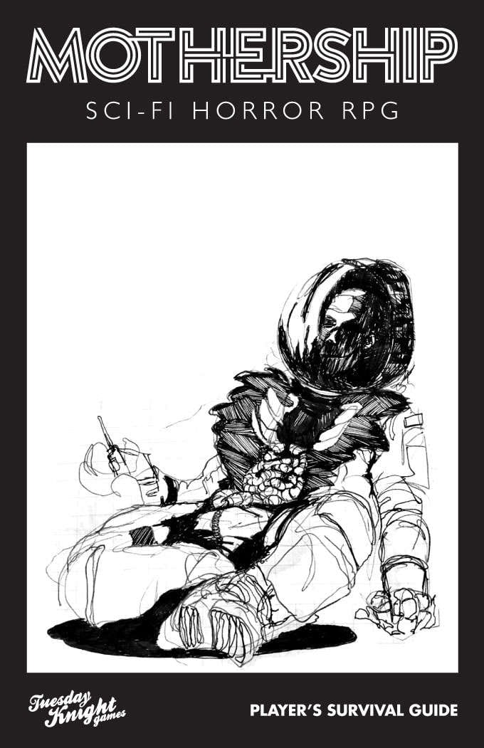
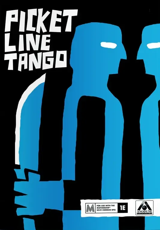
Storytelling covers (clockwise from top left): Songbirds 3E, Fever Swamp, Heart: The City Beneath, Picket Line Tango, Mothership, and Knock #4.
Great covers tell a story.
Characters, setting, plot, tone, and conflict. There are many ways to define a story, but in a cover, it usually comes down to one thing: tension. What happened? What is about to happen? What the hell is happening?
- Songbirds 3E. Talk about an evocative scene. The artist, Charlotte, knows how to capture facial expressions and create a sense of tragedy. 👁️
- Fever Swamp. Sometimes, fantasy scenes work. The trick is what you choose to depict. This cover leans hard on its setting and gives us a lot to take in. 🤒
- Heart: The City Beneath. This is another example of a fantasy scene given much-needed life. There's a metaphor here—a sense of overwhelming doom. ❤️
- Knock! Issue 4. Against all odds. Only this time, much, much worse. The composition here brings a lot of tone and tension here. Funny and relatable. 🍄
- Mothership. Simple but effective. The astronaut is dead and we can't see what killed them. The most famous technique in horror is right on the cover. 🛸
- Picket Line Tango. What better way to create tension than to show a character—who could be anyone—ready to stab you in the back? 🔪
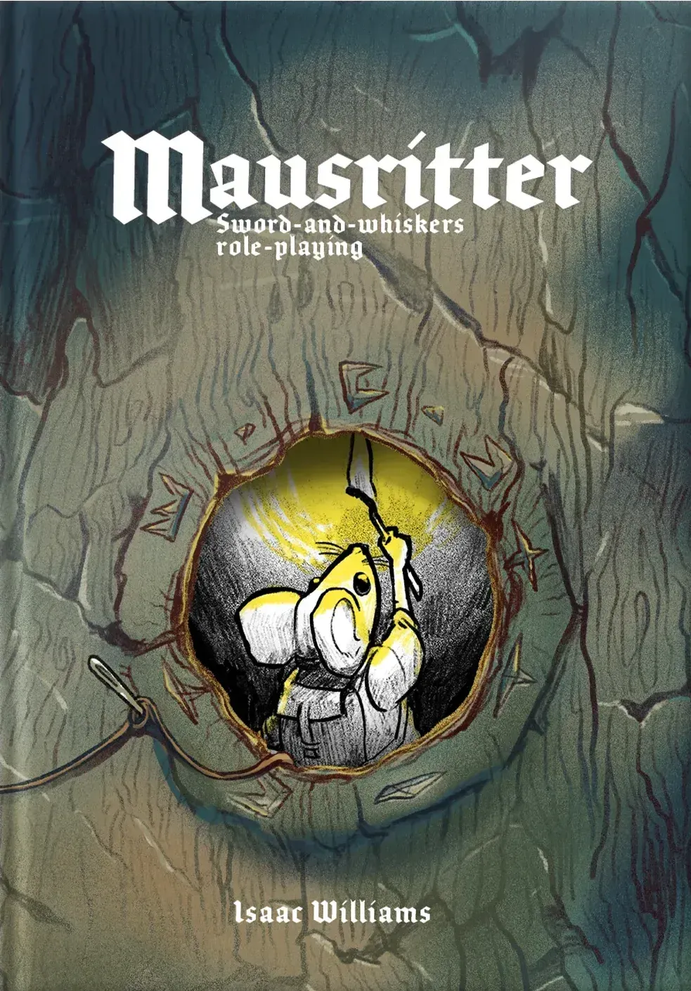
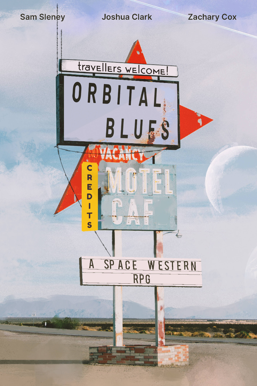
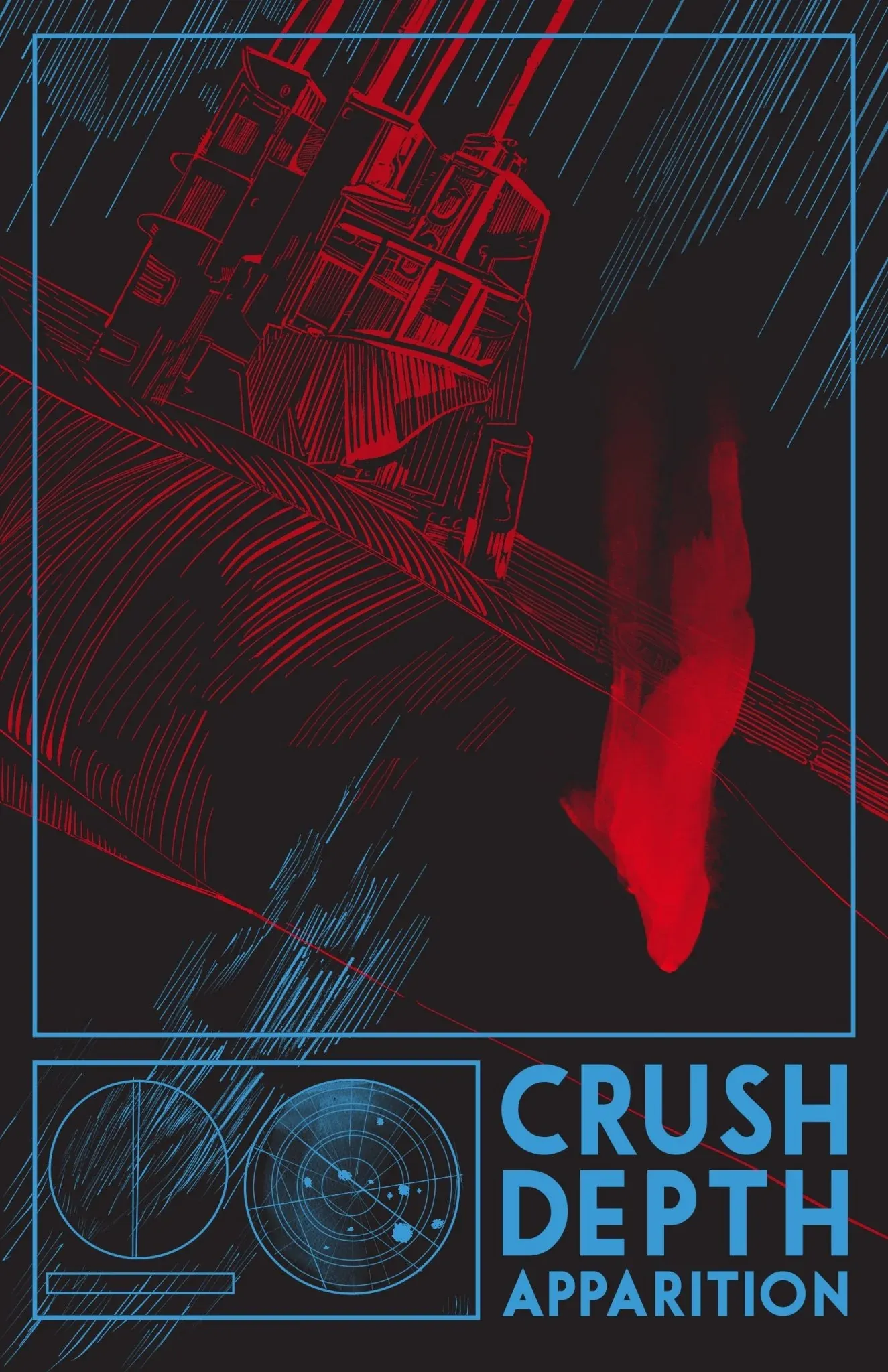
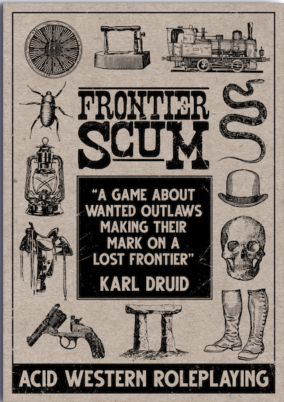
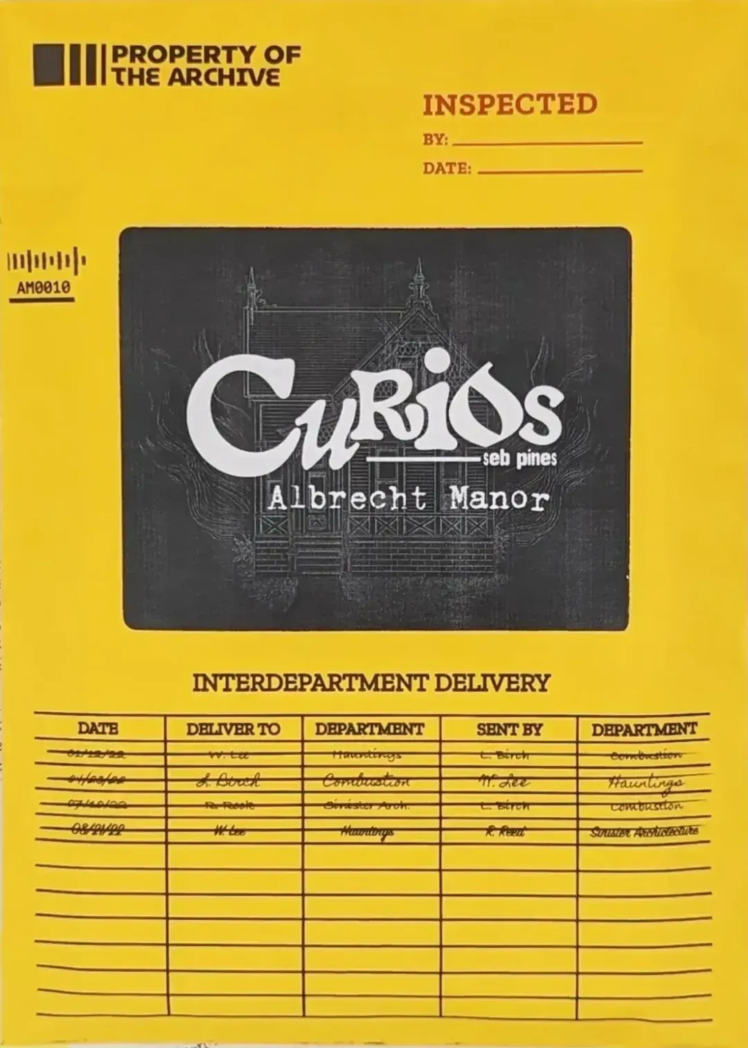
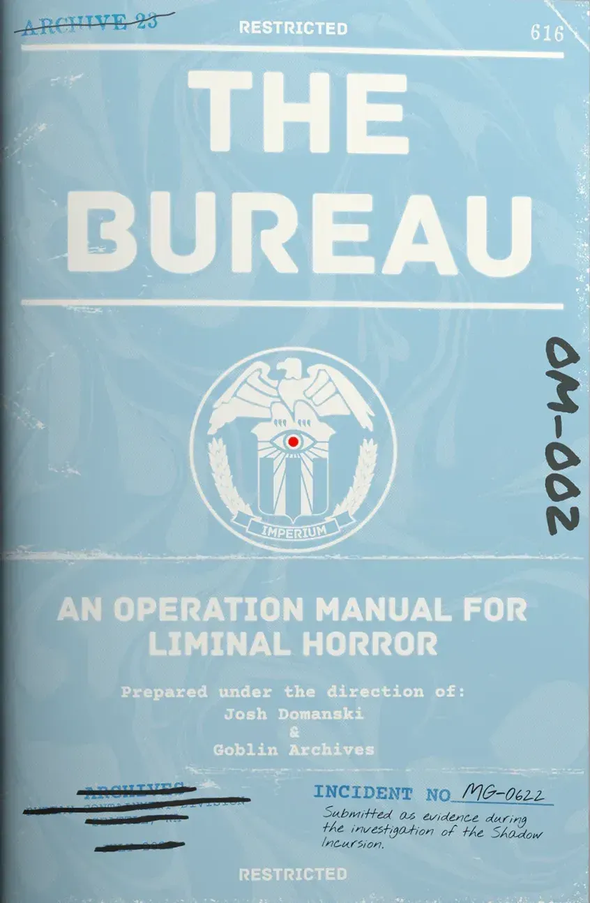
Scene-setting covers (clockwise from top left): Mausritter, Orbital Blues, Crush Depth Apparition, The Bureau, Curios, and Frontier Scum.
Great covers put us in their world.
When your game has an interesting setting, sometimes the best thing to do is lead with it. Put us in the characters' shoes or make the book physically represent the world. Either way—make the game's interior exterior.
- Mausritter. The physical book has a hole cut out of it. A literal window into the characters' world. Talk about a fast introduction to what the game is about. 🐭
- Orbital Blues. Usually, a static scene like this falls on its face, but if the setting is unique enough, like in Orbital Blues, you get away with it. 🍺
- Crush Depth Apparition. Color and dimension can do a lot of work. This cover's darkness and framing recreate the claustrophobia of its submarine. 🌊
- Frontier Scum. Like a turn-of-the-century Sears catalog. What a frustratingly simple and inevitable idea for a Western's cover. 🤠
- Curios: Albrecht Manor. Something about this cover screams case files and library return slips. I suspect that combination was the idea all along. Perfect. 🔍
- The Bureau. Many have attempted to recreate the clandestine case file aesthetic found in Control and X-Files, but few have done it as well as this. 🖨️
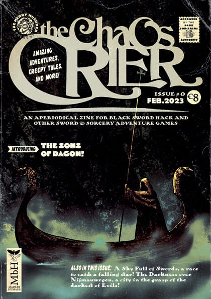
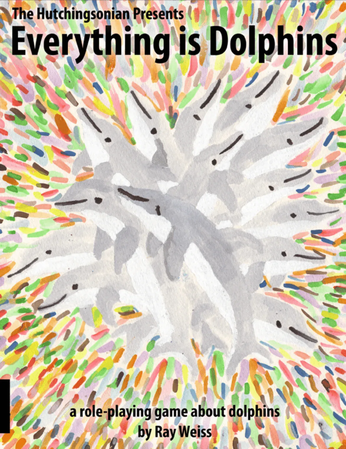
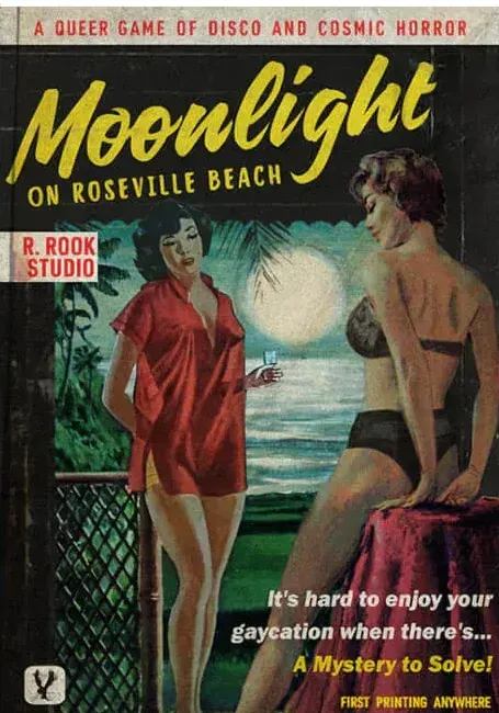
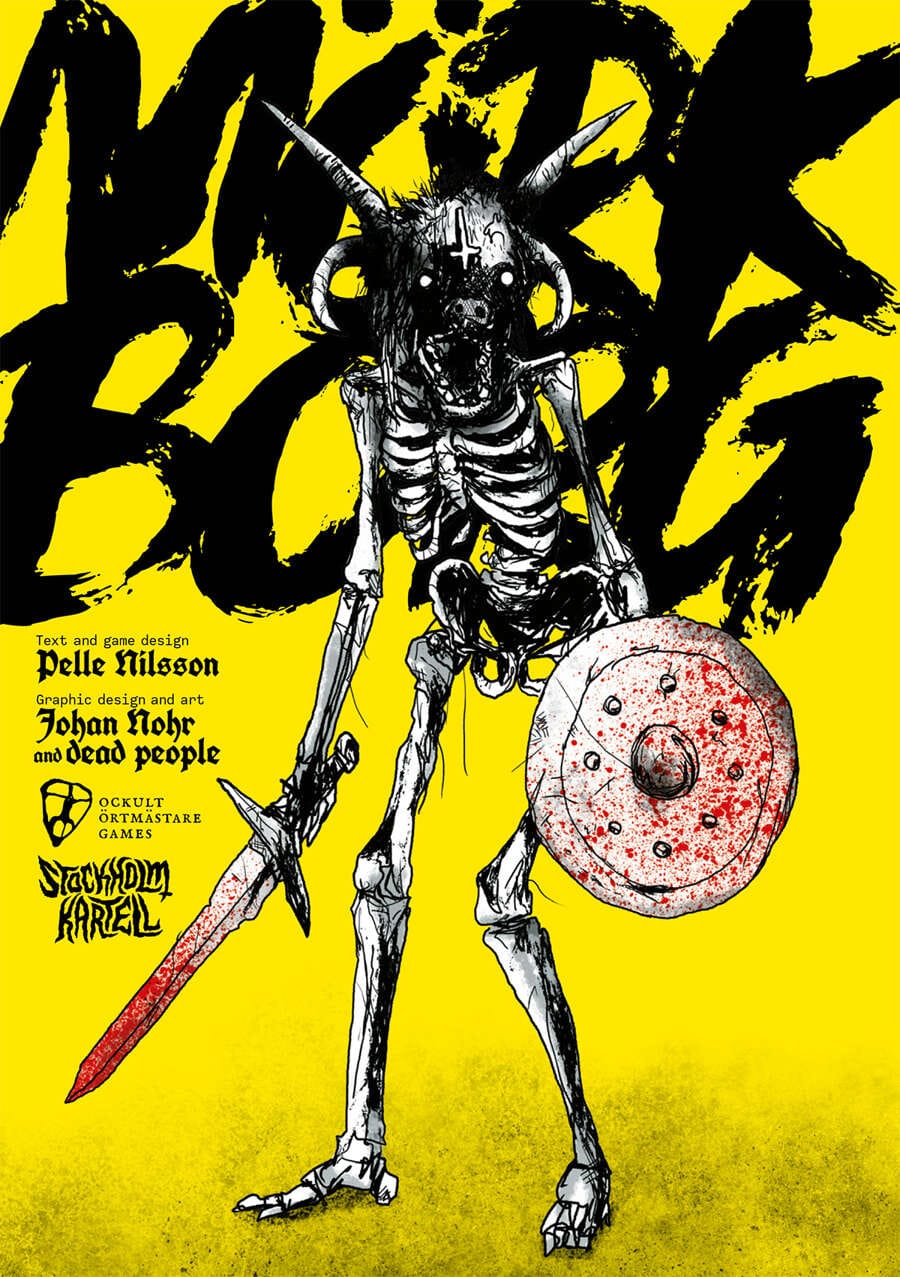
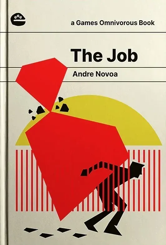
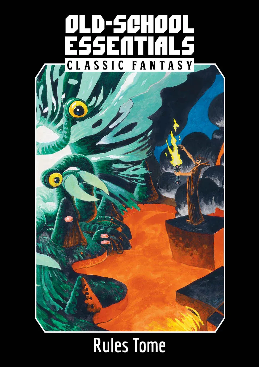
Subculture covers (clockwise from top left): Chaos Crier, Everything is Dolphins, Moonlight on Roseville Beach, OSE, The Job, and Mörk Borg.
Great covers show off their roots.
Make something out of your interests, and people with those interests will find you. But here's my theory: the more niche the interests, the more specific the articulation, and the more obscure the subculture—the more intense the fans.
- The Chaos Crier. This zine looks like it was unearthed from a stack of pulp magazines. The faux stamp, price tag, and type treatment are pure nostalgia. 🔔
- Everything is Dolphins. A cover so good it would deserve a place on any fridge. I love how unabashedly silly and childlike this cover is. 🐬
- Moonlight on Roseville Beach. I used to see covers like this every time I visited a corner store, but this was my first rotary romance in rpg form. 🫦
- Mörk Borg. Say what you want about the art direction (plenty have). This cover went up like a signal flare for chipper metalheads everywhere. 💀
- The Job. Andre Novoa found the perfect partner in Gontijo. A designer who has probably watched more stylish Italian crime capers than anyone. 💰
- Old School Essentials. We've seen many old-school covers, but OSE found a way to articulate the genre in a fresh way with the original artists. 🧙
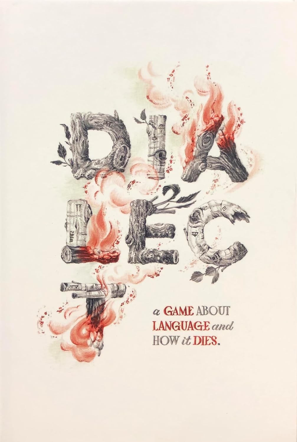
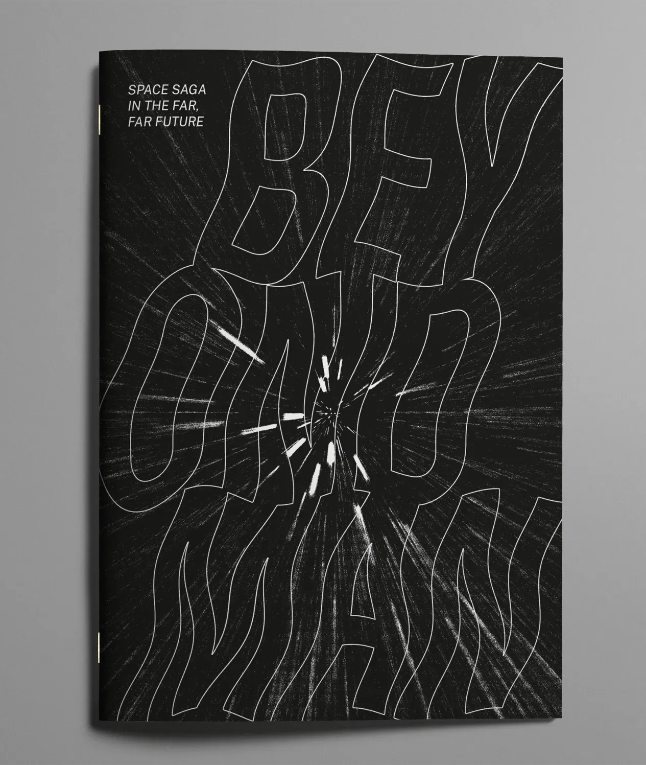
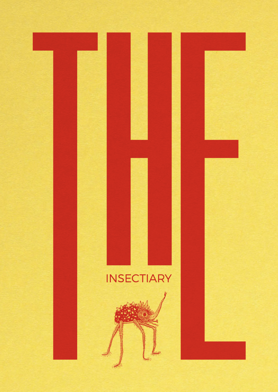
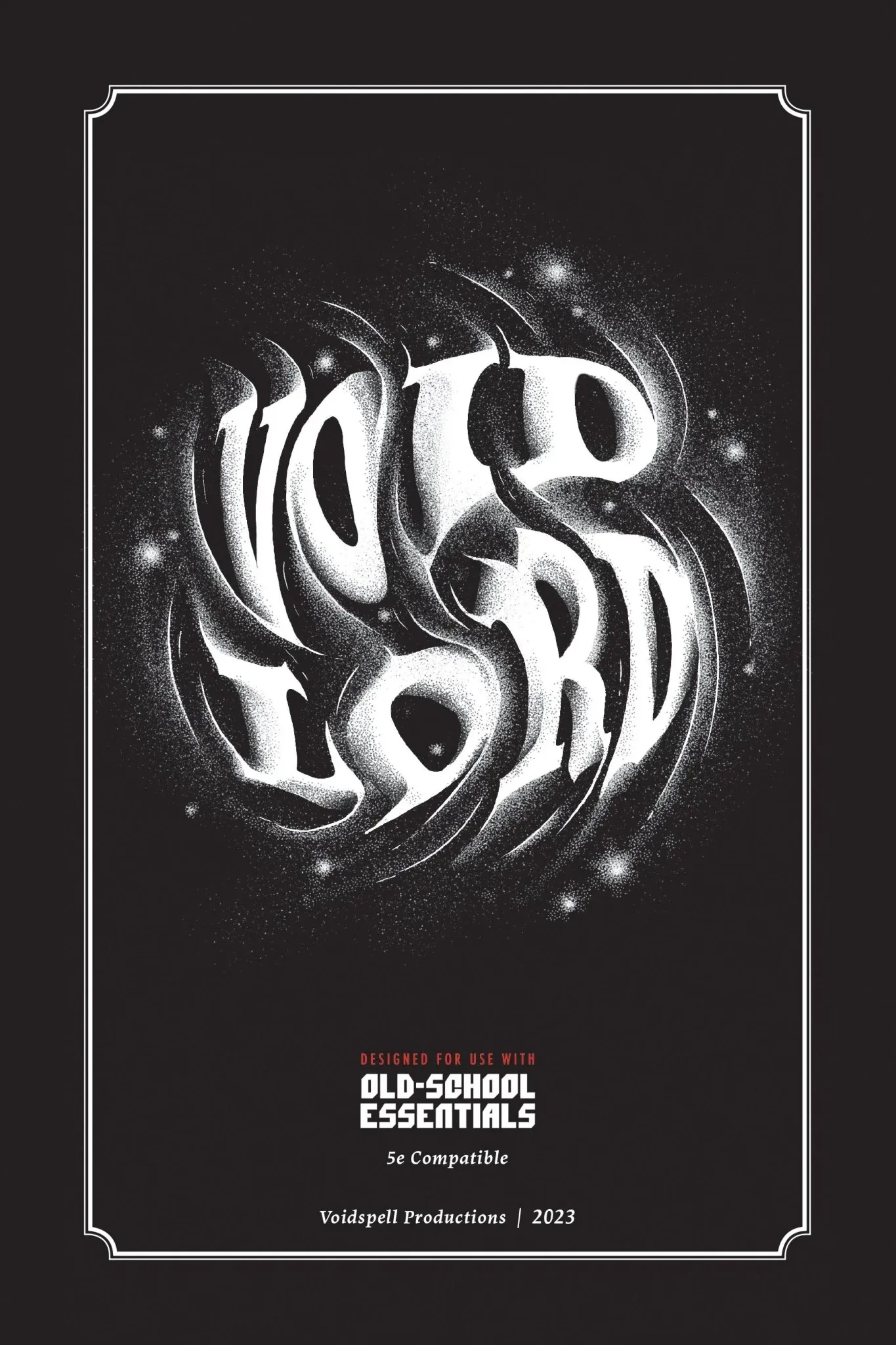
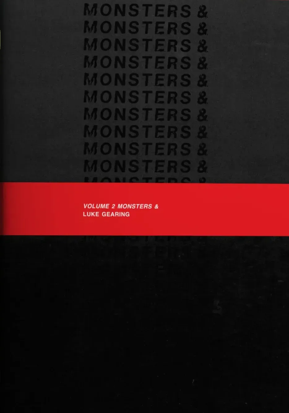
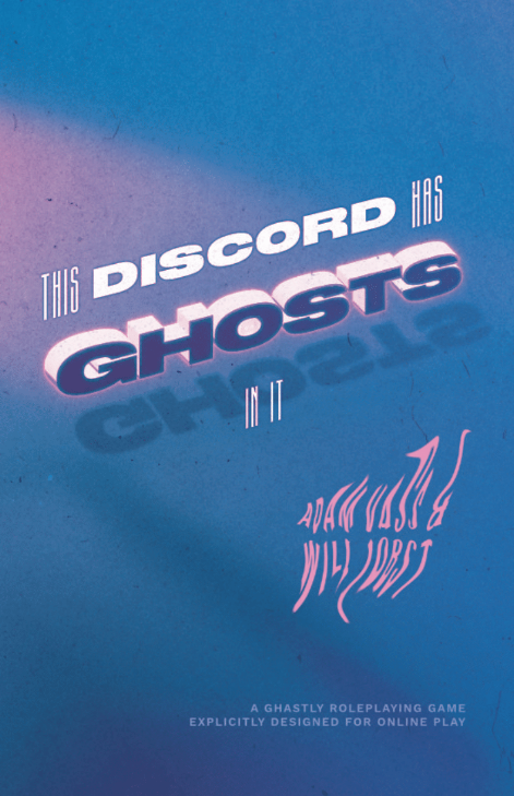
Type-driven covers (clockwise from top-left): Dialect, Beyond Man, The Insectiary, This Discord has Ghosts in It, Vol. 2 Monsters, and Void Lord.
Great covers can be type-driven.
Art gets all the glory, yet typography can also make and break a cover. As an overt layout maniac, I can't help but cheer on every rpg that chooses to lead with its title above all else. Bonus points if the title is great as well.
- Dialect. The warm colors, soft lines, and ample white space make this illustrated title sing its gentle song. The tension of life and death is palpable. 💬
- Beyond Man. I'm a sucker for gravity distortion bullshit. This cover is so simple and evocative that I'm tempted to read it right now. 🌕
- The Insectiary. Type modulates how we read. Did you read the first word like it was the most important thing ever? Did your eyes land like a bomb? 🐝
- Void Lord. The white and black here is striking. The texture makes it feel at once physical and like it's crumbling away. A great bit of art meets type. 🌑
- Volume 2 Monsters. If you know Luke Gearing, you know what you're in for. The cover chooses the reader, and this cover chooses pure word freaks. 🐉
- This Discord Has Ghosts in It. Expressive modern type that glows like neon. Adam Vass, you've done it again. 👻
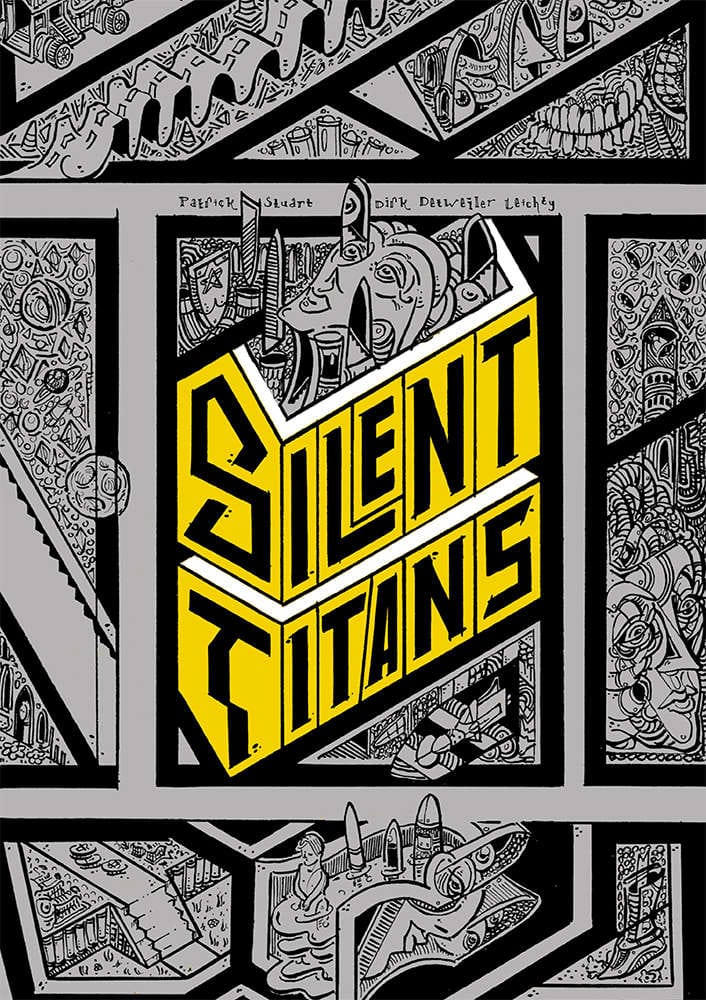
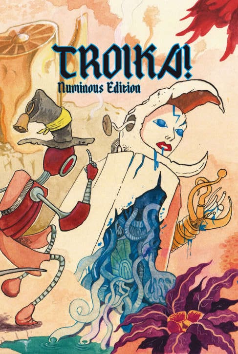
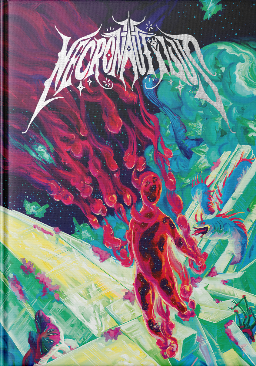
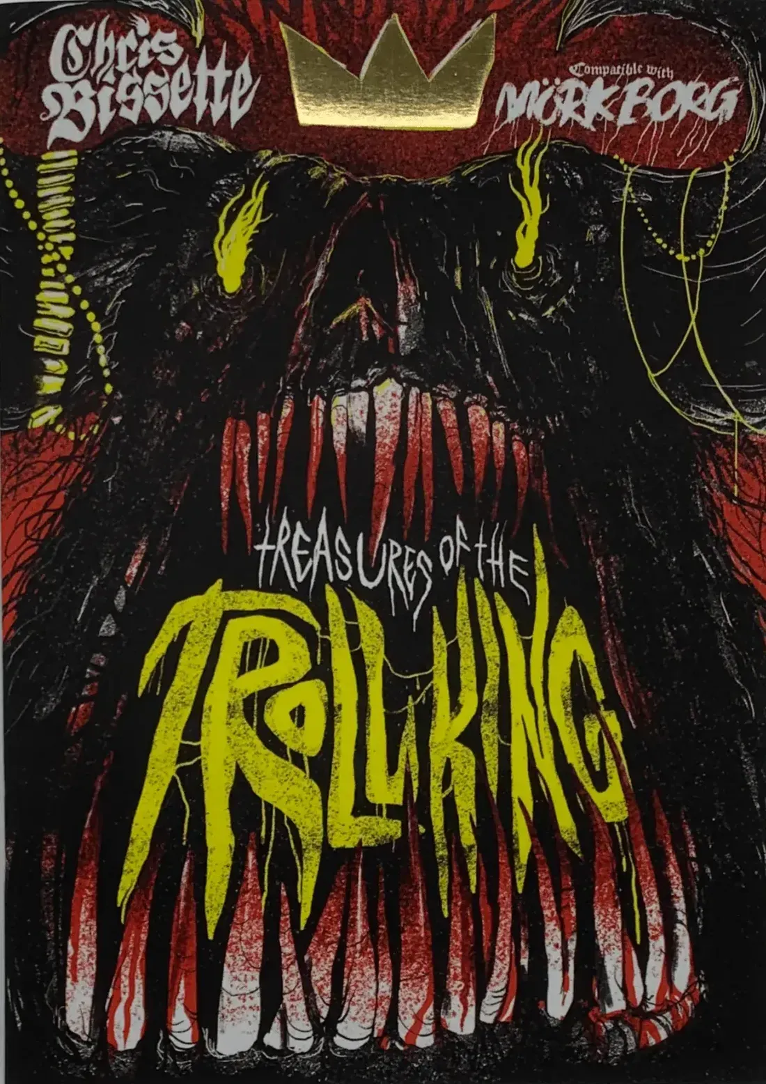
Stylish covers (clockwise from top left): Deep Carbon Observatory, Silent Titans, Troika, Troll King, Thousand Empty Light, and Necronautilus.
Great covers are not afraid of style.
An art style is more than a technique or look. Covers can be painted, scribbled, drawn—whatever. A thing's looks are only surface-level. An art style is derived from the artist. Therefore, great art styles are often about personal style.
- Deep Carbon Observatory. Talk about an evocative cover. This remaster is pure id poured onto the page. No literal depictions or complicated metaphors. 🔭
- Silent Titans. Dirk Detweiler Leichty's art is like no other. It's like if MC Escher had a baby with Shel Silverstein, then that baby dropped acid. ⏱️
- Troika! The unrestrained, playful gonzo of Troika found its match wit. h this cover. What's happening? No one knows. And the interior won't have answers. 🌝
- Necronautilus. Never mind the typography, which could have earned a spotlight alone. The art here really does something for me. 🌌
- Thousand Empty Light. Alfred Valley has turned his photocopier aesthetic into an art form. This cover is like a dystopian Rorschach test. 👽
- Troll King. Johan Nohr's visual style mirrors the texture and excitement of Chris Bissette's writing and game design. A pairing I want to see more of. 🧌
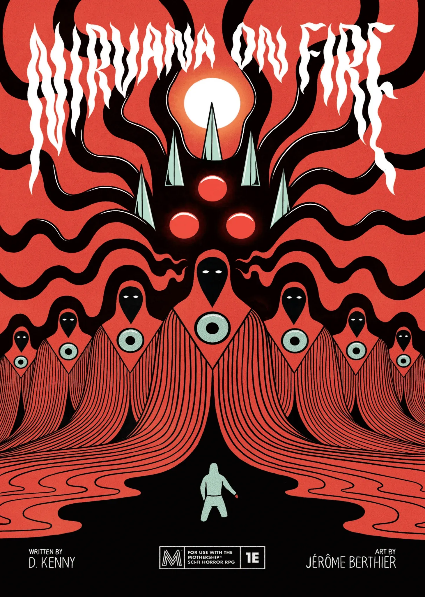
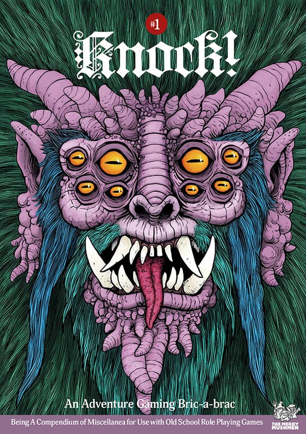
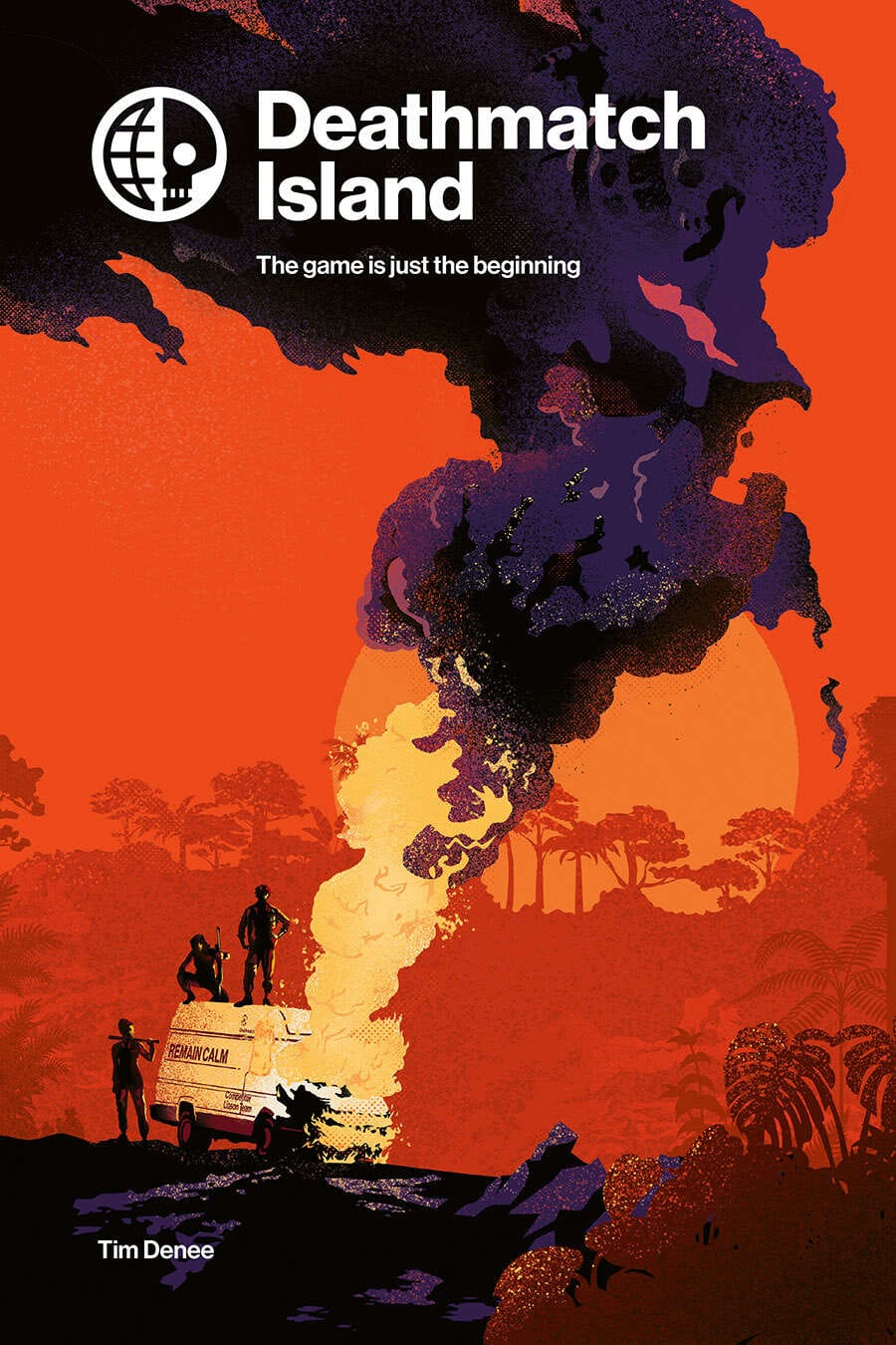
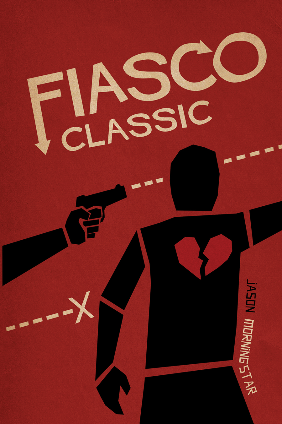
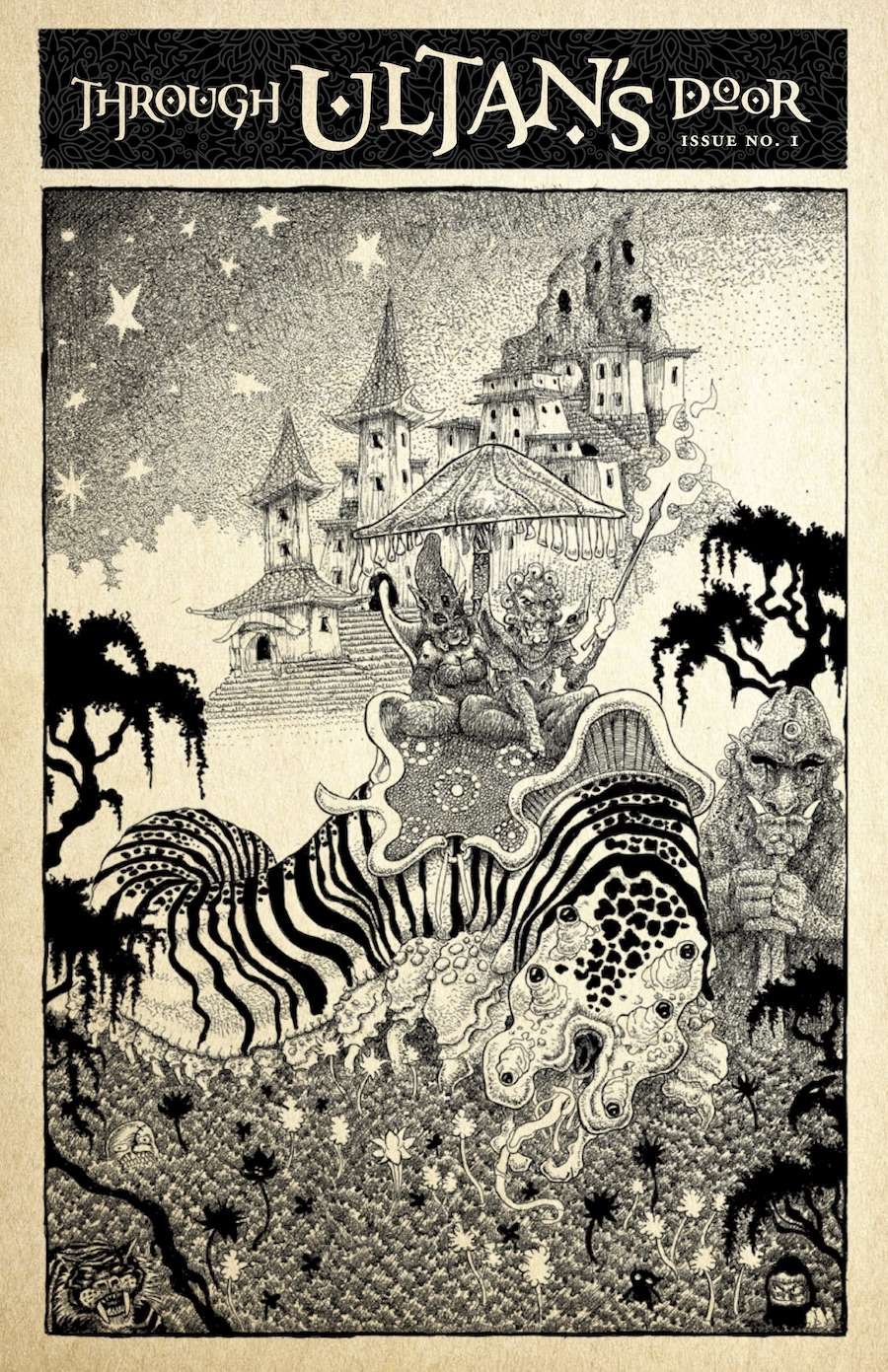
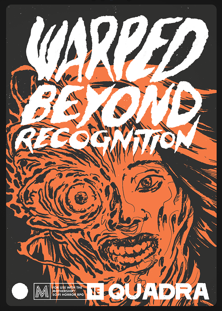
Niche covers (clockwise from top left): Nirvana on Fire, Knock #1, Deathmatch Island, Warped Beyond Recognition, Through Ultan's Door, and Fiasco.
Great covers aren't for everyone.
Don't bother attempting a cover that will work for everyone. Nothing survives in the desert of indifference. Leave the cynical, impersonal, risk-averse work to Artificial Intelligence and those who insist on using it. They make terrible players.
- Nirvana on Fire. The simple geometric shapes, stark colors, and vector-like lines might not fly with a grittier crowd, but they mesmerized me immediately. 🔥
- Knock! Issue 1. This ugly mug has a face only an old-school, blog-reading sicko like me could love. Turns out there are dozens of us. Dozens! 🍄
- Deathmatch Island. This cover doesn't even capture the sheer beauty of this book—but it does a good job of telling a story in a stylized way. 🏝️
- Fiasco. If Saul Bass movie posters live rent-free in your head, odds are you're the right audience for Fiasco's darkly comic but cinematic schtick. 🔫
- Through Ultan's Door. This zine holds a special place in my heart for going full baroque when the OSR mainstream was still loyal to the AD&D house style. 🚪
- Warped Beyond Recognition. Body horror. It might deter some, but it's a calling card for greats like Cronenberg and Rob Bottin in the horror genre. 🧑🚀
Final thoughts on book covers.
Hundreds of worthy rpgs didn't end up in this blog post. The one commonality across all of them was that they committed to an idea and took chances. At the end of the day, that's my biggest challenge to designers everywhere: take chances. Make something you like. Don't worry about what others like.
If you're looking for hard, tactical advice, here are some takeaways:
- Plan your title's placement ahead of time. Don't commission the art without making space for it (or, better yet, pay the artist to incorporate it).
- Consider hiring someone to do the typography separately. Some designers can make versions of your cover's typography as wordmarks or logos.
- Titles near the top of the book's cover are easier to read and will be more visible on a bookshelf where other books might end up in front of it.
- Keep logos small (unless going big is part of the idea). Look at other non-rpg books for reference. Oversized logos will make your game look cheap.
- If you depict a scene from the game, depict the scenes that emerge naturally from rules. Avoid generic scenes that any game could recreate.
- Always print out your covers, set them down, then judge from afar.
- Check colors for accessibility. Compliant color combinations can't hurt.
- Don't be afraid of white space. Empty space can enhance other elements.
- Follow common design principles like hierarchy, proportion, and more.
- Don't be afraid to break the rules.
Thanks for reading.
Explorers Design is a production of Clayton Notestine. If you liked this article, please consider liking, sharing, and subscribing. Members who pay just $5/month also get unlimited access to templates, tools, and resources.