Typography 101: Getting Started
Beginner tips and tricks for setting up, arranging, and pairing your game's typography.
Typography is the art of arranging text to make it legible, readable, and evocative. It's one of the most daunting parts of graphic design, because if your type is bad, the rest of the design will look bad, too.
I've resisted writing about it for a long time, because there are hundreds of books and websites about typography. This article is a remix and adaptation of those texts, with some modifications for our particular art form. If you're interested in the original sources, you'll be happy to know I cite them throughout.
What's a typeface and what's a font?
You might have noticed the terms used interchangeably. That's fine. Most designers I know say "fonts." The mass adoption of software like Microsoft Word popularized the word "fonts" to mean typeface. Only the most pedantic designer would correct you. That is, except for instances where it's important. This is one of those times.
Typeface. A typeface is what many call a font. It's the overall design for a set of letters, numbers, and glyphs. Helvetica, Time New Roman, and Garamond are examples of typefaces. Typefaces with lots of variations often get called "Type families."
Fonts. Unlike a typeface, fonts are specific variations of a typeface with common traits. Helvetica is a typeface, but Helvetica Bold, Helvetica Italic, and the other variations are fonts of the Helvetica typeface.
Here's why knowing the difference matters:
- Typeface will give you more accurate and knowledgable results on Google.
- Recognizing typefaces trains the eye and makes you better at pairing them.
- Most projects use multiple fonts from the same typeface.
Six essentials of good typography.
This list was adapted from Butterick's Practical Typography. It may feel overly prescriptive, but in reality there are millions of opportunities for self- expression in these six essentials. The more experienced you get, the easier it will be to stray from this framework.
Rules can only raise the floor in design. If you want to raise the ceiling, you have to break the rules—and it helps to know them before you break them.
- Body Text. It's the foundation of every good book and zine. It might be enticing to start with the cool looking headers, but you'll save yourself a lot of headaches if you start here. Find a good typeface and hammer down the details like size, spacing, and length. Once you have your body text, you can build out the rest of your book including the grid system.
- Point Size. How big is the font? The most comfortable range for body text is usually 10–12 points in print. Digitally, it's 15–25 pixels. In games, we tend to make our type too small or too big. When in doubt, compare your text to non-rpg books. And be careful: point size is relative, it changes from typeface to typeface. Always test your type before committing to it. Download it, print it, and give yourself something to read.
- Line Spacing. Also called leading (rhymes with "sledding"), line spacing is the vertical distance between lines of text. It should be 120–145% of the point size, some typefaces like lots of headroom, others like a hobbit hole. On websites, use values like percentages. In word processors, use an exact point value.
- Line Length. The horizontal width of the text block has a massive impact on readability. Line length should be an average of 45–75 characters per line (use the word counter). Some designers say you can go as high as 90, but in rpgs, our text is more mechanical and often benefits from paragraph breaks.
- Functionality. There are lots of ways your type can work against you, and while type choice is responsible for most headaches—it's better to start thinking about functionality now. Avoid common pitfalls. Your body text should be easy on the eyes, easy to read, and not too flashy. Let your game stand out with its mechanics, writing, and art. Don't make the text extreme to compensate.
- Type Choice. The last and most challenging part of good typography is picking the right typeface. It should be thematic, accessible, easy to read, and versatile. There are many things to look for when choosing fonts.
Typography search checklist.
I won't lie, finding the right typeface is hell. If you're indecisive, you can spend days looking. That's why it's important to focus on the body text. It's always easier to find something specific. Once you have your foundational text, you can look for good pairings.
Here's what you should look for when choosing body text:
Type that supports the project. Every typeface has a personality and functionality derived from its history, purpose, and aesthetics. When picking a typeface, you want this context and function to reinforce your project.
- Context. Audiences have opinions and expectations. Even the most obscure typeface is going to tap into these associations for good or ill.
- Function. Typefaces are often made for a purpose. Think of fonts made for programming or signage. This function can also serve your project's needs.
Type that is comprehensive. You'll want a typeface that is versatile. That's means built for your immediate needs and future applications. (You never know, you might want to translate your game into a new language!)
- Multi-language support. Bare minimum, you want all the accent marks and ligatures found in other languages. Special characters are a bonus.
- Basic weights and styles. Some typefaces don't have italic, bold, or even regular weights. You'll want them all. Variable typefaces are even better.
- Complete set of glyphs. If you're using a typeface for the body, you need lowercase, uppercase, small caps, and numbers. Always check your fonts.
- Complete punctuation. Make sure you have more than just periods and commas. You'll want apostraphes, hash marks, accent marks, and more.
- Bonus: Alternative glyphs. Alternate glyphs are substitute letterforms for special situations. Think of combined letters or stylistic alternatives.
- Bonus: Alternative widths. Some typefaces come with wide, narrow, and condensed versions that are especially useful as headers and titles.
- Bonus: Optical sizes. Our eyes percieve things differently when they change size. Some typefaces account for this with stylistic tweaks.
Reliable usage licenses. Don't trust random websites. You want a license that grants you the right to use the type in commercial projects. Any good font will include a text file when you download it that spells out your rights as a user.
Legibility and readability. Legibility refers to how easily the reader can distinguish between letters, while readability refers to how easy it is to understand the actual text. Both of these can be tested by demoing the text with a writing sample.
Compatibility. Last but not least, you want your type to pair well with others. This requires a balance between harmony and contrast with the other typefaces.
How to incorporate other typefaces.
Body text is one part of the game's visual design. Once you have it settled, you'll need titles, subtitles, headers, and page numbers. Depending on the game, you might even need captions, sidebars, footnotes, and more. This part of the process is the hardest because it requires practice. Your first few attempts at pairing typefaces will be terrible. However, if you take your time to set up the body text, it'll be exponentially easier.
What makes typefaces pair well together?
The secret to pairing typefaces is balance. You want the other typefaces to contrast with the typeface in the body while still complimenting its overall look and feel. Unfortunately, it's not a science. It's an art that requires experimentation.
In the Explorers Design Method we incorporate new design elements by looking at context and function. That same principle applies here. Every typeface has a history of patterns, aesthetics, and theory baked into them.
Contextually, typefaces belong to a time period, have reputations, and reflect the ideas, beliefs, and values of their creators. Typefaces that share context are often complimentary in some way.
Functionally, typefaces are built for a purpose in specific conditions. Some typefaces were made for early computer screens. Others were made using the same machinery. Typefaces that are functionally similar tend to compliment each other.
Here are some examples of typefaces and what they bring to a project:
Helvetica Neue. This is a re-invention of the Swiss sans serif typeface. It's made to be neutral and is the de-facto typeface for signage, professional documents, and material design. It pairs well with other Swiss typefaces and likes to play the silent partner to more expressive type partners.
EB Garamond. This all-time classic has roots in the 16th century. Its chiseled serifs are synonymous with fine art, printed books, and luxury brands. It plays well with other typefaces revived from the period and does surprisingly well with thicker, more modern typefaces you'd see in a museum.
IBM Plex Sans. This relative newcomer was designed for IBM. It takes the style of American gothic typefaces (not to be confused with the painting) and fine-tunes them for use on computer screens. It's modern sensibilities and purposeful construction make it play well with other modern web fonts. It's utilitarian nature can even give flashier typefaces some much needed grounding when the two are paired together.
As you can see, history can give us a lot to think about when we're weighing our options, but context and function isn't limited to a typeface's backstory.
Here are some additional tips and tricks for pairing typefaces:
Tip #1: Consider using one type family.
Rather than try to pair different typefaces, consider using a typeface with multiple fonts. Families like IBM Plex, Noto, and Fira are so robust, you can lay out an entire book in that one typeface.
In every type family there's an ideal font for headers, footers, and more. They're made to be complimentary, so you can focus on contrast by modifying the size and weight of your elements. I highly recommend this strategy for designers who are easily overwhelmed. Some of the greatest designers in the world, insist on using one type family.
Tip #2 Look at font classifications.
Type designs are sorted into dozens of type classifications from the very basic, like serif and sans serif, to the lesser known old style, humanist, geometric, grotesque, glyphic, and transitional. Like any taxonomy, these genres blur together. Some typefaces borrow characteristics from two or more categories. You can learn more about these categories on Google fonts' classification page.
What's cool about classifications is that they often indicate how they are similar (complimentary) and dissimilar (contrasted) from each other. Humanist and old style, for example, derive their contours from the human hand, but arrive at different forms. One is a serif. The other is sans serifs. Because their roots are similar, the two categories share many pairings between them.
Tip #3 Pair type from the same designer.
Typefaces from the same designer often pair well together. This is for two reasons. One, designers make more money when they supply all the typefaces for a project. Two, type reflects the patterns, tastes, and biases of its creators. If a type designer has lots of typefaces in their portfolio, some of them will likely share idiosyncrasies.
It's not a foolproof system but it's worked for me in the past. Another benefit of looking up the designer, is that they often write about their projects, dropping ideas of what it can be paired with. Usually they're designing for a need. And sometimes that need is, "I needed a font that could pair with newsprint."
Tip #4 Steal from your inspiration.
I recommend this method for first time designers all the time: Steal. It's like a short cut for learning type. Find a book, movie poster, or website that you like and try to recreate it. Take a picture of it, import it into your design software, put a 50% transparency on the image, and try to make an exact match.
The more you do it. The less you'll have to. There's nothing wrong with mimicking others, so long as you steal from non-rpg sources and are open about it. I personally like to look at old books and catalogs. There are lots of websites for finding inspiration. Some of them even write down the fonts in use. For websites, I use a tool like Font Ninja.
Tip #5 When in doubt, try it out.
Sometimes the only way to make a decision is to try it out; create lots of variations, print it out, and see what combinations work best. Johan Nohr, the visual designer for Into the Odd Remastered, has a super intuitive method for this.
I'll outline it in a dropdown since the original Twitter thread is slowly being lost to internet rot.
The "Nohr Method" for Typesetting
- Pick a typeface. Always choose the "text" option over the display, caption, and funkier alternatives. Remember: we want to figure out the body text.
- Decide on a font. Usually, you want to use Roman, book, or regular, but sometimes light or medium works best. It depends on the typeface.
- Pick some sizes and line heights, then combine the two. Johan calls this the brute force method. You want to try out every possible combination of size and line height.
- In a separate document, create a textbox with about 800 characters. You want to read this text, so borrow a passage from your game. Then, duplicate the text box until you have a grid. Make each row a different type size and every column a different line height. The larger type-size boxes should be adjusted to 45-75 characters wide.
- Make lots of variations. Create rows and columns that aren't whole numbers. You want to explore every possible combination within 1/1oth of a point size.
- Print out your favorites. The first thing to do is eyeball it. What draws your eyes? Indicate your favorites then read them. The best options should be eye-catching and easy to read.
- Rinse and repeat. Johan takes the best from step 6, makes even finer variations, and prints them out again. Once he has a winner, he sometimes tries different letter and word spacing. These steps are pretty advanced and less necessary if you use well-designed typefaces.
- Congrats. You have the perfect typeface for your body text.
Exploring typography further.
Like I said before, a lot of this advice was adapted from other sources. It's really easy to get deep into typography. If you're looking for additional resources I recommend these websites, books, and tools.
Books:
- Butterick's Practical Typography. The six essentials of good typography is from here.
- Thinking with Type: 3rd Edition. A great text for beginners. Super approachable.
- The Elements of Typographic Style. A classic with some history mixed in.
- Stop Stealing Sheep. Erik Spiekermann's classic. Available under CC BY-ND 4.0
Websites:
- Fonts Knowledge by Google Fonts. A comprehensive guide with examples.
- Typewolf. Great for finding font pairings. Try adding "Typewolf" to Google queries.
- A Typography Cheatsheet. A comprehensive guide to using proper characters.
- Fonts in Use. An archive of typographic design, indexed by typeface, format, and topic.
- Letterform Archive. This collection is similar to Fonts in Use with an emphasis on print.
- Font Ninja. A tool and website for identifying fonts on the web.
Tools:

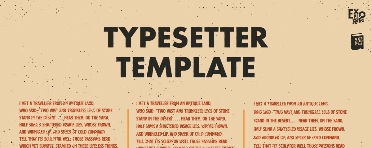
This file is useful when using The Nohr Method for typesetting.
Explorers Design is a production of Clayton Notestine. If you liked this article, please consider liking, sharing, and subscribing. Members who pay just $5/month also get unlimited access to templates, tools, and resources.


