Exploring The Royal Art Gallery Heist
A design delve into the adventure, The Royal Art Gallery Heist, and how its brevity gives it certain advantages.

You're in a design delve, an exploration into the creative work of a book, zine, or pamphlet. Our goal? The same as always: to discover the new, strange, and novel, to hone our design blades, and fill our pockets with glittering insights.
The quick pitch and play.
This system agnostic one-shot is free and available right now on Itch. It's designer and publisher, The Department of Unusual Observations, has a couple of one-shots and micro rpgs around the same length (just 4 pages!). They're longer than a bifold but shorter than a zine. It's an adventure length we don't get enough of, and it's going to be a big topic of conversation later in this design delve. But before we get to that, let's skulk into today's design delve with some opening text.
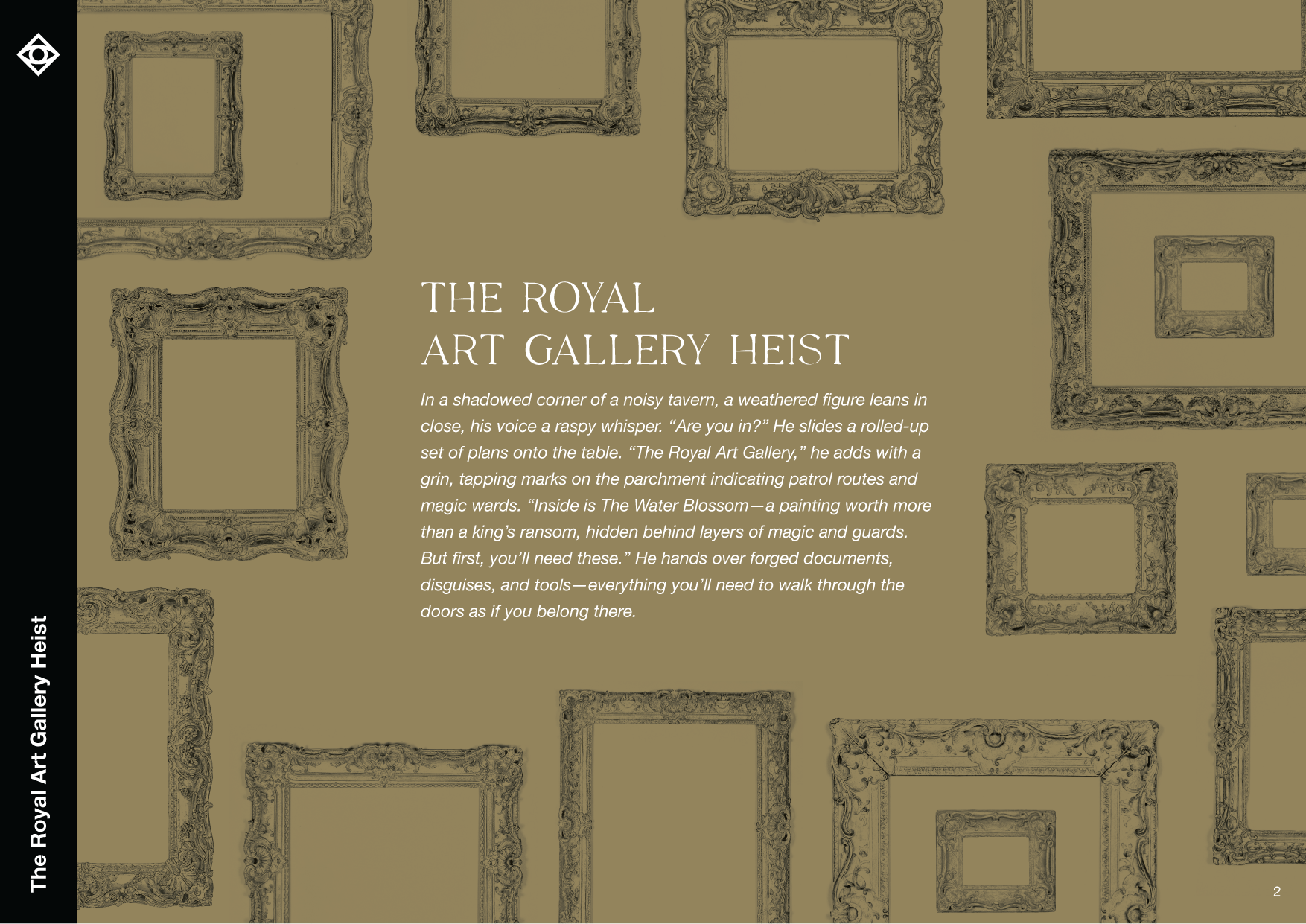
In a shadowed corner of a noisy tavern, a weathered figure leans in close, his voice a raspy whisper. “Are you in?” He slides a rolled-up set of plans onto the table. “The Royal Art Gallery,” he adds with a grin...
Talk about a familiar trope! A mysterious figure in a tavern? Call it played out if you want, but one thing is certain—it's efficient. Not only that, it's still visual. The real question is: what comes next?
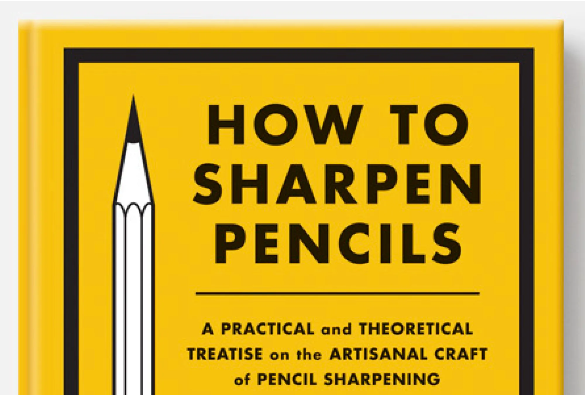
The cover of The Royal Art Gallery Heist
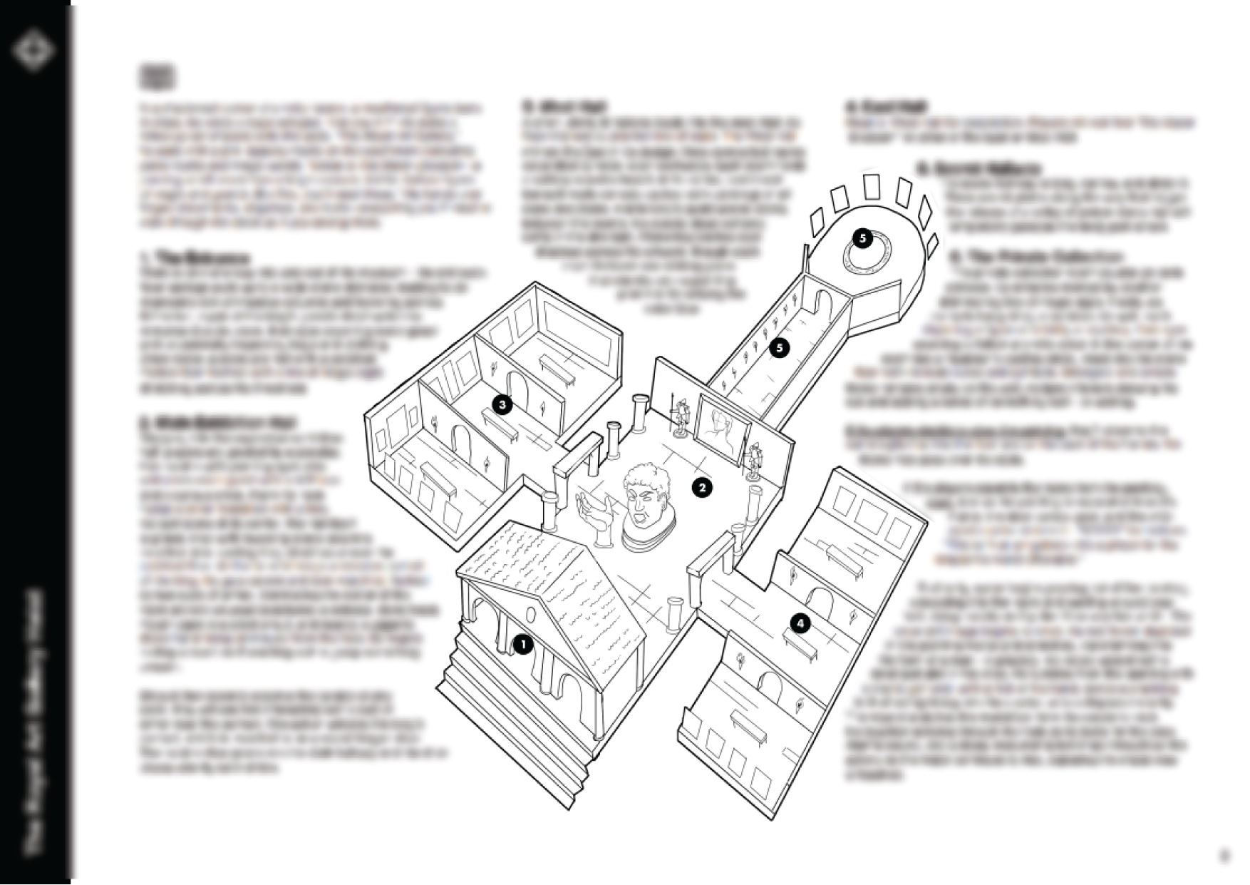
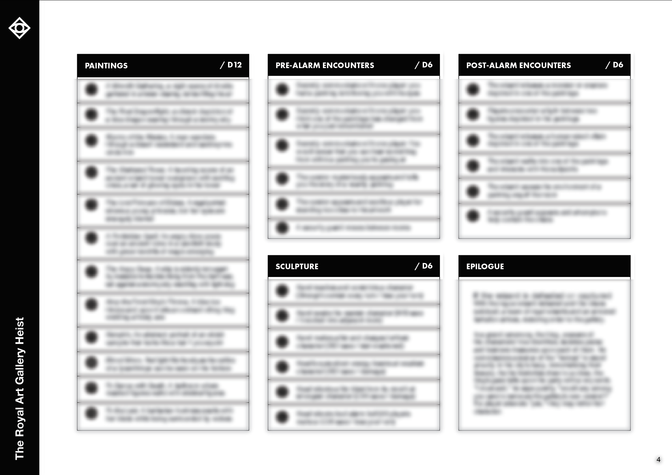
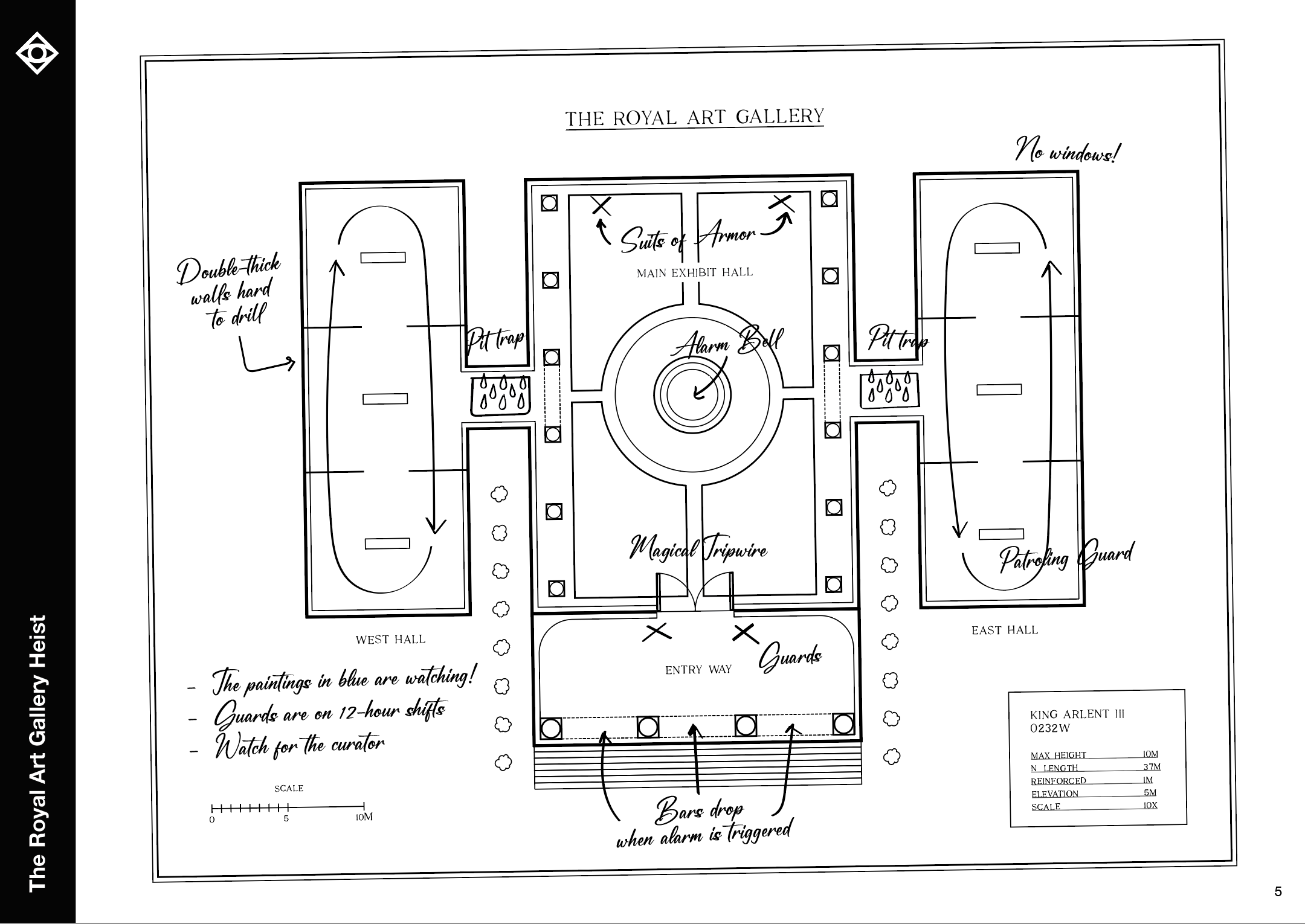
The entirety of The Royal Art Gallery Heist adventure (clockwise, starting from top-left); the intro page, adventure proper, diegetic map, and roll tables.
Delving into The Royal Art Gallery Heist
What comes after the intro page is your classic one-page adventure with a map in the center and room descriptions squeezing into whatever's left. Royal does this well—though it's still plagued with tiny type like most adventures in this format. Where it excels is in its overall visual design, which is clean, orderly, and approachable. Not one page feels overwhelming or overstuffed.
The real challenge is the overall design of the adventure itself. It's a one-shot with a lot of narrative decisions that are either serving that end or relying on it. For example, there's explicitly only one entrance to this museum, a fairly linear path through it, and—perhaps most shockingly—canned scenes at the start and end of this adventure. It's a different approach from the high-agency games I've grown used to. But is it bad? I'm not so sure. One-shots demand a certain amount of forcefulness to keep moving.
What makes this adventure work is context. The fact it's a one-shot and short means a lot of the more prescriptive, canned, and railroad-y aspects can be chalked up as play support by way of example. If this linear adventure with its assumptions and prescribed solutions were several pages longer, it would be more work to dismantle and ignore. Thus, I'm reminded of the subtle importance of page-count. Never mind the physical considerations, like binding, developmental editing, and layout. Short works meet different expectations. The more pages we add, the more expectations we rush to meet. Had this adventure been longer, I would be more critical, but at the end of the day—what can 1 page do wrong that I can't fix immediately? Not much. In particularly short adventures, I don't expect a lot of support. I don't even get them for that. I want ideas and a tiny play set to put them in. This does that well. It's brevity is its strength.
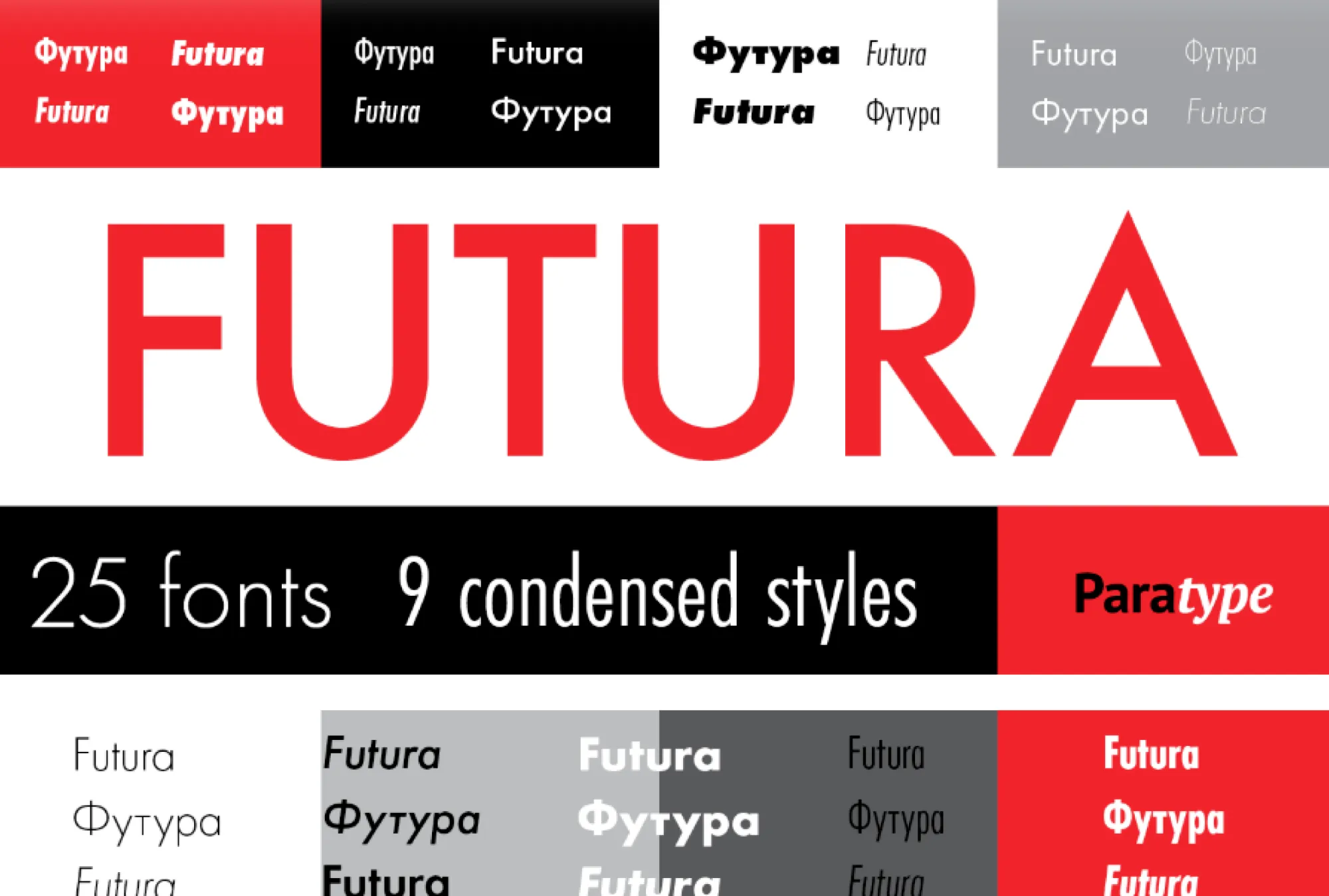
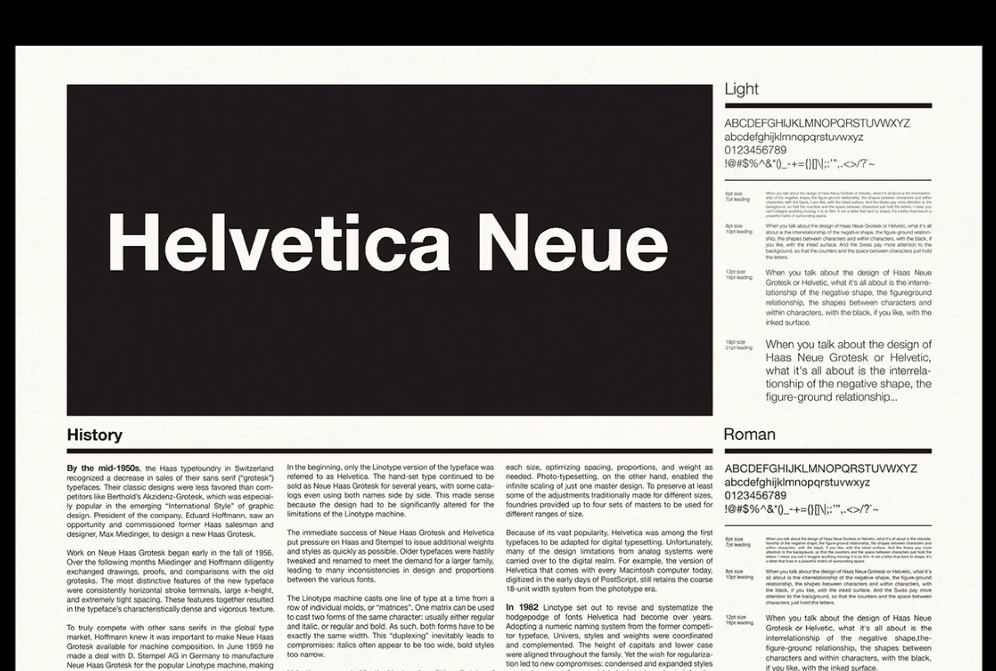
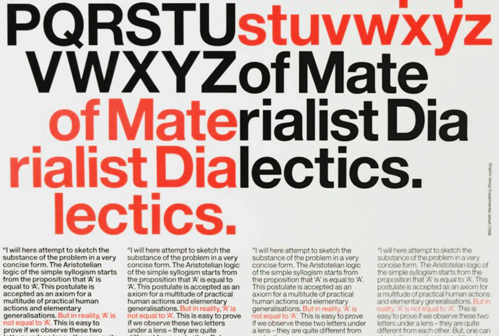
Examples of the more prominent typefaces used in The Royal Art Gallery Heist.
Design Lore
Type and layout. A lot of Department's work uses Helvetica Neue and Futura—both famous and popular type families nearly everyone (including you) are familiar with. Helvetica is a grotesk typeface. It has clean unadorned strokes in similar mono-widths from one letter to the next. It's clean, sterile, and "simple." Similarly, Futura is a geometric typeface—which means the letterforms draw on standard shapes. Both of these typefaces are a double-edged sword in this adventure.
They're a perfect choice for a system and setting agnostic adventure, but The Royal Art Gallery Heist is only one of these things. It's system agnostic but setting intentional. Fantasy with the serial numbers filed off. This works against the adventure's overall type and layout choices which are innately modern. In the text, the gallery reads like Versailles but the type is modern like MOMA. Sometimes a juxtaposition or dissonance like this creates new meaning, but in Royal's case it feels like a mismatch. There is another typeface used sparingly within the document called Seraphic, which more closely evokes the setting with its serifs and raw uneven strokes, but it's relegated to the intro prose and player handout. In the bulk of the work, it's overshadowed by the more modernist design system.
Despite those misgivings, there is a beneficial edge to this sword, and it's the functionality. The more modern typefaces are easy to read at small sizes, draw the eyes, and contrast when appropriate. Like I've written before in Typography 101, a typeface is defined by its context and function. Despite the context clashing with the overall work, these typefaces were designed to be legible and hyper functional in more pragmatic use cases. This adventure can be interpreted as one.
Design Loot
- Not every page has to be the adventure proper. Royal uses just one page for the core text. The remaining pages are an intro, random tables, and a handout. These additions flesh out the work by providing easy pacing into the work, like with the intro, or by putting general purpose gameability on the bones, like with the roll tables.
- Don't repeat things when space is scarce. The diegetic map, in addition to being a good handout, obviates the need for overly technical writing in some of the adventure. For example, guards are described in the adventure proper, but the handout actually shows their exact position and routes. In a longer adventure format, this could cause problems by separating pertinent information from each other, but in this tiny adventure it works great.
- Accent colors go a long way. There's only one color in the entire adventure that isn't black or white—it's sepia and I think it does a great job of tying the overall work together from the archival photo to the parchment-like intro page. It's one of those economical creative decisions that makes a big impact overall.
- Writing your first adventure? Start small. Not only does a short adventure have greater odds of being completed, you get more leeway for certain design decisions. This is not Department's first adventure, but it's a great example of how adventure format sets expectations.
Final Thoughts
Overall, I think this could be a good one-shot. I'd add quite a bit to it, and change how the one interactive npc works, but I could do it minutes before a session. This adventure is a great case study in the power of brevity. The less you ask from the audience, and the more you do to help them, the more grace you get.
I didn't even mention there's a twist at the end of this adventure. It's a pretty good one that could use a little more telegraphing. I won't spoil it here, but the adventure does suggest something is amiss, but in order for the environmental storytelling to work, a narrative has to emerge—as it stands, the telegraphing mostly sets a tone. It needs a little more than spooky paintings and mean statues to make the players investigate further.
You can find The Royal Art Gallery heist on Itch. It's free and worth a look. Especially if you're looking for inspiration into density and organization. Until next time, I'll keep exploring.
Explorers Design is a production of Clayton Notestine. If you liked this article, please consider liking, sharing, and subscribing. Members who pay $5/month also get access to additional tools, templates, and inspiration.