Tabletop Accessibility Checklist
A forever-unfinished list of guidelines for making analog games more accessible.

The best tabletop games are inclusive of, and accessible to as many players as possible. This long but forever-incomplete list of guidelines is derived from the Web Content Accessibility Guidelines (WCAG) 2.1 and other resources provided under the Americans with Disabilities Act (ADA). It's also heavily inspired by other accessibility resources including the Visual Accessibility Skills Toolkit (VAST), Webflow's Accessibility Checklist, the A11Y Project, and books like Giving a Damn About Accessibility.
If this is your first foray into accessibility design for tabletop games, or you want to know Explorers Design's perspective on accessibility, you can find our introduction and core thesis at the link below:
Does this checklist make my project accessible?
Completing this checklist will make your projects more accessible, but it will never make them fully accessible for all. This checklist is a starting point. It is not a replacement for testing, feedback, or hiring professional consultants.
What is the success criteria?
Most items on this checklist have a corresponding WCAG "success criterion." These parameters are specific, testable, and repeatable. They're what gives the WCAG its power to affect change. When possible, I tagged each of these rules with a relevant rule in the footnotes.
General Checklist
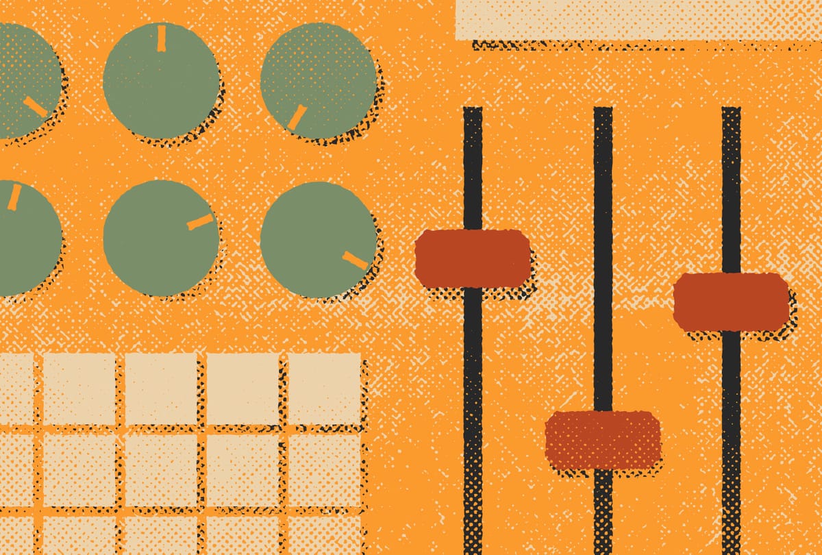
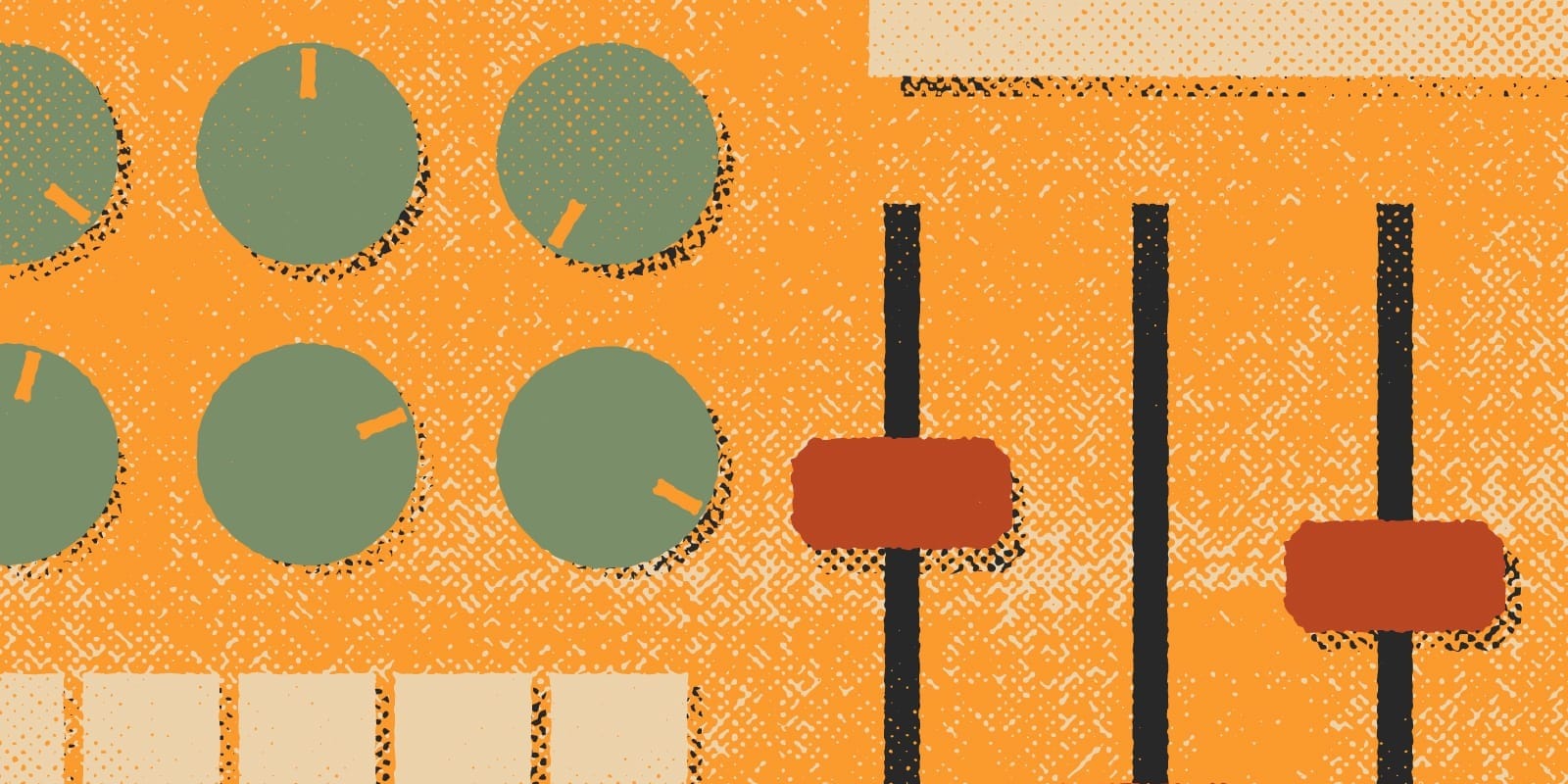
How your game looks in any given situation. This checklist is includes structure, typography, art, and more.
- Create a structured layout with hierarchy. Visual cues like contrast, symmetry, whitespace, and hierarchy convey meaning.[1]
- Use clear, sequential, and tagged headings. Unstructured content is overwhelming for anyone, but for users with screen readers it's impossible.[2]
- Optimize text for legibility and readability. Pick appropriate typefaces and fonts, and then modify them as necessary with size, width, and leading.[3]
- Add descriptions to sensory-based instructions. Rules and instructions should not rely solely on characteristics like shape, color, size, or proximity.[4]
- Create appropriate color contrast. Borders, icons, and text should have an appropriate amount of contrast (a ratio of 3:1) to other adjacent colors.[5]
- Avoid color as a sole differentiator. Color is an insufficient differentiator for players with visual impairment and cognitive limitations.[6]
- Include Alt Text for all important images. Alt text describes images to users with assistive technology and can be applied online and to PDFs.[7]
WCAG 1.3.1 Info and Relationships
Graphic Design 101: A Beginner's Glossary
Grid System 101: A Beginner's Glossary ↩︎WCAG 2.4.6 Headings and Labels
Visual Accessibility Skills Toolkit: Tags ↩︎WCAG 1.4.8 Visual Presentation
Google Fonts: Readability and Accessibility
Typography 101: Getting Started ↩︎WCAG 1.4.3 Minimum Color Contrast
WebAIM Contrast Checker ↩︎WCAG 1.1.1 Non-text Content
VAST 2.3 Objects and Alt Text in PDFs
How to Write Alt Text by Harvard University ↩︎
Website Checklist
This checklist only covers some of the basics for accommodating users and players with different abilities.
- Make all functionality available from a keyboard. Functionality with a keyboard is usable by all kinds of assistive technologies that simulate keystrokes.[1]
- Include alt text in all important images. Alt text describes images to users who are unable to see them. This includes screen readers.[2]
- Avoid using images for meaningful text. Don't nest sentences, paragraphs, or other important content in visuals where they can't be read or scaled.[3]
- Find and fix empty links. The purpose of each link should be determined from the link text alone. Turning "here" into a hyperlink is insufficient.[4]
- Enable zoom without horizontal scrolling. Users with low vision should be able to scale content without horizontal scrolling. Always ensure reflow.[5]
- Ensure text can be resized without loss of content. Some users may scale text for legibility. Use REM rather than absolute units like px.[6]
- Make interactive elements at least 44 px. Buttons, controls, and other interactive elements should be a minimum size for players with motor disabilities.[7]
- Use semantic HTML whenever possible. Non-semantic lists, dropdown menus, tabs, and other web features can be challenging for users with screen readers.[8]
Motion Checklist
Motion is defined as any graphic that moves, either on its own, or by a person interacting with it.
- Include motion warnings. e.g. "This section contains motion that may be triggering to some players. Discretion is advised."[1]
- Avoid excessive motion behind text. Motion behind text can cause a depth mismatch that makes text triggering or illegible.[2]
- Remove excessive flashing. Flashing and blinking can trigger seizures.[3]
- Remove parallax scroll The visual effect can trigger vertigo and does not increase the user experience despite it's prevalence in web design.[4]
- Avoid "scrolljacking." Scrolljacking is when a website overrides traditional scrolling on a page and links animation (like the appearance of text) to it.[5]
Media Checklist
Media includes any work (pre-recorded or live) like audio and video.
- Include captions in videos. Captions allow deaf or hard of hearing people access audio content. Be cautious when using automated captioning services.[1]
- Include audio descriptions. Audio descriptions describe visual content in videos and other content for users with vision impairment or cognitive limitations.[2]
- Remove autoplaying media. Videos, animations, and audio that automatically plays is confusing, anoying, and stressful for everyone.[3]
- Provide controls to pause media. Provide a global pause function. If your media is functional with a keyboard, make the space key pause playback.[4]
- Transcribe podcasts. Many deaf or hard of hearing audience members are unable to experience podcasts without documentation.
- Provide show notes. Show notes on YouTube videos and podcasts provide context that is accessible to assistive technology.
Additional Resources


Explorers Design is a production of Clayton Notestine. If you liked this article, please consider liking, sharing, and subscribing. Members who pay just $5/month also get unlimited access to templates, tools, and resources.