Great Covers: September '26
Great covers from across the tabletop rpg industry.

I'm back this month with a slightly different format. Five covers of note. New, interesting, or on my mind. Without further ado, here they are...
Seven-Part Pact
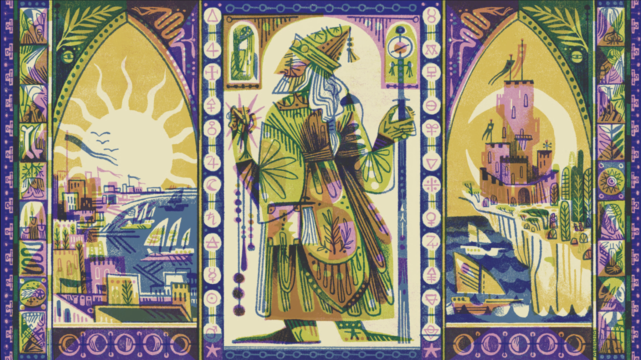
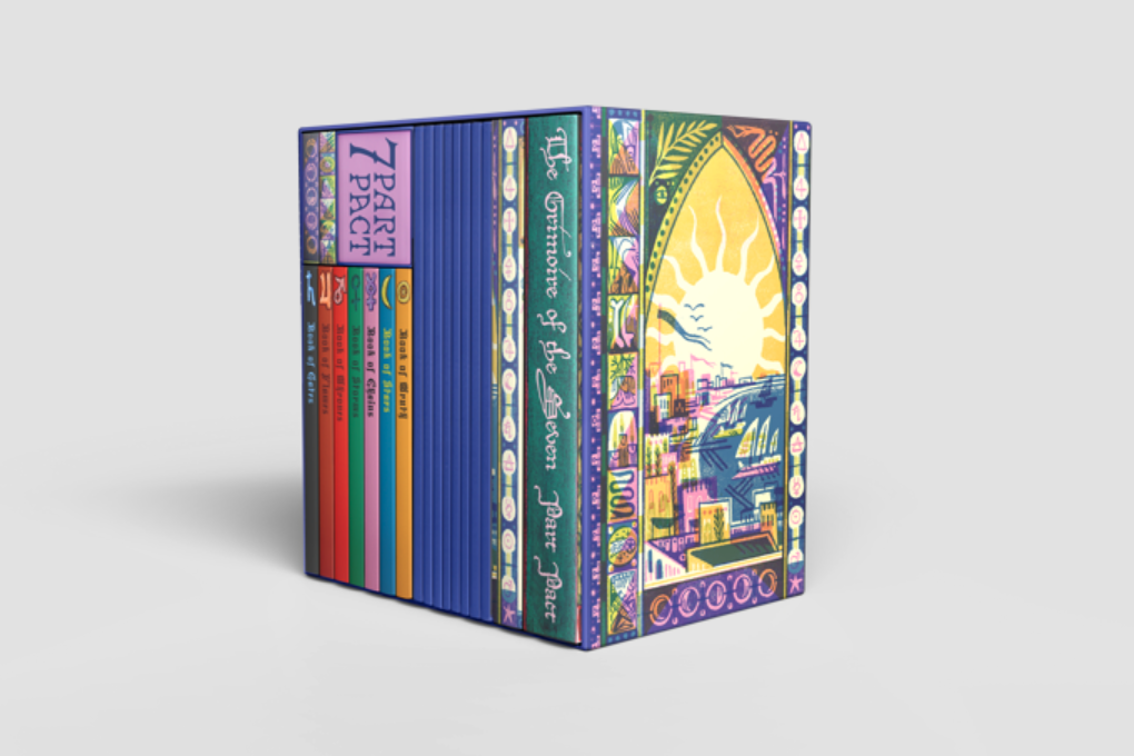
Seven-Part Pact, a game about the might and folly of powerful wizards bound by a venerable pact. What's pictured here is the planned slipcase art by Seattle-based illustrator, Pam Wishbow. Seven-Part Pact is a maximalist game. The kind that corrupts a kitchen table with knick-knacks, charts, booklets, cards, and notes. There will be conspiracy, patriarchy, power, violence—and thanks to this game's cover—a lot to look at.
I love how the art captures the ornate, kaleidoscopic-feel of the game without plucking something more expected off the wizardly tree. Less Planeswalker. More weirdo antiquarian with a stationary fetish. Excellent.
Tiny Fables
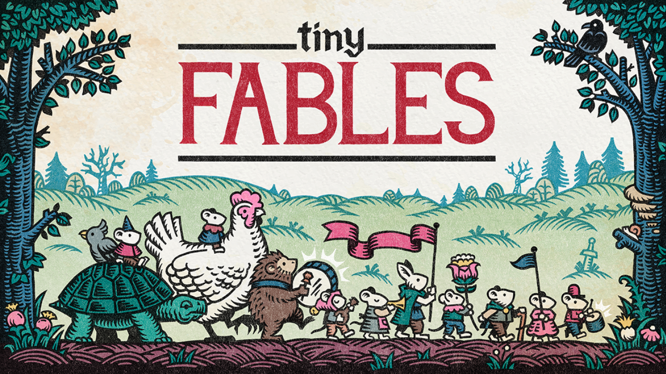
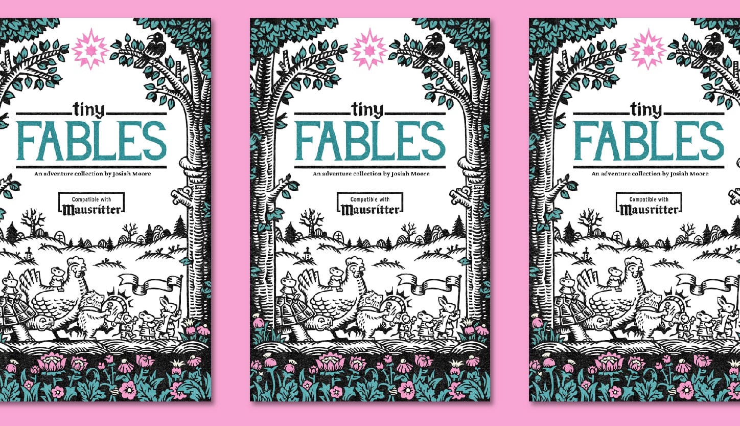
There's a lot to love about Tiny Fables cover. Its execution is flawless. Harmonious colors, clean woodcut-style illustrations, soft textures, and a simple but evocative composition. Tone is on full display in this cover. It's just so cute!
Something worth calling out: the title and art compliment each other. There are two reasons for that. One (1), the letterforms borrow some of the visual characteristics of the art—serifed, humanist, similar weights. Two (2), the art gives the title somewhere to be. Too many covers diminish their title and art by piling them on top of each other with outlines, overlays, and drop shadows.
Empire of Hatred
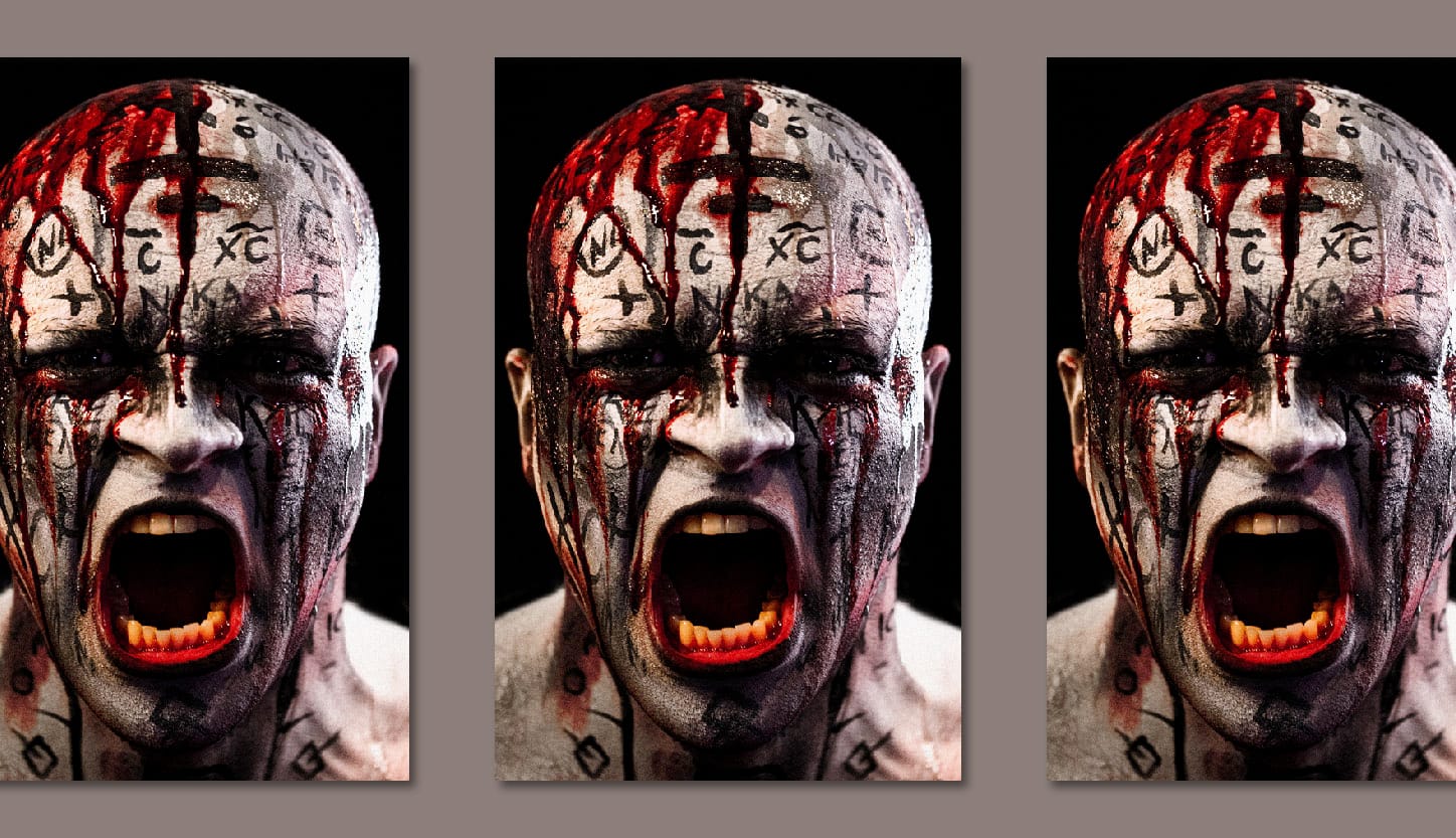
I can think of only a few self-inserts in tabletop rpgs. This is the loudest and most interesting: Sam Sorenson screaming bloody murder. This is who I picture in front of the mic recording Dead Letters. A blood-drenched zealot for simulation.
Something interesting: this cover doesn't have a title. Online you don't necessarily need one. The storefront's UI will label it for you. But if this does live on a shelf somewhere, I don't think it needs the title. Empire of Hatred? Oh yeah, the screaming one. It's right over there.
Green Oaks
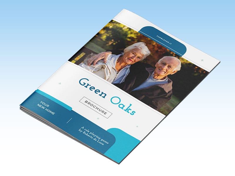
My biggest regret from the 2025 Ennies was not nominating Green Oaks for best cover or design. My wife nearly tossed it in the trash when I got it. If it weren't for that tiny snippet of copy in the lower right, it would be too covert for its own good.
This kind of cover takes guts, and I officially award Green Oaks the crown for in-world artifacts. Sorry, Call of Cthulhu and prop-tastic LARPS—you never stood a chance. Look at what you had to spend for a fraction of Green Oak's power.
Wages of Sin (Special Edition)
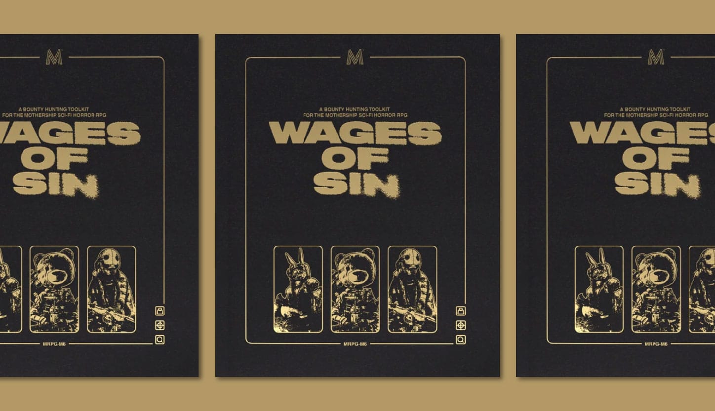
Normally special edition covers are a downgrade immortalized in leather. Not so with this one! The simplicity and colors do a lot for this Mothership release. The trio of portraits is also a better appetizer for the interiors smorgasbord of bastards, dissidents, and saps. It makes me wonder what an entire rogues gallery might look like.
Pay special attention to the logos and icons here. These are the correct proportions. Anything else would be a distraction. A clumsy bit of trade dress. Logos should never compete with the book's title or art.
Send me your favorites.
This is a fun regular exercise, but it's hard to do on a regular schedule without help. If you have a new release or new obsession, let me know in the comments or on Bluesky.
Current covers I'm looking for:
- Typographical covers. Minimal art. Font everything.
- Minimalist covers. Something with next to nothing.
- Scenery covers. Something that depicts a place well.
Until then, I'll keep exploring.
Additional Reading
 Clayton Notestine
 Clayton Notestine
 Clayton Notestine
Explorers Design is a production of Clayton Notestine. If you liked this article, please consider liking, sharing, and subscribing.