Great Book Covers July '26
Cover inspiration from across the tabletop rpg industry.

Playing a book by its cover.
If the composition is considered and the elements compelling, great book covers come in all styles. From the grim dark to the art house, there's a treasure trove of inspiration out there. Below are examples, some old, some fresh—all great. Not all of them are from this year—just what passed my desk in the last month.
A couple years ago, I wrote about the art of the book cover. This is a sequel of sorts. Let me know your favorites in the comments or on Bluesky and Instagram. If this ends up being popular, I'd love to make it a series featuring latest releases and trends.
Anyway, enough with the preamble. Let's look at some book, zine, and pdf covers...
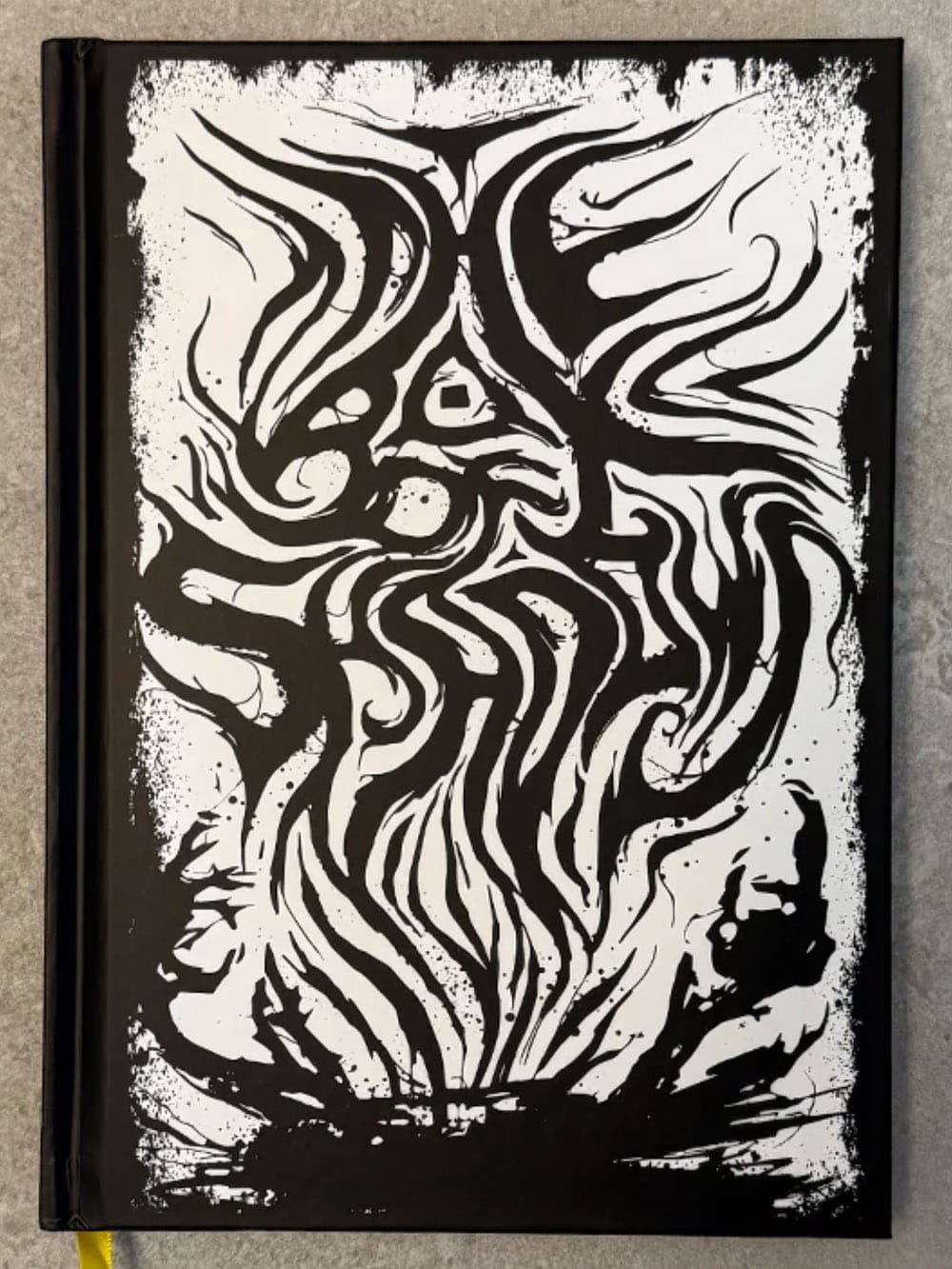
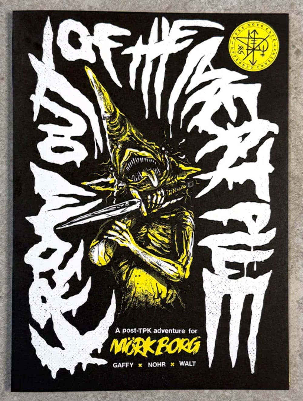
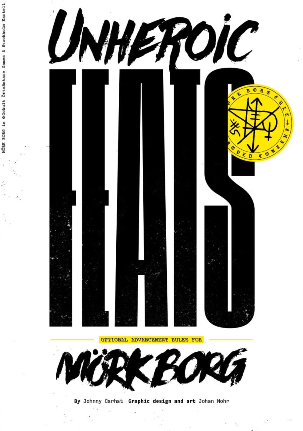
Covers (left to right): The Box of Shadows, From Out of the Meat Pile, and Unheroic Feats.
The Box of Shadows
If I had a dollar for every metal album I couldn't read, I'd have enough money to buy more metal albums. Box of Shadows treads the line of legibility and comes out on top with a title that does double duty as a Heavy Metal handshake and a conceptual depiction of shadows bursting out like poisonous gore.
Takeaway: Make your design elements perform multiple jobs. What can they do both literally and figuratively?
From Out of the Meat Pile
Johan Nohr is going to keep having a timeshare on this blog so long as he keeps designing great looking books, covers, and games. There's a playfulness here—classic Mörk Borg—with rounded letter forms and light texture. One of Mörk Borg's secret powers is its monsters—they make perfect centerpieces.
Takeaway: What is your game's proverbial ape that you should be pointing at? Maybe they should be on the cover. It sounds obvious, but if you did your job right (and made them interesting) it'll work.
Unheroic Feats
There's a misconception by some that Mörk Borg, Cy_Borg, and other subculture. games are noisy—that's only mostly true. Sometimes they're subdued despite all the blood and guts therein. Notice how the supplement's content, "feats" is in a bold yet clean typeface, and the Mörk Borg "unheroic" is painted.
Takeaway: Art and design can signal the role and position of your work. What elements can you strip away and what elements can you enshrine?
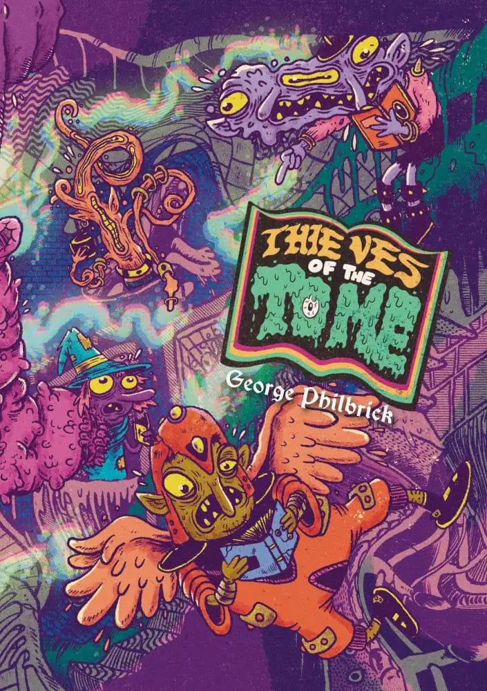
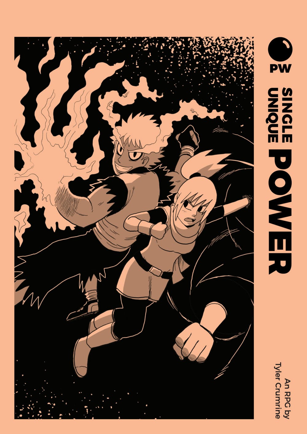
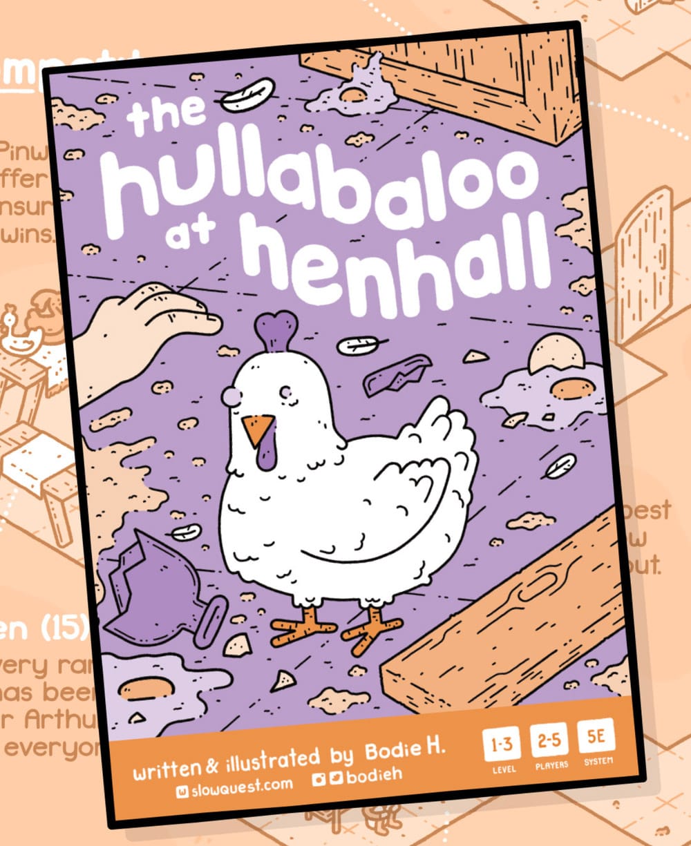
Covers (left to right): Thieves of the Tome, Single Unique Power, and The Hullabaloo at Henhall.
Thieves of the Tome
It's a merry-go-round of color and freaky little dudes! Sometimes a great cover gives the eyes something to explore, and I love how this one rotates around the title without leading our eyes astray. When I first saw this cover, I examined every thief before drifting to the next one in line.
Takeaway: Does your cover have characters? How are they interacting? Does the interaction lead the viewer where you want them to?
Single Unique Power
Tyler Crumrine has an entire series of games with the same style of cover. Despite that, they all feel distinct. Why? It’s the art composition. Notice how the eyes and hands of the characters guide ours. From the character mugging the viewer, to the punch that guides us to the title and back. Our eyes ricochet on this cover.
Takeaway: Where do your character's eyes, faces, and hands point to? It's a common mistake to have them lead off the page—imagine if this art were reversed, would it work the same way? The answer is no.
The Hullabaloo at Henhall
Good covers tell a story. Great covers make us want to finish it. This goofy cover is a snapshot. In the first act, something (probably the chicken) trashed this place. Now we have a disembodied hand—a player's hand—reaching in. What happens next? We have to play to find out.
Takeaway: If the cover's a snapshot, what happens next? The cover that suggests an interesting answer hits harder than the cover that doesn't.
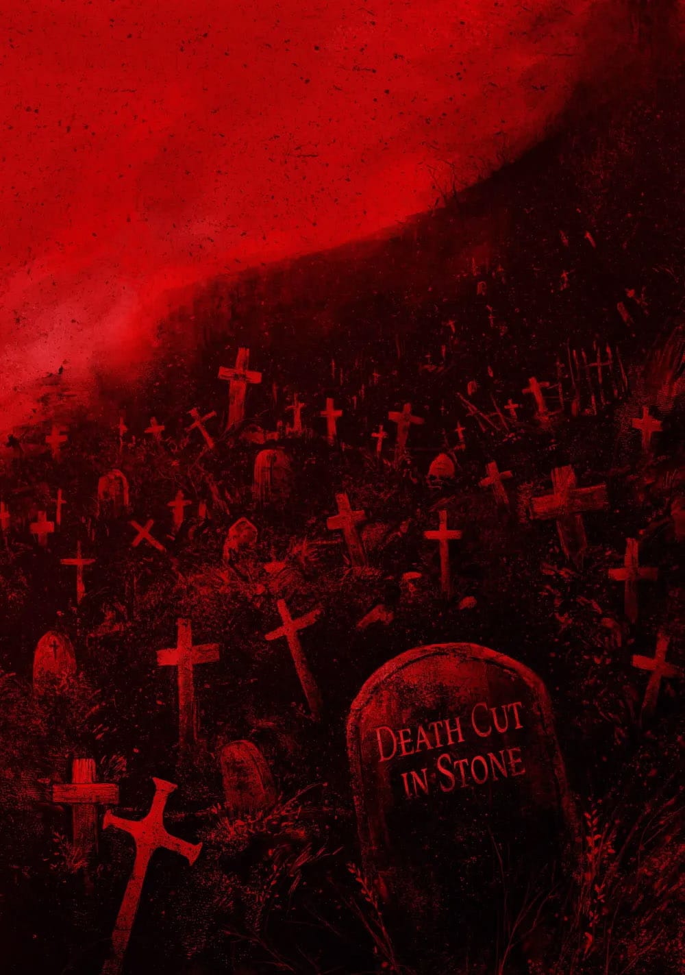
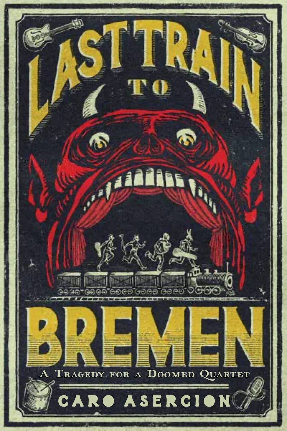
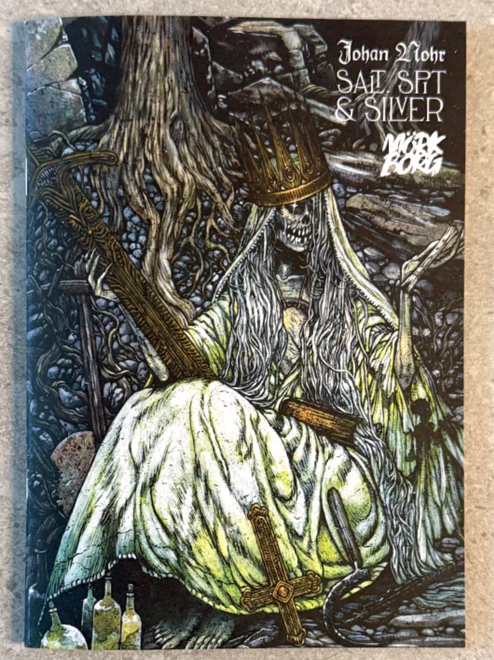
Covers (left to right): Death Cut in Stone, Last Train to Bremen, and Salt, Spit & Silver.
Death Cut in Stone
Composition. Composition. Composition. A blood-soaked monochrome under a slash of horizon, forcing our eyes down a bleak landscape of graves. Normally, it's best practice to place titles near the top, but I like how this title puts us inside its world. If this zine were a normal size, the title might get covered up on the rack, but this is A6, so it's likely to live right in front, waiting for your eye to settle there.
Takeaway: How does your format's size impact the way it's read? Where will your game live when it's put in the real world?
Last Train to Bremen
Sometimes mimicry make a cover great. The type, colors, and texture here resemble real-life matchbooks, flyers, and packaging from the early 20th century. Notice The Hellmouth; a real-life stage design used in moral and religious stories. It’s no accident it's being used here for a capsule game about damnation.
Takeaway: What is your game in non-game terms? How has that thing been depicted before? What aesthetics will reinforce what your game already is?
Salt, Spit & Silver
Catholicism has given in me an inexplicable love for skeletons in finery. I left the church as soon as I could, but Id be lying if I said a gold-studded crossbow didn't get me excited. This is a great piece of art given the entire page to breathe.
Takeaway: What are the visual shorthands that grab your audience?
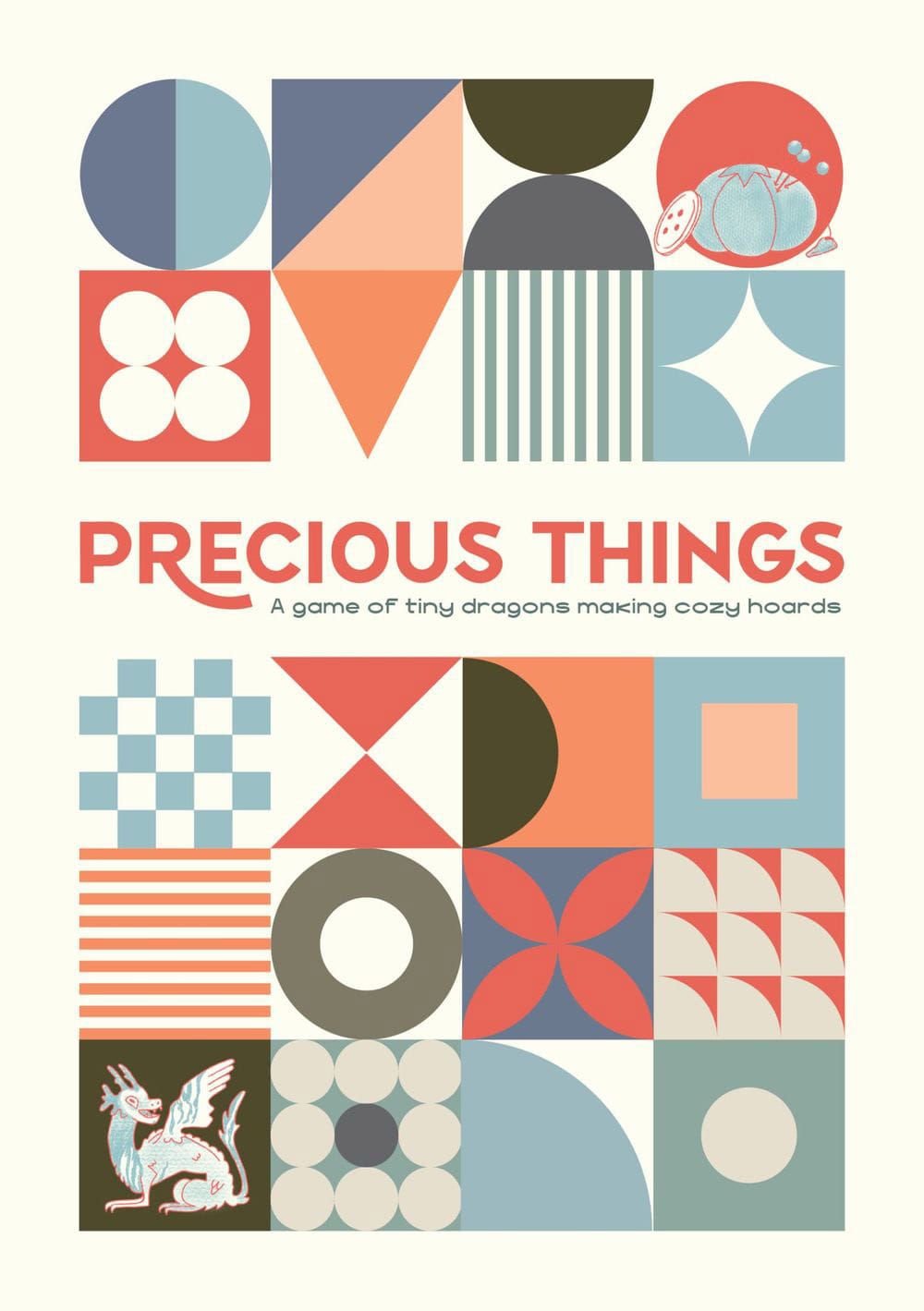
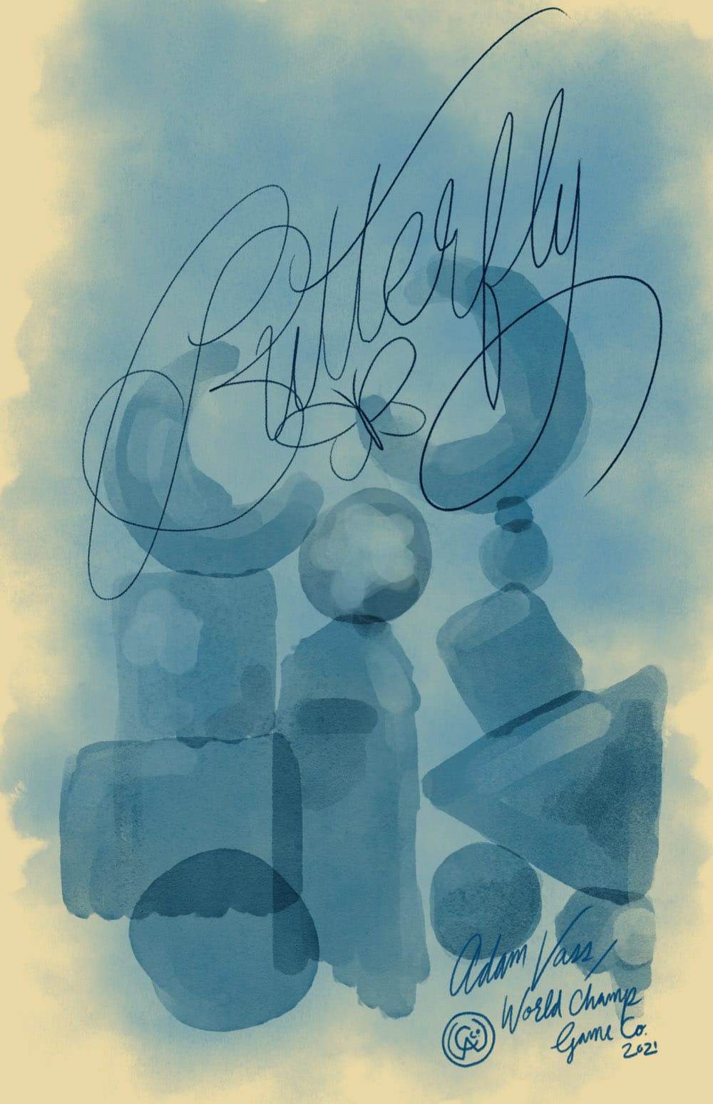
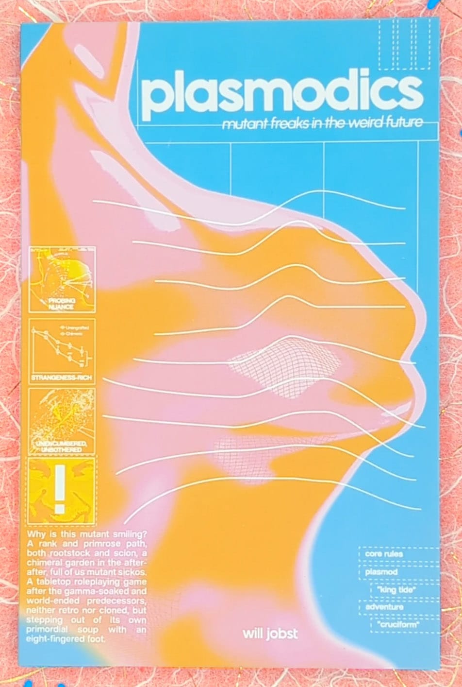
Covers (left to right): Precious Things, Butterfly, and Plasmodics.
Precious Things
This cover's simple but varied collection of boxes and patterns gives us an abstract depiction of a cozy dragon's hoard. Notice how the muted colors reinforce the games promise by remaining quiet and understated.
Takeaway: What do the colors say about the game? What's their tone? How loud are they? Sometimes the flashiest colors aren't right for your game.
Butterfly
Beautiful and delicate. This might be one of the most original—and gutsy—covers I've seen in rpgs. Butterfly is about artists, so naturally, we get a painterly cover of organic shapes, depth, and balance. Notice how even the World Champ Game Co logo is drawn. That's holistic attention to detail right there!
Takeaway: What's the least obvious way to depict your game? Is there a metaphor, abstract or literal, that you can use to tell a story?
Plasmodics
Plasmodics is what Gamma World would look like if it was nuked in the microwave with cans of spray paint. It's a Qud-like game of weird mutant freaks in a fluorescent world of light and tie dye. This cover captures that bubbly energy and shocks it with commercial graphics. It really stands out in person.
Takeaway: Color combinations are everything. Some vibrate off the page. Others settle in and blur. What makes the most sense for your game?
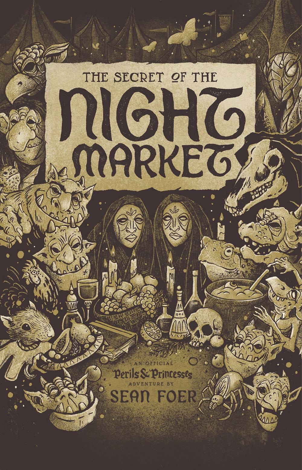
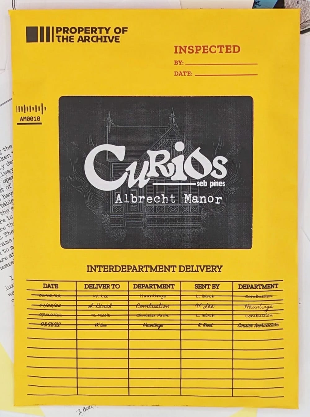
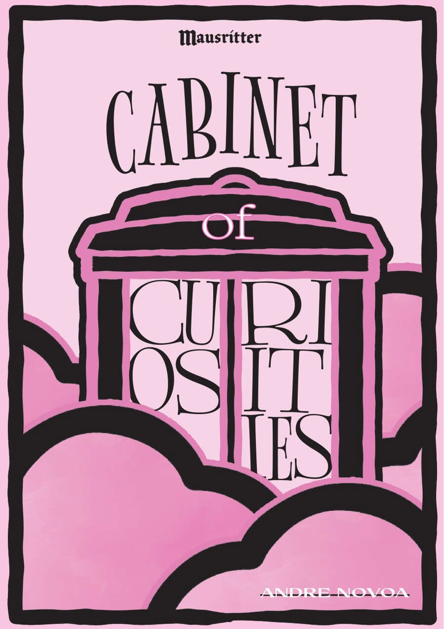
Covers (left to right): The Secret of the Night Market, Curious: Albrecht Manor, and Cabinet of Curiosities
The Secrets of the Night Market
When I think of real-life markets, I think of weird characters, fresh food, and random knick-knacks. This cover lays it out like a buffet. I love how Ryan uses color and shadow here to create drama. It puts us right in the scene, like we're sitting across the table, seeing the market through candlelight.
Takeaways: What's in the foreground and what's in the background? What feels like the subject and what feels like the background?
Curios: Albrecht Manor
The magic of this cover is that it does two things: it introduces the game and foreshadows how to play it. Curios is a epistolary horror mystery. It comes in a manilla envelope. During play, you do what the fictional characters do—with an object that feels like it came right from their world.
Takeaways: All covers are introductions, but the best covers say and do multiple things, like convey tone, communicate themes, and foreshadow playstyle.
Cabinet of Curiosities
The biggest mistake new designers make is treating their title like an afterthought. Don't slap it on, make it an active participant, or do what Cabinet of Curiosities does and make it the star. I love the playful tilts and shakes in the typography. It looks like it's clattering around inside that cabinet.
Takeaways: What elements can you borrow from the cover to make your type feel like it belongs? Consider shape, size, color, texture, and tone.
What are some of your favorites?
I would love to do this exercise again and explore new releases, but it's hard to do without help. Share your favorites. What covers do you think are some of the best out there? What is it about them that makes you excited.
Let me know in the comments or on Bluesky. Until then, I'll keep exploring.
Additional Reading
 Clayton Notestine
 Clayton Notestine
 Clayton Notestine
Explorers Design is a production of Clayton Notestine. If you liked this article, please consider liking, sharing, and subscribing.